skip to main |
skip to sidebar
I know there are some "purists" (see "snobs") out there who refuse to do any post-processing on their work, claiming that any editing ruins what the scene really looked like, or is dishonest about portraying the photo, or any other number of pretentious reasons. Today I went to the zoo, and after editing one of my "keepers," it really drove home the point that editing can have a HUGE impact on the quality of a photo.
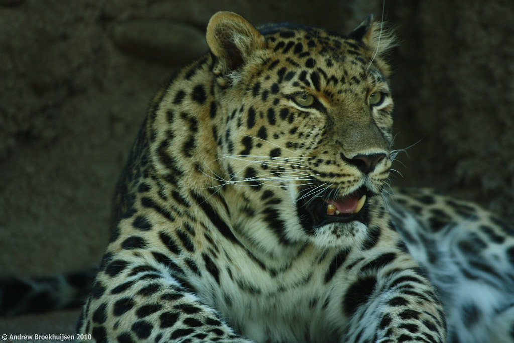
This isn't to say I support over-editing. There's definitely a line, and all too many people cross it. But those purists would have ended up with a shot looking like this, even if they were using regular (daylight balanced) film:

click to enlarge, or see it on Flickr
Aperture: f/5.6
Shutter Speed: 1/60
ISO: 200
Focal Length: 300mm
Monopod
Granted, it's not too bad of a shot. But the evidently fluorescent bulbs used to light the habitat gave off a pretty greenish tint which was very apparent with the white-balance set to "daylight." Also, because it was a moving subject and I didn't have time to make EV adjustments between shots, I underexposed by a bit.
Between fixing those things and other regular optimizations I do to every photo in Lightroom, I ended up with this:

click to enlarge, or see it on Flickr
Aperture: f/5.6
Shutter Speed: 1/60
ISO: 200
Focal Length: 300mm
Monopod
It's just a better photo now, thanks to regular editing techniques. Now for this photo, I actually took it a step further and cast the whole thing in a strong monochrome blue with added contrast to make it really punchy.

click to enlarge, or see it on Flickr
Aperture: f/5.6
Shutter Speed: 1/60
ISO: 200
Focal Length: 300mm
Monopod
In this case, I think this more extreme treatment works for the photo. However, it's somewhere on the line of "too much post-processing." I'm okay with that as I have a "regular" version to call the photo. This isn't so much a photo as a creative manipulation of a photo. I wouldn't say either of the two images is "better," they're just different.
Feel free to share your own thoughts on post-processing in the comments.
Also, for those of you who noticed/cared, I did switch the links on the images back to a large version of the photo rather than a full-res version. If you want to view the full-res version, just go to it via my Flickr link.
Oftentimes at work when there are no customers, I find myself reading books about stuff like studio lighting, Lightroom and Photoshop techniques, etc. Today I learned about adjustment brushes in Lightroom. I kind of already knew they existed, but just figured there wasn't much point to learning how to use them when I could do all the same stuff in Photoshop, and more easily.
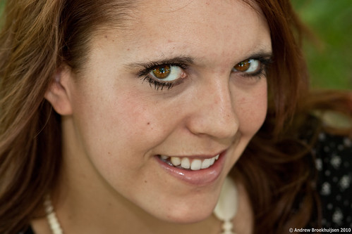
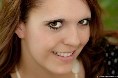
Anyway, I was wrong. Between adjustment brushes and a few other tricks I read up on, I was able to revisit a portrait I did of my friend Linnea (one of the photos from this post) and make VAST improvements on the final product. See for yourself:

click to enlarge, or see it on Flickr
Aperture: f/4
Shutter Speed: 1/30
ISO: 100
Focal Length: 85mm
Tripod

click to enlarge, or see it on Flickr Aperture: f/4
Shutter Speed: 1/30
ISO: 100
Focal Length: 85mm
Tripod
The first one looks good. But the second really crosses a few lines into looking more professional, in my opinion. The irises are more saturated, the whites of the eyes are brighter and cleaner, the overall exposure is more pleasant, the skin tones are just right, the browns in the hair are more pronounced, the portrait is sharper where it should be sharp and softer where it should be soft. I would like to take a moment and personally thank Adobe for making such delicious, relatively automatic skin retouching features that make everyone look like a model with perfect skin.
Sorry it's so late. I was determined to have fireworks for the calendar, and it took me longer than I thought to find some and photograph them.
Anyway, you know the drill. Share with your friends or whoever.

1600x1200
Happy July!
Just got back from a week long vacation in Stanley, Idaho, as well as camping for a family reunion. Which is why I still don't have the July calendar up yet. Luckily, I did shoot some fireworks in Stanley, so I'll probably put it up tomorrow.
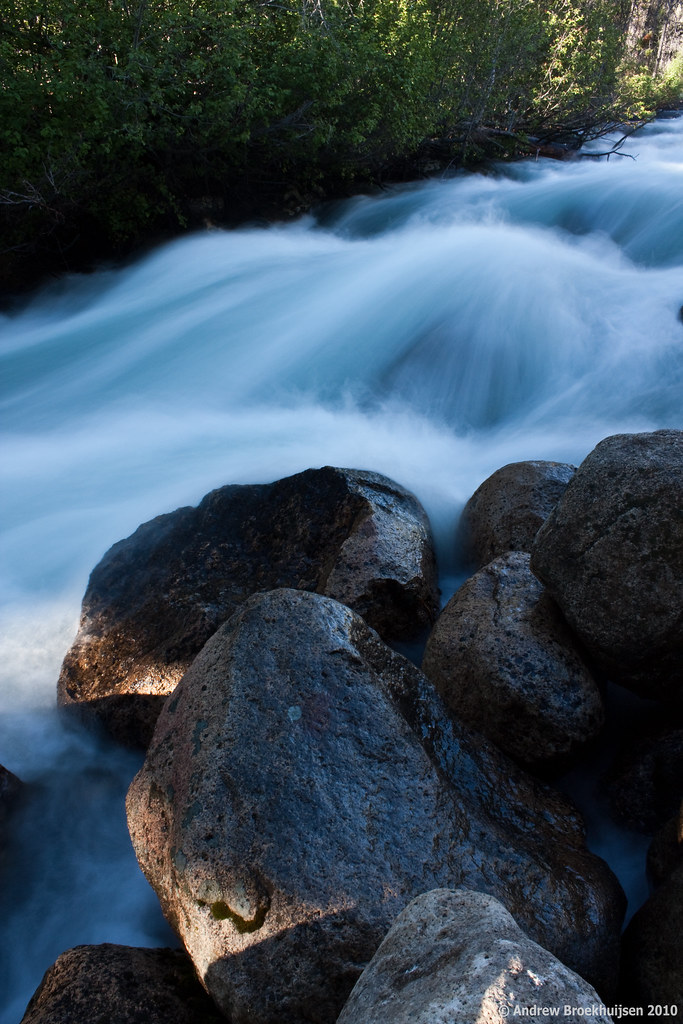
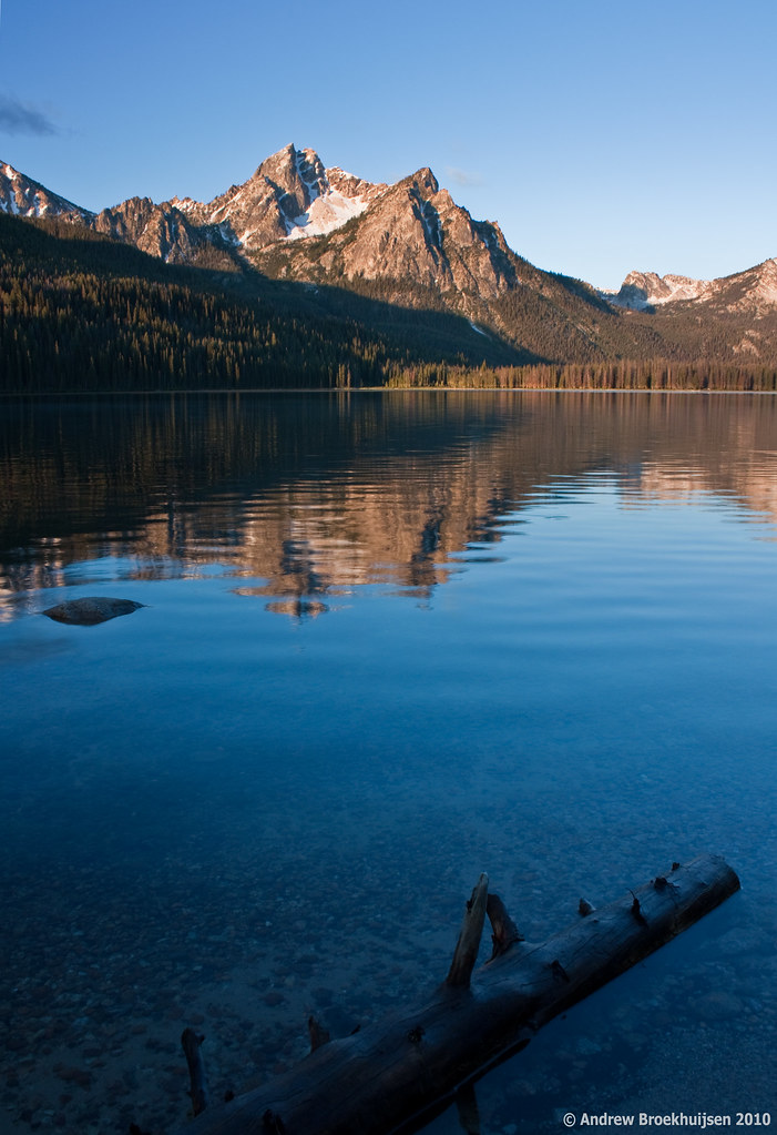
Stanley is a beautiful area. I think I have more shots that turned out well, but these two were the first to immediately grab my attention after I dumped my memory card. Thank goodness for polarizers... now I just need a wide-angle lens that has better optics than my kit. Which would be virtually any other wide-angle lens. Wide angle lenses are expensive though. So for now, I'll settle for the kit.

click to enlarge, or see it on Flickr
Aperture: f/22
Shutter Speed: 1 second
ISO: 100
Focal Length: 18mm
Tripod

click to enlarge, or see it on Flickr
Aperture: f/10
Shutter Speed: 1/5
ISO: 100
Focal Length: 18mm
Tripod
I'm a little disappointed in the depth-of-field on the second one. Should have gone narrower than f/10; the mountains are not crisply in focus. Guess I won't be printing that one as a 30x40.
More to come as I find more time to dig through the photos in the last card dump. And I'll try to remember to get that calendar up tomorrow as well.
