skip to main |
skip to sidebar
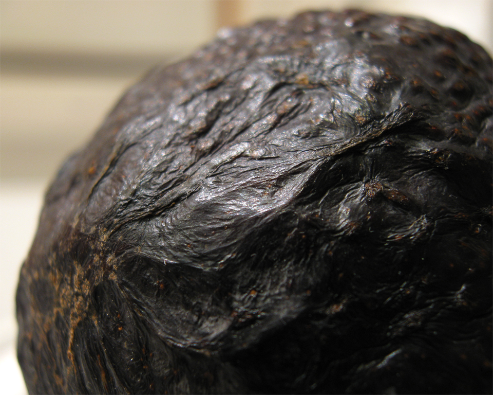
Once again, it managed to snow literally all day long here yesterday. So I finally bit the bullet and went outside to do some photography anyway. Today is just partly cloudy, so I'm looking forwards to going on my architecture shoot (finally) in about an hour. I did, however, get one reasonably good shot during the snowy weather yesterday. I was out at the foot of my driveway, shooting macros of trees that had snow and ice on them, but weren't completely covered.
click to enlarge, or see it on Flickr
Aperture: f/2.6
Shutter Speed: 1/250
ISO: 80
Handheld
The light was nice. Again, I love shooting when it's overcast. The light is so diffuse, yet it's plenty bright enough to get quick shutter speeds for handheld shooting.
I just barely increased the contrast on this, but left the brightness pretty much alone. In fact, I used a little trick to slide the left end of the histogram up a little; the exposure was correct, but the image was still too bright for my liking. Basically, you duplicate the layer, adjust the levels about twice as far as you want to end with, and then set the now posterized duplicate layer's opacity down to around 50%. It helps minimize the effects of the posterization without sacrificing your levels adjustment. A very subtle blue cast was added to aid in the "cold" feeling of the photo, and I desaturated about 40% to make the leaves looks dead...er.
Apparently the tube I have to attach to my camera in order to mount lenses and filters partially blocks my autofocus sensor. It still does a pretty good job when there's this much light, but especially for macro shots, I try to use manual focus. Unfortunately, it was so bloody cold outside that I didn't feel like playing around with focus on my own. The resulting image isn't tack-sharp, but it's an acceptable compromise. I couldn't stay out too long or else my lens would get snow on it, which is not only annoying to clean up, but gets in the way of the photo, too.
Today's post was SUPPOSED to be the start of a few days worth of architecture shots taken of abandoned buildings. I had a shoot lined up yesterday, and... it started snowing. Not in the plan. Unfortunately, it seems to still be snowing today. So I might have to wait on the shoot until tomorrow, or even later this week.
Instead, I'll show you a couple of Christmas tree ornaments I turned on my lathe. Nothing too fancy; one is maple, and the other is walnut. But they were pretty fun photography subjects (once I finally got them to stop rolling off the counter).

click to enlarge, or see it on Flickr
Aperture: f/2.6
Shutter Speed: 1/13
ISO: 80
Handheld
Not as tack sharp as I would have liked. That goes with shooting handheld at 1/13th of a second. I don't care how braced against things you are, or how good your image stabilization is. At 1/13th, you'll get better results with a tripod. Unfortunately, when I shot this, I was in a hurry to get out the door.
On the bright side, I barely had to do any post-processing. The lighting was already pretty warm, but not overdone, the white balance was just right, and I didn't feel adding a lot of saturation or contrast would help this photo. I didn't even crop. This is very close to being right off the camera.
Out of curiosity, does anyone else out there woodwork or woodturn?
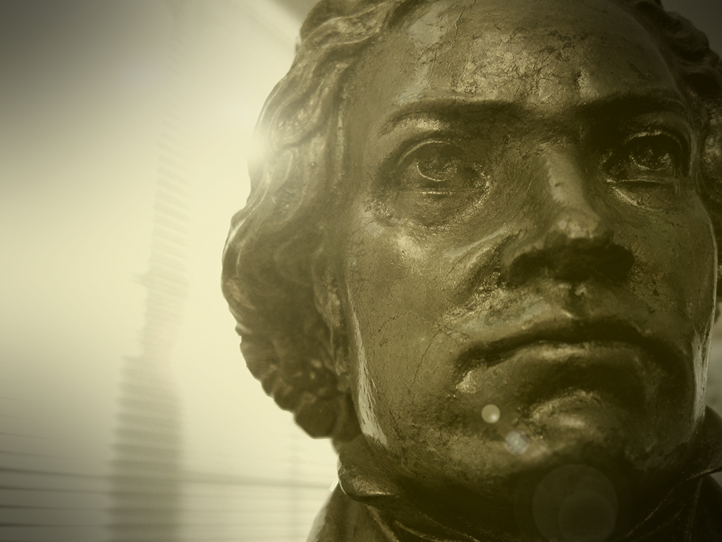
I tried again, and this time I think I got the lighting right. I had to keep reminding myself that the objective wasn't to get the exact same photo, but a better one. Though the hands aren't quite as contrasty as the original, I think the photo looks less over-processed. I'm pretty much happy with it. Happy enough, anyway, that I'm not going to try and top it.
click to enlarge, or see it on Flickr
Aperture: f/4
Shutter Speed: 1/40
ISO: 80
Tripod
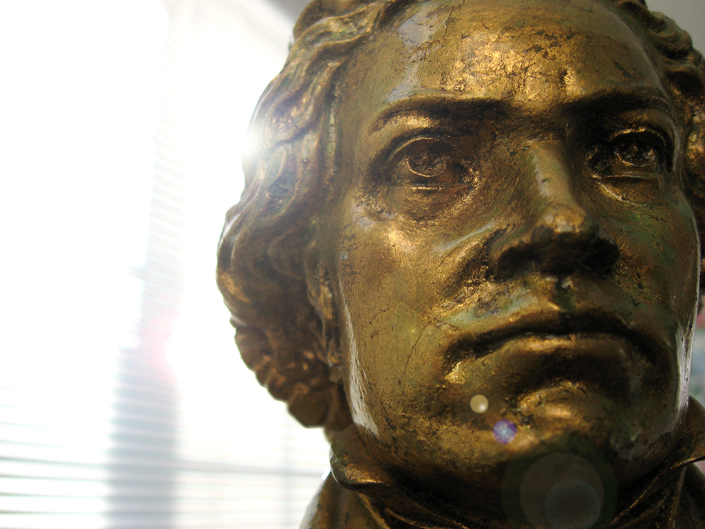
The camera when taking this picture was aimed south-southwest. The window where the light came through for this shot is on the south side of the house, so taking the photo earlier in the day gave me a better angle. I was happy with the shot (this time I only took 6 shots before uploading to the computer), so I went to post-processing. I noticed that though the original photo had a lot of black, it wasn't really monochrome, so I skipped the Channel Mixer mask layer. I added a subtle 10% opacity Solid Color mask layer at a gold color to give it a warmer cast, lowered the brightness a lot, cranked the contrast quite a bit further than I normally would for any photo, and added a subtle bokeh texture. This texture came from my Christmas tree. I just turned the lights off in the house when it was dark outside, turned on the tree, and set my focus to the closest it would go. The lights on the tree gave me a nice multicolored bokeh, which I converted to B&W, and then Sepia in Photoshop before applying to this photo. After flattening, I added a small but strong vignette, and called it good. I'm happy with the results. My only regret is leaving my bracelets on in the shot. I should have taken them out of the frame by pushing them up my arm or something; I feel they distract from the feel of the photo.
Back before I got my Canon PowerShot A590 IS, I used a little point-and-shoot Olympus that had 3.2 megapixels, and couldn't go full manual. I got quite a bit of good use out of this camera, even though I wasn't very "into" photography back then. Somehow, I managed to get this photo with that camera.
click to enlarge, or see it on Flickr
Exposure details lost
Knowing that I didn't have a very good grasp of post-processing back then, I figured I would try to re-create the shot, and do it better. I think all I knew how to do was crank up the contrast back then, so I felt pretty good about my chances of out-doing my 13-year-old self. I shot 32 photos, using a circular polarizer, and various apertures and angles. Most of them were underexposed by 2/3 of a stop, because I wanted few highlight wash-outs (even after cranking contrast), and I wanted really black, moody darks.
Only after having uploaded, textured, vignetted, color-cast, and otherwise played with what I felt was my best out of the set did I realize a few things:
1. It doesn't matter how good you are at post-processing if the source material isn't good.
2. I didn't have a CPL back then, so I shouldn't have been using one now.
3. The camera I used for the original probably did not have the capacity to underexpose by 2/3 of a stop, so I should have just listened to my light meter like a good little boy.
4. My lighting was different, and not nearly as good in my re-creation attempt.
So. Despite my best efforts, I got a rather disappointing result.
click to enlarge, or see it on Flickr
Aperture: f/4.5
Shutter Speed: 1/30
ISO: 80
Tripod
I still believe that if I can get a capture as good as the original, then I can do a much better job with post-processing, and end with a better picture. It seems, however, that fate didn't want me to get as good of a capture the day I shot these. All I can do is try again when there's better light.
P.S. I think a bokeh texture would look good on this; better than the one I used. However, I don't have a good bokeh texture. Anyone know where I can get one rights-free? It has to be at least 8 megapixels.
Yesterday I showed you that new extreme post-processing method I discovered. Well I've been playing with it a lot, but I'm still not so sure how I feel about it. I have an image I took three days ago. Before I discovered this new post-processing method, I would have ended with a final image something like this.
click to enlarge, or see it on Flickr
Aperture: f/2.6
Shutter Speed: 1/250
ISO: 80
Handheld
Decent. But I tried out the new method on it, this time casting it a slightly darker shade of gold, and using a less subtle bokeh texture, and a slightly harder vignette.
click to enlarge, or see it on FlickrSame exposure details as above
Every time I look at the two, I change my mind about which one I like better. On the one hand, the first one is definitely a more natural look. But the second one captures the feel of the photo more effectively in my eyes.
I like playing with this effect, but I don't like the idea of all my future photography being treated like this. I'm worried about crossing the already dubious line between "photography" and "post-processing art," if that makes any sense.
Help me untangle my thoughts here. First off, which do you like better? Second, why? Does this feel like homework? Sorry. I need your help.
I went up the canyon near my house a couple days ago, and was able to snap one keeper before Mother Nature forced me back into the safety of my heated car. Having read about some cool post-processing tricks earlier, I decided to try one out. Quite frankly, it was more because I wanted to try the new technique out than because I thought it would look particularly good on this specific photo, but I'm pretty happy with the result.
click to enlarge, or see it on Flickr
Aperture: f/8
Shutter Speed: 1/8
ISO: 80
Handheld
When I first took the photo, I wasn't thinking with post-processing in mind, which actually led to some problems down the road. I wanted to increase the "cold" feel of the picture, so I shot with Tungsten white-balance. This added a lot of blue, but when I got it onto the computer, it looked kind of fake.
To get the effect, here are the steps I took in Photoshop.
1. Duplicate background layer.
2. B&W second layer with a Channel Mixer mask layer.
3. Put a Solid Color mask layer over at whatever opacity I used. I picked a dark green olive-ish color.
4. Flatten that out so I'm down to two layers again (1 original untouched image, 1 green monochrome).
5. Added a texture to my green monochrome image. It's super subtle. I think I only used 10% opacity.
6. Used the Levels box to remove some of the blue from my background layer. I took out enough that it probably posterized pretty badly, but that was taken care of in the next step.
7. Changed the blending mode on my green monochrome layer to Hue, played with opacity until the colors (olive green and cold blue) mixed to produce the color you see in the image.
8. Flattened, added a vignette.
This technique is really really fluid in that you can play with blending styles, colors, levels, opacity, or even paint-mask out parts of the colors if you want. I didn't even touch the Brightness/Contrast box after the final image was done, though in hindsight, I probably should have.
If you're crazy enough to try this technique (or a similar one), post a link in the comments. I'd love to see your results.
First off, Merry Christmas (or happy Hanukkah, Kwanzaa, or whatever thing you celebrate this time of year) to everyone! Hope your holidays are lovely.
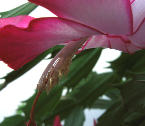
Anyway, this picture was taken the same day as yesterday's picture. It's an indoor macro shot right up against the window out into the lovely cloudy light. This gave the flower some cool back lighting, but I had to overexpose the background to avoid silhouetting the subject.
click to enlarge, or see it on Flickr
Aperture: f/2.6
Shutter Speed: 1/80
ISO: 80
Handheld
I'm actually pretty happy with the lighting in the background—it makes the photo look almost like it was shot in a light box. I wish I could have done something about the leaves and window thingies cluttering up the background, but I don't think they're too terribly distracting.
As you may have guessed from the title, a subtle Orton Effect was applied. I'm liking this effect more and more the more familiar and comfortable I become with it, especially for flowers. As this was taken handheld, it wasn't as perfectly clear as my macros with tripod usually end up, so the Orton Effect also helped hide the minute amounts of camera shake.
I love shooting on cloudy days. The snow was falling after school, and I got let out about 15 minutes early. While I waited for my carpool to get released, what better thing to do than take pictures? Though it was snowing pretty thickly, it wasn't all that cold. This resulted in a lot of water on my car from the melted snow. With the lovely cloudy light that is so diffused, yet usually almost as bright as sunlight, I took this nice macro shot.
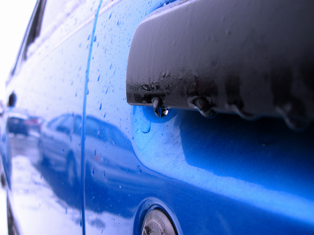
click to enlarge, or see it on Flickr
The water droplets look nice, and the one I wanted is clearly in focus. The reflection of the other car in the parking lot is (hopefully) a nice secondary subject, but one that isn't too distracting, and I'm loving how the background just fades out to white.
I have a teacher who has been collecting Dr. Pepper cans since the beginning of last school year. She's amassed quite the collection now, and artfully arranged them into a massive tower which she keeps in her classroom.
Not only am I a little too proud of the title of this photo, I think it was one of the few photos that looks good with a selective desaturation.

click to enlarge, or see it on Flickr
My high school had a Christmas dance last Friday, and my Chamber choir decided to go as one big group. The theme of the dance was ugly sweaters. I think we succeeded in that theme. The group wanted me to do pictures, as I do them for a heck of a lot cheaper than the school, yet (ideally) I know enough to get pictures that aren't just crappy snapshots.
Anyway, the lighting was a real challenge. By the time I arrived at the house where the portraits were to take place, it was in the late stages of sunset. This completely eliminated any idea of having a group picture that day, as my flash isn't powerful enough to fit 18 couples into the frame and still be effective without a real light source somewhere else, and since my camera isn't SLR (it's a Canon PowerShot A590 IS), I can't slave extra flashes or strobes. Also, side lighting makes for awful portraits unless you're going for something really moody. And it's hard to get 36 people to look moody all at the same time :)
I shot as many portraits as I could, doing my best, until the lighting became downright ridiculous. With my flash on the softest setting, I was getting surprisingly good fill lighting in the faces, and with my aperture wide open and my ISO at 100 rather than 80, the ambient light was doing okay. But when the ambient light rapidly disappeared, I had to boost my flash power, which gave me hard shadows and bad photos in general. So I stopped. We're going to have to do these photos sometime before 5:00 when we try again.
Hopefully with the time of day problem solved, I'll be able to get just fine portraits. I'm keeping my eyes open for a cloudy day sometime over Christmas break where I can get everyone whose pictures didn't get taken (or didn't get taken well) together, and if I can find a nice sunny day and get some reflectors together for fill lighting, I should be able to do the group shot.
Here's the portrait of me with my date. Feedback is absolutely welcome; I'm a portrait noob.
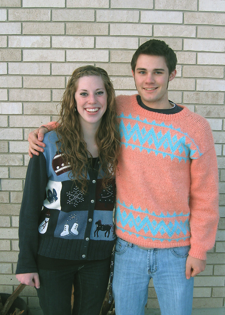
click to enlarge, or see it on Flickr
Areas to improve on that I've already noticed: there's some clutter in the bottom of the frame, the bricks (and therefore "horizon") of the photo is uneven. And my expression looks like I've never touched a girl before. But I think the background bricks are pretty neutral, so I didn't worry about throwing them out of focus. And the lighting looks acceptable to me.
One final note: the resolution that this photo is displayed at on this blog page just happens to be one of those sweet spots where you randomly get weird pixellation issues. They aren't really there, just look at the expanded size before you accuse me of using too much unsharp mask :)
I'm sitting in my photography class right now, and I still haven't gotten back my camera. So This photo was actually taken on the same day as this post, at the same location.
As I've said before, I think that the majority of pictures should be left in their original color. But this small lake provided a unique challenge: the colors were super dull and boring. Quite frankly, it's a disgusting lake. There's an unbelieveable amount of garbage in it, including an ATV that someone tried to drive out into the middle while it was frozen over a few years ago. This crappy color made for a good opportunity to try out some monochrome effects. The B&W picture in the linked post above turned out good, so I tried a sepia on this. I don't really have a philosophy on sepia tone except that it's overused, so this is the only image I've ever done in sepia.
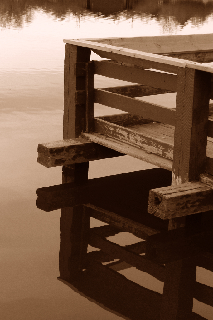
click to enlarge, or see it on Flickr
I'm specifically looking for feedback here. Is the color of the sepia wrong? Is this picture not even good in sepia? I know the vertical alignment is off, so I'll fix that if I ever print this. Anyone who knows anything about sepia, feel free to help me out here.
If you have good sepia tone photos, feel free to post links in the comments.
Today, I am having a photographic emergency. It's called, I was out at a dance on Friday night, and went to like 4 different locations via 4 different cars. Somewhere in that confusion, my camera with all my gear and my tripod got left in a friend's SUV. So I haven't had it with me for two full days. I'm quite disappointed, having missed 3 particularly great photographic opportunities. Yes, I counted. But it's my fault.
Anyway, that left me with one option if I was planning on getting a post out today (if you haven't noticed, I've been trying my best to get one out every day): looking through my old untouched iPhoto pictures. When I upload the contents of my card, I put them all into iPhoto, choose the keepers out of the batch if there are any, and take those on to post-processing.
Luckily, there are at least a few post-processing-worthy photos that I haven't gotten to. Good thing, too. Here's one I found today. I took it during a show my Chamber choir put on every night for about a week in early December. The aforementioned show left me very little time for photo editing while it was going on, so there are at least a few good photos that I just never got around to Photoshopping.
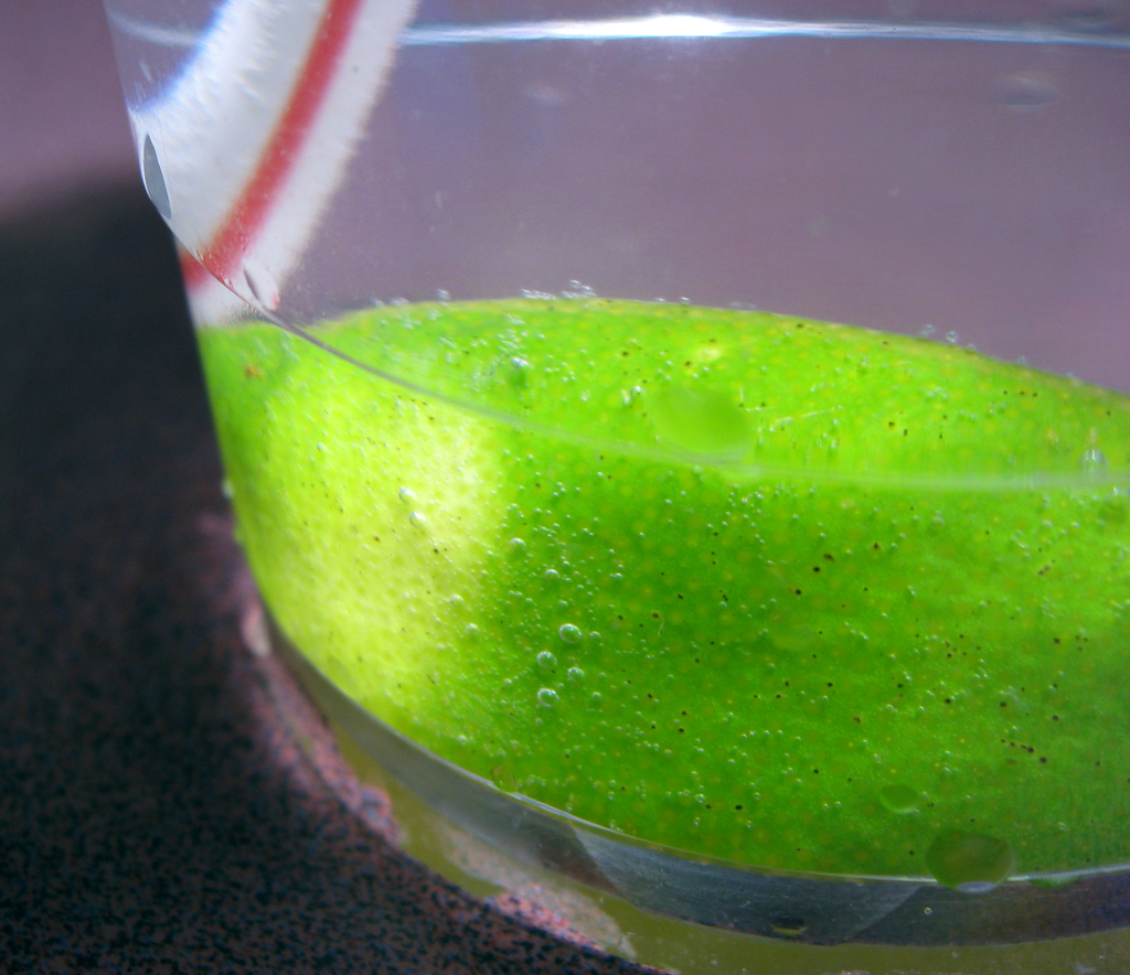
click to enlarge, or see it on Flickr
I'm particularly fond of the colors. I didn't touch the saturation, and only bumped the contrast up +5 in an effort to accentuate the carbonation trapped between the lime and the cup. The composition, not so much. But a fun photo to look at.
One thing I love about being a photographer is that I can randomly notice something, think, "that would be a good picture," and in no time, I end up with more photo material to post-process when I get home to my computer.
That happened to me yesterday, and here's the result.
click to enlarge, or see it on Flickr
The composition is a bit iffy, but I was a little constrained in that I had to shoot from a certain angle to get the right things in the reflection. But I like the colors and the contrast.
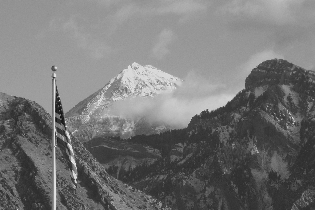
I found a better vantage point for taking basically the same panorama of the mountains—right in front of my school. Since it's significantly closer, the mountains get better detail, and I can also take enough raw material to chop of any clutter in the foreground, which is nice.
click to enlarge, or see it on Flickr
I wish I could upload a larger resolution to Flickr, but since I'm currently on a free account, they knock down all my files to a maximum of 1024 pixels wide. Even 1024x208 doesn't do this justice though. In fact, my monitor (1680x1050) doesn't do it justice. To view a panorama, I really want to do a print.
I learned that using a polarizer while taking panoramas is a big no-no. It made some pretty extreme lines between frames, even after the best blending job Photoshop would give me. What I ended up doing was selecting the mountains, copying them into a new layer on top, selecting the sky, copying into a new layer just below the mountain layer, and Gaussian blurring the crap out of the sky copy layer. That hid the lines pretty well, but also made the sky look rather fake, and erased the nice clouds I had going. I also boosted my blue in the Levels box a little too much, which partially posterized the sky. It's not really noticeable in 1024x208, but if I ever want a print, I'll be re-doing this.
So, a decent photo, but a great learning experience. When I finally do one with a final print in mind, I'll re-shoot on a similarly sunny day (or maybe a cloudy day...), and WITHOUT a polarizer. I over-edited this to get rid of the lines, and that won't do if I'm going to spend $50 on a print and a custom frame.
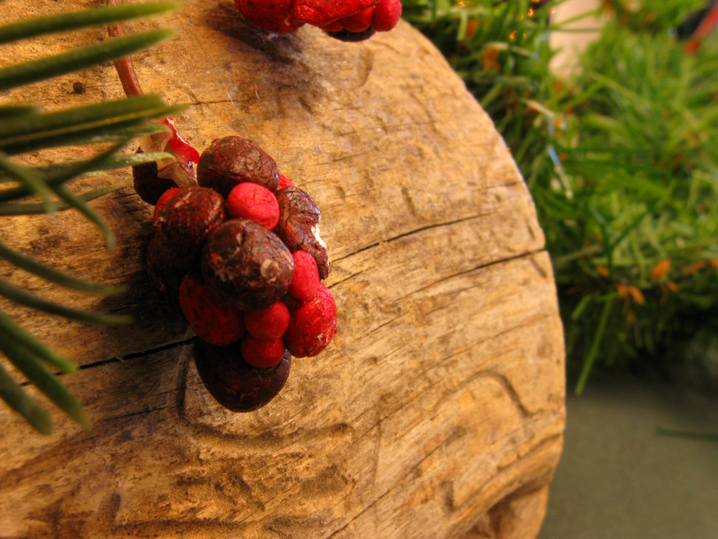
Short post today. I made another pen as a secret-Santa gift for a friend in the Chamber choir I'm in. This one is walnut.
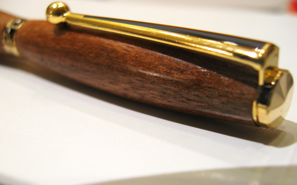
click to enlarge, or see it on Flickr
As far as straight-up photographic value goes, I don't like this one as much. It's rather out of focus in what I consider to be an important area of the photo. But the lighting is nice, and an unsharp mask in Photoshop helped a little.
Apart from photography, one of my hobbies is woodworking, and particularly, woodturning. I have a nice setup with a mini-lathe in my garage, as well as some other shop tools. I have also amassed a pretty nice collection of pen-blank sized exotic woods over the past few years. As my friend's birthday was today, last night I turned a basic slimline pen out of Tasmanian Blackwood. Turns out (pun definitely intended) small woodworking projects make for some cool macro photography opportunities. It's nice that I can get twice the regular artistic value out of a single pen.

click to enlarge, or see it on Flickr
I do quite a bit of woodworking, though not so much during the winter months. So now that I know about this, I'll be photographing more of my work. Cool.
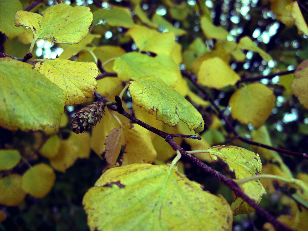
Today, I had an interesting quandary. I shot a nice macro of a leaf on some snow for the blog. I was going to make the post about how nice it is to use a white surface that reflects light evenly back onto your subject, and using a polarizer to cut down on snow-induced glare. But when I was post-processing, I couldn't decide which way I liked the photo better. So I've uploaded both possibilities, and I'm hoping you guys can decide for me.

click to enlarge, or see it on Flickr
I like this one because it's out of the ordinary: despite being a winter shot in the middle of December, it has a kind of happy, almost "summer"-y feel to it. I think this is because of the lighting.
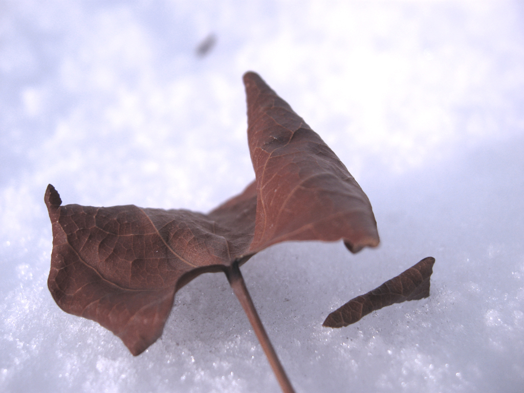
click to enlarge, or see it on Flickr
On the other hand, I like this one because it goes with the flow a little better as far as taking the feeling the shot presented to me, and emphasizing that, rather than going against it.
What say you?
High Dynamic Range, or HDR photography is an attempt to make a photograph appear more like it does to your natural eye. Your eyes are able to simultaneously see the detail in the clouds of a bright sunny sky, and the texture of the underside of a rock in the shadow. Your camera's sensor is not. The idea then, is to take more than one exposure—one geared towards getting the details in the highlight areas of the frame, one at a "proper" exposure, and one geared towards getting the details of the shadows. That's a basic set-up, of course. Some HDRs take more exposures than three, some only take two, etc.
The unfortunate part of HDR is that it requires special software to do it quickly. It IS theoretically possible to merge more than one photo manually in Photoshop, but it's a whole lot of work, and the outcome usually isn't as good. I use Photomatix Pro.
Here is the result of my first ever attempt at HDR.
click to enlarge, or see it on Flickr
The verdict? Eh... it's okay. To be frank, I liked the results of the single "proper" exposure better. But the photo isn't composed very well. I was more concerned with getting source material for my hungry Photomatix Pro window. And honestly, I think this photo isn't a very good image for the HDR effect. Not very many shadows.
Oh, well. More to come, I hope. I've seen some pretty astounding HDRs, so if you have any good ones, link them in the comments.
For my photography class at the high school, I recently had to mat one of my photos. I had rarely even considered printing my photos, really, and was surprised at the result.
Even a photo that looks really nice on the screen looks 10 times better printed. The screen can't display the kind of resolution and detail that is really there. Especially for macro photography (my personal favorite), printing reveals details and beauty that, as far as I know, can't be seen in any other way.
I was pretty happy with this photo just seeing it on the screen. I know you've already seen it, and the detail on screen is great. But when I printed it, it looked insane. The details were as sharp and crisp as the real thing. Unfortunately, there's no way to show you how good it looked printed. You'll just have to try it yourself.
click to enlarge, or see it on Flickr
So experiment with printing some of your photos. If you have a nice color printer at home, buy a ream of high-quality paper and print them yourself. Otherwise, head over to the nearest Costco—their prints are ridiculously inexpensive, and process quickly.
One of the blogs I follow is the Digital Photography School (or DPS). I've never really bumped them before, although they've been on my links for some time.
Anyway, they have a photography challenge every weekend. The theme this time around is self-portraits in the mirror. Now, if you're like me, the first thing you thought of after hearing that was, "Crap. The world is being taken over my MySpace pictures." But after a few examples, I was converted. It IS possible to do creative photography using mirrored surfaces, even self-portraits. Just... try to avoid holding the camera on a 45 degree angle.
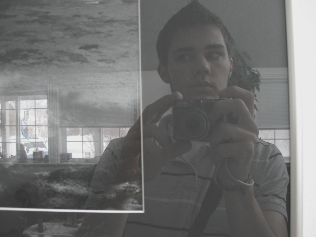
click to enlarge, or see it on Flickr
I discovered stereophotography a few years ago, before I was really into doing photography myself. It's exactly what you would think it is. Stereo = two. Two photographs.
The idea behind stereophotography is getting actual depth out of a photo. You have two eyes. The slight difference in viewing angle between your two eyes allows you to judge distance, or perceive depth. So if you take two images from a slightly different perspective, you should be able to view them with depth.
To view stereophotographs, cross your eyes. The two side-by-side images should become three images. The one in the middle is the one you want to carefully focus on. It's similar to viewing Magic Eye pages. If you do it right, the middle image will seemingly be in 3D. It makes you feel like you're AT the location, rather than looking at a photograph of the location. Here's one I tried to take of my living room last night.

click to enlarge, or see it on Flickr
This one was less of an actual photograph (really crappy composition, etc.) and more of an experiment to see if I could get the effect to work. It works. There's not a whole lot of depth in the shot to see, but the technique was successful. I'll definitely have more interesting stereo shots in the future. But here's one of my favorite stereophotographs of all time.
This month's photo has been chosen from Flickr user YM_Arki's photostream.
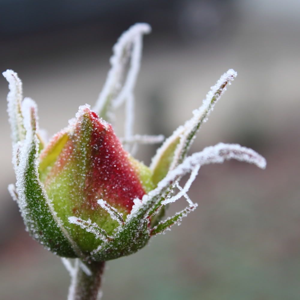
click to enlarge, or see it on Flickr
© Carol South
This beautifully executed macro of a frozen rosebud illustrates much of the overlooked beauty of winter. If you have time, be sure to head over and check out her photostream. There are tons of great shots in there.
For the past couple of weeks, I've been heading out to start and scrape my car so it could defrost in time for me to get to my early-morning class. Every morning, I've noticed the ice crystals on the windows, and told myself to get a macro shot. And every morning, I've decided against it because I was too cold and/or tired and/or late.
This morning, there was just a SLIGHT dusting of snow all over my windows and hood. It wasn't the normal frost, but it still looked cool. I turned on my headlights, which reflected off the garage door and back onto the snowflakes. Since I was already going to be late, I figured I might as well bite the bullet. And aside from that, the snowflakes looked great, even with the naked eye. I knew I wouldn't have a chance like this again anytime soon.
I went inside, put on my macro lens, and attached my gorilla pod. Then back outside, I put up the tripod on my hood, got all my exposure settings in order, and was preparing to push the shutter release, when... dead batteries. Mother Nature has a cruel sense of irony. I went back inside, switched out my batteries, and repeated those last steps. When I work with macro and a gorilla pod, I set the timer to wait 8 seconds (to allow for the gorilla pod to stop shaking), and shoot 3 exposures, in case something gets bumped, a gust of wind comes up, etc.
This entire episode took place in 1.3 degrees Fahrenheit. The shutter speed was 8 seconds, since I refused to compromise on ISO. Each shot took another 8 seconds to process. So all in all, about a minute of standing around, waiting for timers and exposures, in the 1.3 degree Utah morning at 6:30.
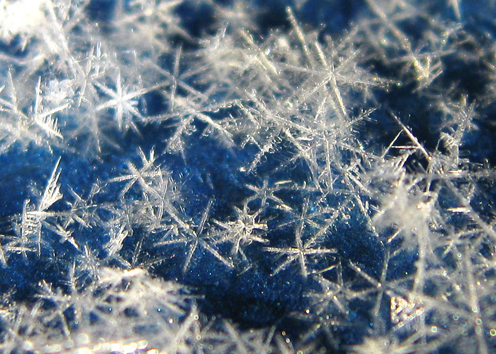
click to enlarge, or see it on Flickr
Turns out, sometimes it's worth the extra effort (give or take a few frostbitten fingers).
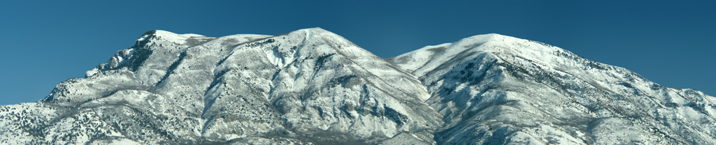
Panoramas are all about capturing more than you can fit into a single shot. For instance, here in Utah, I have a lovely view of the Wasatch mountain range, even just from my house. But even if there was a 0mm lens, it wouldn't be wide enough to capture the whole thing at once. So I decided to create a panorama of it (using my new tripod and telephoto lens).
Basically, you shoot as many overlapping images as it takes to cover the area you want. I then turn over my batch to Photoshop CS, which does quite a good job of stitching them together. Once you have a single image, you can then go on to do color corrections, etc. Here's the finished result of my first ever panorama:

click to enlarge, or see it on Flickr
I mostly did this as an exercise to help me learn what to do and what not to do while shooting; I realize I could have found a FAR better vantage point so as to avoid having random tops of houses and trees in the shot. Also, I apologize for the relatively low resolution. The full-res file is approximately 92 megabytes, which would use up all of my remaining upload space for December on Flickr.
Next time I post about panoramas, I'll include a specific tutorial on how I create mine. But if you already have some sitting on your harddrive, feel free to post links!
One cool thing my family does is sort of an early Christmas. We like to get the gifts mostly done before the 25th, so we can focus on that day more as a religious holiday. Needless to say, early Christmas presents is a win for me. This year, my wishlist was composed almost exclusively of photography gear. I got:
-A new tripod (heavy duty, 6'3" max, fluid head)
-My own gorilla pod (now I don't have to use my brother's)
-A telephoto lens (2.2x magnification, which brings my total possible to 8.8x... not bad at all)
-A UV filter and a circular polarizer
-A camera bag which holds all my stuff
Boo-yah!
And because I feel obligated to have a picture every post, here's a nice depth of field shot of a keyboard.

click to enlarge, or see it on Flickr
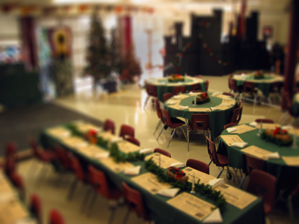
For most pictures, accurate color representation is what you're after. I usually just stick with my AWB (auto white-balance) setting; it does a good job. Other times, a preset is nice (indoor shooting w/o flash calls for the Incandescent Bulb setting). But for some photos, you can really change the feel of the photo by using what would technically be the "wrong" setting.
Here's an example of a shot I took indoors with no flash. It was during the set-up process of a Christmas dinner/play that my school does (which I take part in). Because we were still setting up, the windows weren't yet covered, which was letting in a lot of blue light from outside. I wanted this shot to be more cozy and feel like the holidays, however, so I used the "Cloudy" preset. This preset adds warmth to your colors, as cloudy light tends to be blue and cool.
click to enlarge, or see it on Flickr
I like how it turned out—warmer than the light in there really was, but it captured the feeling I was after.
Try fiddling around with your white balance from time to time. A lot of cameras these days have a manual setting (mine included) which can make for some very interesting colors if you "set" it with some other color besides white. Post links in the comments!
I've always loved macro photography. Since my tripod recently gave up the ghost, I've had an opportunity to be using a small gorilla pod. This forced me to take macro shots almost exclusively for the past week or so. I've done a few non-macros, but not nearly as many as usual. With the weather getting colder down here, I've been trying out indoor macro recently, too. One of my favorite images to date is this one of my keys.
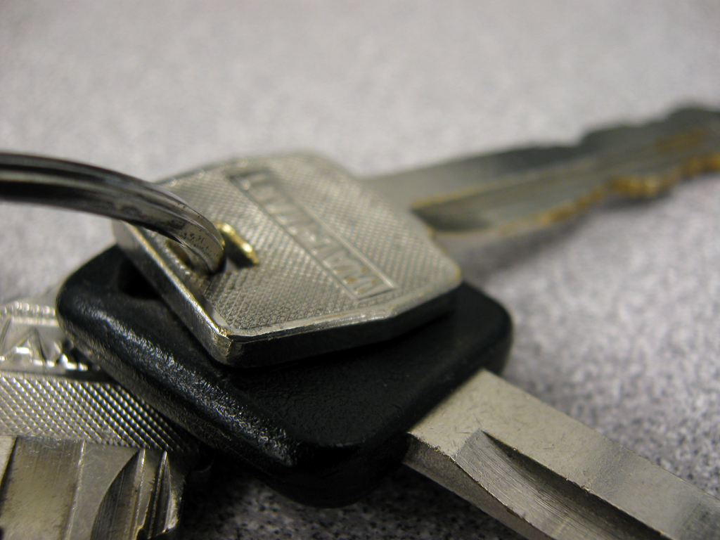
click to enlarge, or see it on Flickr
The expanded view offers a nice look at how dinged up the keys are from use, but the really cool thing for me was looking at it in full resolution (8 megapixels). Obviously I couldn't view the whole image on my monitor at once, but the clarity I got (thank you, solid gorilla pod) was extremely interesting up close. I had no idea there were so many micro scratches all over everything that I couldn't see with my naked eye... or that didn't look very interesting with my naked eye anyway.
So I'll challenge my readers to shoot some macro images of everyday objects, and take a closer look—you might be surprised at what you find. Share your photos in the comments!
I've been experimenting with tilt-shift more and more lately, and I've learned a couple of new things.
click to enlarge, or see it on Flickr
First of all, you don't need to have a picture of a massive landscape. It just can't be a close-up picture of a single subject; there need to be some "background" type elements present to provide perspective and feel to the photo, or the tilt-shift effect won't really work.
Second, you can use a radial gradient rather than a reflected or cylindrical gradient. It all just depends on what you want the photo to look like in the end. Different gradients work better for different photos.
This isn't a particularly spectacular tilt-shift, but I like how it looks, and it was a good exercise. Feel free to post more links to your own tilt-shift work in the comments!
I'm taking a digital photography class right now at my school. In fact, I'm sitting in that class right now. It's easy enough that I tend to have a lot of free time. Anyway, what I was getting at is that one of our assignments was to take a macro shot of something from an interesting perspective, such that people would have to guess what the subject was. Since I love doing macro photography, I enjoyed this challenge. Here's my result. Can you tell what it is?
click to enlarge, or see it on Flickr
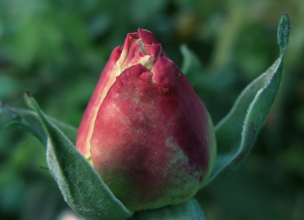
Remember the rose from this post? I figured since it wasn't as sharp as I generally like my macro photos to be, it would be a good one to try the Orton Effect on. I'm very happy with the results.
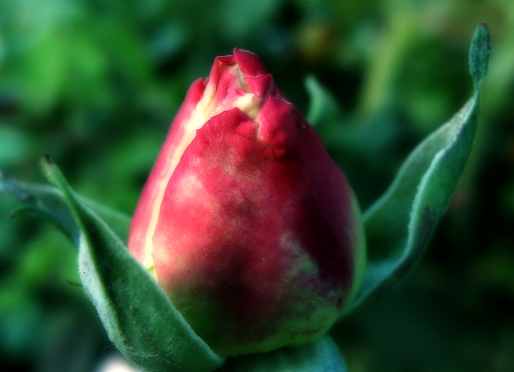
click to enlarge, or see it on Flickr
I've refined my Orton technique somewhat since my last post. Here's the process I used for this photo:
1. Finish any pre-Orton Effect editing you want to do (color corrections, curves, cropping, etc.)
2. Duplicate the Background layer. Name this layer "Screen."
3. Change the blending mode of the "Screen" layer to, you guessed it, "Screen."
4. Merge the two layers again. It should look overexposed—don't worry, this is not a mistake.
5. Duplicate the Background layer again. Name this layer "Blur."
6. Apply a Gaussian blur to the "Blur" layer. It should be strong enough to erase the details without erasing the general shape. This is one step where you can have some artistic license--more blur will result in a more impressionistic image.
7. Change the blending mode of the "Blur" layer to "Multiply."
8. Flatten your image.
9. Go back and re-adjust brightness and contrast as desired.
Again, this is a pretty subjective effect—one person might love what another person hates. So play around with layer opacity, blending modes, etc. I'd love to see your results in the comments!
Yet another weapon I have added to my arsenal of "tools to make kind of boring shots more interesting" is called the Orton Effect, named after photographer Michael Orton. Apparently, it was originally done with film cameras, using two images exposed on slide film—one overexposed by two stops, and one overexposed by one shot, and out of focus.
Luckily, everything is easier with digital cameras. This is the first post I've done about the Orton Effect, and I'm not super experienced with it, so I'll hold off a step-by-step tutorial until I've found a good general recipe. Essentially, you duplicate your image into a new layer, and apply a Gaussian blur, eventually merging them back together. That's the rundown; obviously there are a lot of tweaks and stuff you can use to get each image "right."
click to enlarge, or see it on Flickr
I didn't want to overdo it in the above photo, so the effect isn't super strong. But hopefully, there's a pretty noticeable impressionistic vibe. My original photo was rather underexposed, and quite frankly, just not a very good photo. I had to do a lot of playing around in Photoshop to make it look any good at all. The Orton Effect improved it, but it's still not great. I guess what I'm trying to say is, if you want a more accurate idea of what the Orton Effect looks like, Google it—this isn't a very good example.
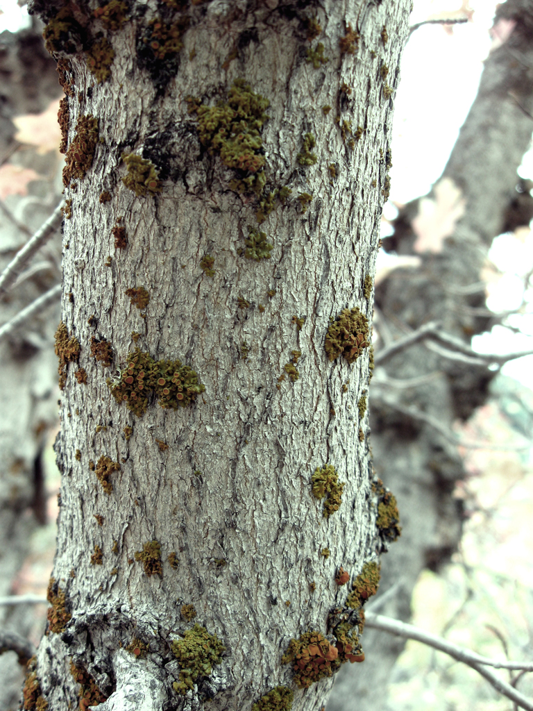
Textures are a great way to add a feel to a photo. They can take a relatively average photo and turn it into a great one. Here's a fairly boring picture I took today. It's a macro (just the camera's built-in setting though, I didn't have my macro lens attached) shot of some torn up bark. Because of the angle of the sun, it's quite contrasty, which I felt could be augmented by texturing a bit.
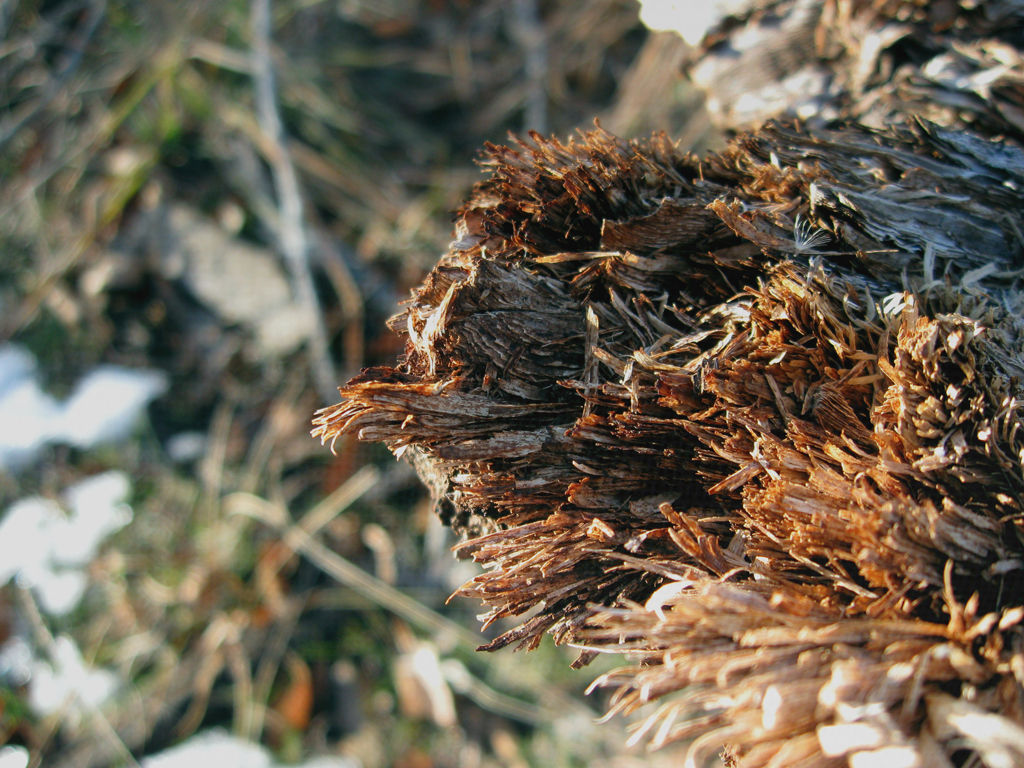
click to enlarge, or see it on Flickr
To utilize a texture, you must first have a texture. I would recommend doing what I did: spending about an hour wandering around somewhere, taking all the textures you can. I came up with quite the collection at the school. Good textures are everywhere. To expose a nice texture, you want it to be fairly uniform, and frame-filling, as well as uniformly lit. Generally, a nice neutral color is also desirable, although that depends on your taste. Also, you obviously can't use a texture taken with an 8 megapixel camera on an uncropped image taken by a 12 megapixel camera. So if you upgrade cameras... go on another texture rampage.
With a wide selection of textures at my disposal, I chose a very close-up shot of some linen. The fibers were individually visible. Here's how to apply the texture:
1. Finish any color corrections, cropping, etc. you want done on your image.
2. Open the texture file.
3. Copy it and paste it into a new layer over your image.
4. Size it to fit your image if it doesn't already.
5. Change the blending mode of the texture layer to "Overlay," "Multiply," etc. Whichever gives an effect you like for that image. For the above image, I used "Soft Light."
6. Play with the opacity. This is definitely a matter of personal preference. Mine is set to 60% in the above image.
7. Use a large, soft, low-opacity eraser to tone down any areas you think are a little overdone. I knocked some of the opacity off of the areas that were out of my depth of field (and therefore blurry) because they showed the texture a little too much.
8. Layer>Flatten Image
Have some good textured images? Post links in the comments.
I went to a football game yesterday, and got some pretty cool stadium shots. First of all, let me just say that I'm extremely impressed with the Image Stabilization technology on my PowerShot A590. I was at 4x optical zoom, shivering with cold, and without even a monopod, shooting with a shutter speed of about 1/25th. My results were still this clear.
Anyway, turns out stadiums are perfect fodder for applying fake tilt-shift. I like my New York shot better from a purely photographic standpoint, but as far as faking the tilt-shift effect, this picture turned out quite a bit better.
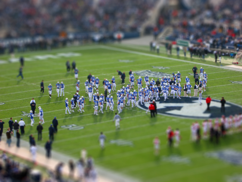
click to enlarge, or see it on Flickr
This photo is slightly too busy to view in such a small size, so I highly recommend the larger view.
Anyway, I decided to go ahead and give a quick-and-dirty tutorial on how to fake tilt-shift in Photoshop.
1. Get an appropriate photo. Big shots taken from high up of large amounts of landscape tend to work best, as they are cool to see in "miniature."
2. Do any cropping or editing you wanted to do before you apply the tilt-shift effect. I would recommend leaving the color corrections out; as that is changed while applying the effect anyway.
3. Go to Quick-Mask mode.
4. Select the reflected (cylindrical) gradient tool.
5. Make sure your foreground and background colors are set to default (black and white).
6. Click and drag, starting from where you want the in-focus part to be, out to the edge of the photo. Follow the natural "line" of the photo. In most cases, this line should be pretty close to vertical. In the above photo, I tilted it a bit to the left. In any case, once you're done, you should see a red gradient covering your photo
7. Get out of Quick-Mask mode. This converts your gradient to a selection.
8. Apply a Filter>Blur>Lens Blur with whatever setting you feel appropriate. I think mine was set to about 90% strength. If you have an earlier version of Photoshop, a Gaussian blur will do (you just won't get that kind of "bokeh" look). This blur simulates a very narrow depth of field which your brain associates with macro photography. It's what tricks your eyes into thinking the shot is of a miniature.
9. If you don't like the way the blur turned out, undo it and try again. Otherwise, boost the saturation on your image by quite a bit. This makes the subject(s) look plastic-y, and contributes to the "scale model" feel. Do the same with contrast. If you have "toys" in mind as your desired result, you shouldn't have a problem finding the right saturation and contrast.
Congratulations! I would love to see some of the tilt-shifts you guys make. They're a lot of fun. Post links in the comments.
I have a very cute cousin. She is extremely difficult to capture indoors, because she doesn't like to stay in one place for more than a second or two. This is compounded by the fact that I don't have a DSLR. My widest aperture is 2.6, and I can't go above 400 ISO without getting into the range of unbearable grain. So basically I was stuck with 1/25ish shutter speeds. After several action shot attempts, I gave up and asked her to just pose for a second. Luckily, she complied.

click to enlarge, or see it on Flickr
Despite my best efforts, it's still a bit blurry. The background is super distracting, and the composition is iffy. But I'm kind of a portrait noob, so improvements will come, all in good time.
I just realized how similar this post is to Gallow's latest. I promise I took this before I saw your new one.
Vignettes come in two flavors: real and fake. Real vignettes happen when a part of your lens blocks the imaging sensor in the corners, and in extreme cases, the edges, from being exposed. Fake vignettes happen when you wish there was a real vignette, but there's not. Just Photoshop.
Vignettes are nice because they draw your eye naturally to the center of the image. The biggest thing to remember with vignettes is that they can be easily overdone. A little goes a long way. Here's how I do them in Photoshop:
1. Do all edits on your image you want done. Vignetting comes last. For the image in this post, I did some minor rotating and cropping, and added a very subtle texture.
2. Make a new layer. Name it "Vignette."
3. Fill the Vignette layer with white.
4. Set the Vignette layer's blending style to "Multiply."
5. Use the elliptical marquee tool to select the area you want vignetted. I usually start dragging from one corner to the opposite to insure I get a symmetrical selection, then Select>Modify>Expand as desired.
6. Invert the selection.
7. Fill the new selection with black.
8. Filter>Gaussian Blur. I use 250 pixels (maximum).
9. Dial down the Opacity of the Vignette layer. I used 50%.
10. Flatten your image. Voila!

click to enlarge, or see it on Flickr
Let's see it: post links to your well-vignetted images in the comments.
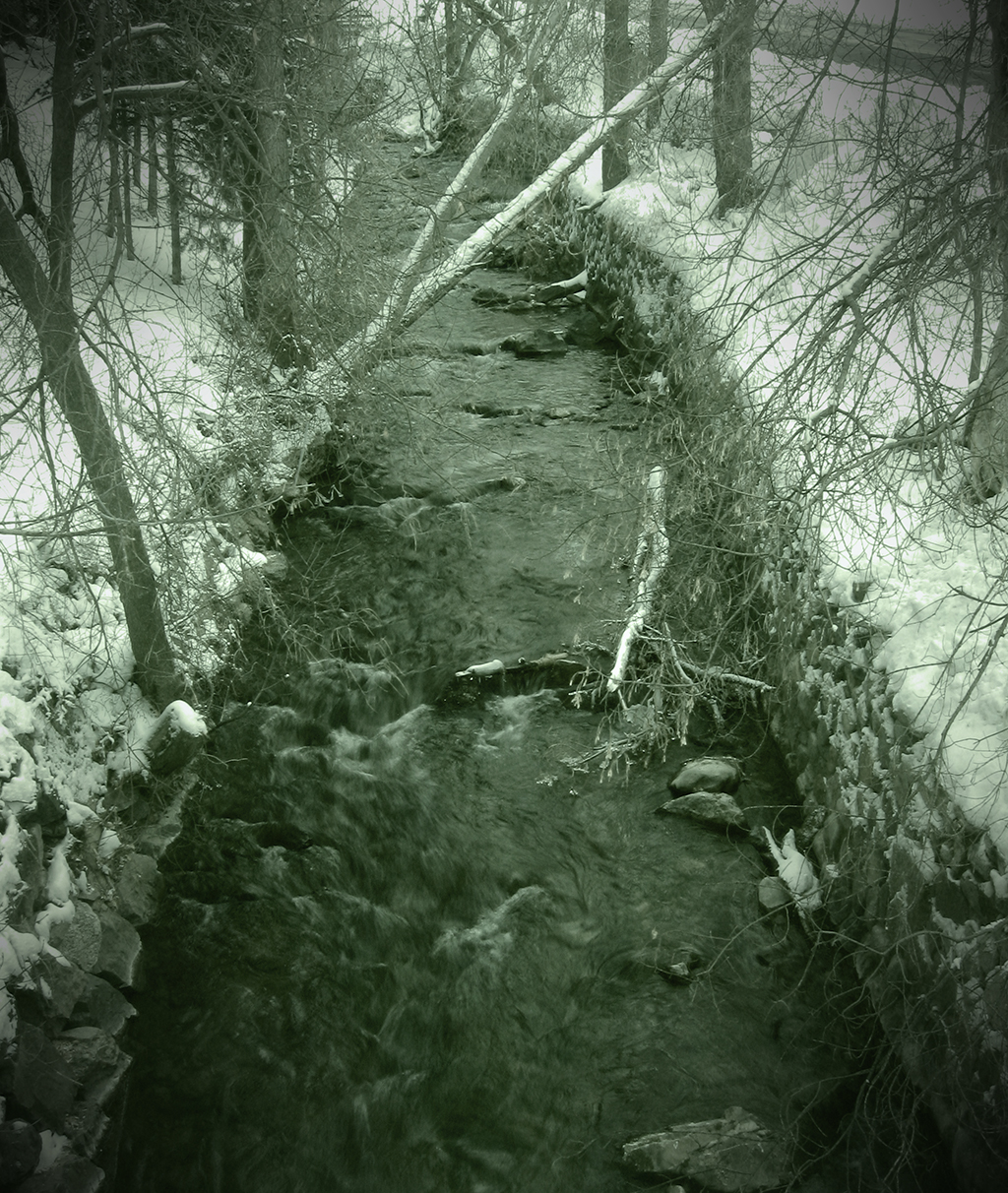
I went out specifically looking for ice to take pictures of yesterday. Lo and behold, I found some fantastic ice. Unfortunately, I was having trouble getting a good photo out of it. The stream I found was only partially frozen, which made for some very interesting ice structures, but also for some very difficult photography. I tried to get down on the level of the ice, but even with a gorilla pod flat out, I had to sacrifice some comfort (in the form of warm, dry knees) to see my LCD display and get the shot in focus. The worst part was that it didn't even turn out particularly good. So I didn't classify any of my exposures from that viewpoint as "keepers" and finalize them.
So I'm asking for not only a critique of what could be done to make this photo better (it's my best photo from the shoot, but it's not particularly great), but what I can do to get better pictures of the ice in general. I know the interest of the subject is there; it's just presenting a unique challenge as far as how to photograph it. Suggestions?
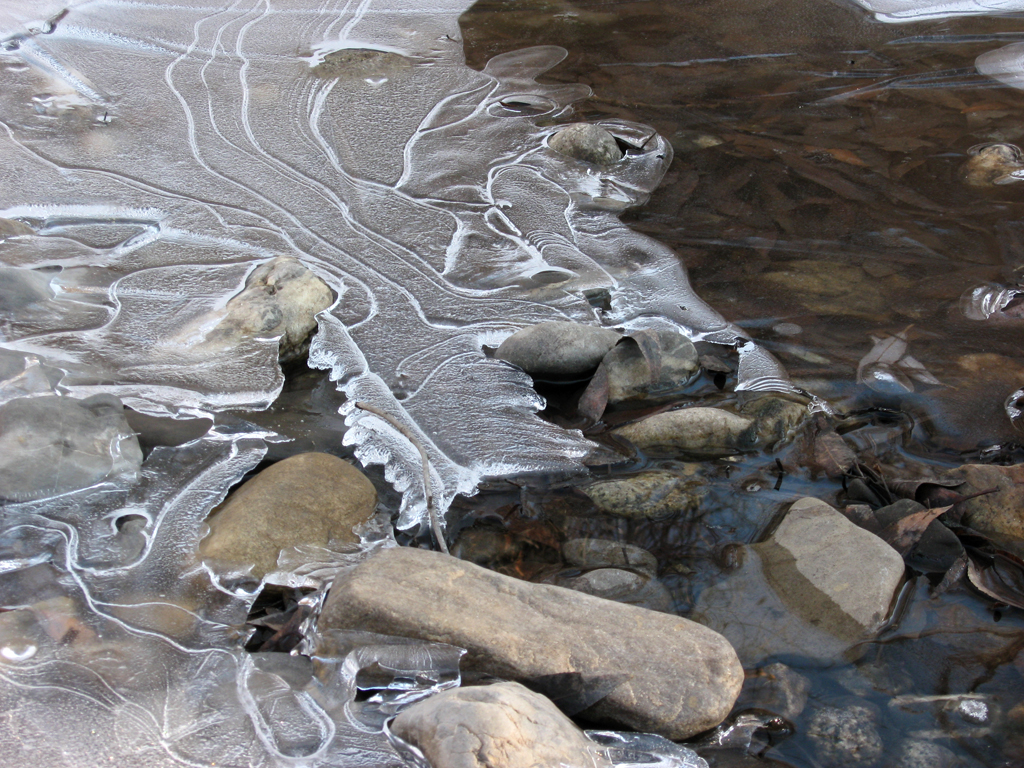
click to enlarge, or see it on Flickr
P.S. Happy Thanksgiving everyone!
We don't always get the chance to shoot at an unusual subject. In fact, the great majority of my pictures are of pretty average subjects. The challenge is in making an average subject into a great photo. One way to help accomplish this is mixing up your point of view.
Do something creative. Don't take a picture of flowers from above, take it from below. One way to help you come up with ideas for more interesting points of view is deciding on some other object to "be," rather than a guy holding a camera. How would a bug sitting on the top of a blade of grass see that fence in the distance? How would a child see that statue?
click to enlarge, or see it on Flickr
I don't have any specific idea of who's point of view this is, but it added some interest to an otherwise pretty boring subject. Aside from the slightly too high saturation, and more than slightly too high contrast (both mistakes I used to make a lot), I like this photo.
As always, I invite you to post links to any photos with an interesting point of view in the comments. Happy shooting!
Here, as promised, is my awesome planned light-painting shot. To heighten the suspense, I'll put my process before I post the photo.
As I stated before (I think), my maximum shutter speed is only 15 seconds. So for a project of this magnitude, I substituted sheer manpower in place of a bulb setting. For the center subject, I had two "painters" with lighters. For the left subject, there was one painter, and for the right subject, I ran over and started painting after firing the flash. Also, one painter was laying on the ground firing the laser everywhere. If you look carefully, the ambient light outlined his legs somewhat, as well as the faces of the two center subject painters.
Step 1: Pose three subjects.
Step 2: Herd painters out of the frame, and tell them to close their eyes to avoid temporary flash-induced blindness (which wastes precious seconds of exposure).
Step 3: Close eyes, open shutter, fire flash.
Step 4: Open eyes, shout "go" to painters.
Step 5: Painters and I sumble forwards in the pitch black darkness, trying not to step on feet, drums, or people.
Step 6: Use remaining 12 seconds or so to simultaneously paint instruments in thin air.
Step 7: Crowd around the LCD screen on the tripod to see the photo (after about 10 seconds of processing).
Step 8: Combine best elements from each exposure into one image in Photoshop.
Step 9: Try fruitlessly to eliminate noise from shooting at 800 ISO; long for a DSLR with a larger imaging sensor.
Step 10: Flickr. Blog.
Here it is, in all its glory:
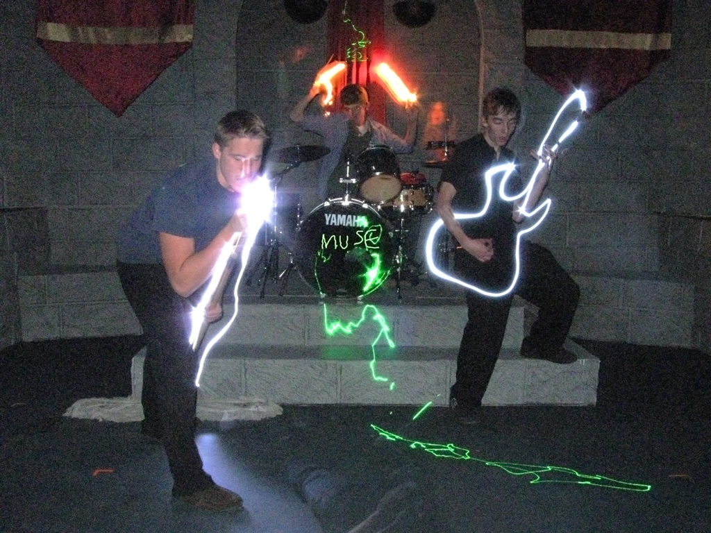
click to enlarge, or see it on Flickr
Got any good light paintings? Post links in the comments!
Recently, I've taken to carrying my camera gear with me wherever I go. Since "wherever I go" these days means either on a photography shoot (where having camera gear is generally a good idea), or school, it hasn't been much of a hassle. And today was one of the times it was nice to have a camera available for a sudden photo opportunity.
click to enlarge, or see it on Flickr
As is my custom, I took several exposures with various compositions and whatnot. This shotgun approach generally guarantees me at least one keeper if the subject is good enough. Strangely enough, when I got the pictures onto the computer, the best one was the first one. That's never happened to me before, but I guess there's a first time for everything.
Let me tell you two contrasting stories—my (to date) two serious attempts at animal photography.
Once upon a time, I tried to take some pictures of my cat. He wandered all around everywhere, wouldn't hold still, and seemed to be purposefully ruining my lighting with every tiny movement.
Once upon a time, I was on my way to a little creek area near my house. I stopped at a neighbor's enclosure where they keep goats. The goats were the perfect subjects. They seemed genuinely interested in my photography efforts.

click to enlarge, or see it on Flickr
Although the photo turned out slightly overexposed near the top, the subject and lighting couldn't have been better. I shot with my white balance set to "cloudy," and my flash's dimmest setting to fill in the faces a bit. Lovely. Thank you, goats!
One photography technique I feel is overlooked is light painting. For those of you who don't know what light painting is, allow me to fill you in (photography pun alert). Light painting is accomplished by shooting in (ideally) a pitch black room. You set your camera's focus with the lights on and your subject in place, then turn the lights off. Your subject poses, and you begin a long exposure, starting with a flash. The flash captures the pose of your subject, and then someone (usually the subject) spends the rest of the exposure time with a lighter, LED, flashlight, or some such device, painting in the air. You can write words, draw pictures, etc.
I was with a few friends tonight, and we were starting to get really creative with our ideas. One friend suggested that we try posing him in a "scared" position, fire the flash, and then have another person step into the frame. We then drew lines all over BEHIND the second subject, outlining him like an ominous ghost. Here's the result:

click to enlarge, or see it on Flickr
This image has been rather heavily processed (darkened a bit, lowered the contrast, and removed most of the color). Pretty cool. An interesting lesson I learned from this is that even something you would think was a mistake can make a shot better. In the last two seconds or so of exposure, someone opened the door (to the left and behind), letting in light from the outside. I thought this would wash out the shot, but it only gave a little light to my background and subject, and cast a better shadow of the second subject.
The second subject had a great light-painting idea on our way out of the building. I won't tell you what, but when we take the image, I'll be sure to do a post about it. If we bring it off, it will be awesome in epic proportions.
Go out there and start painting! Link to your good images in the comments.
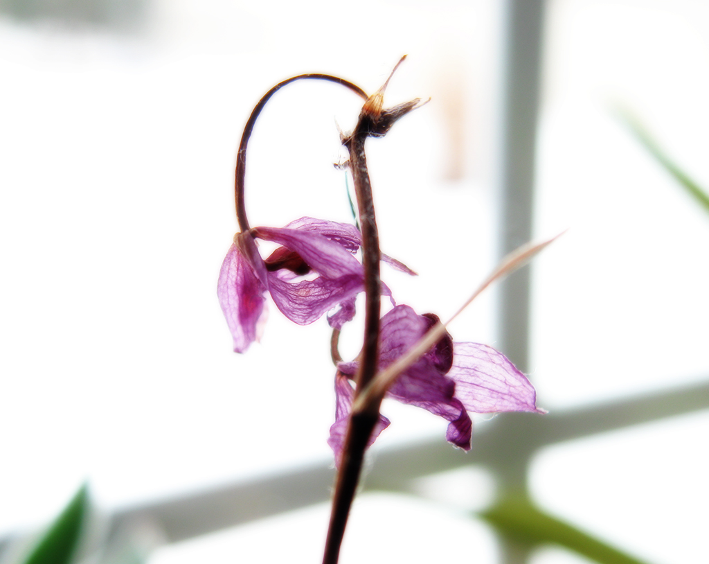
A couple of posts ago, I spent the whole time whining about wind interfering with my macro shots. So I decided to do something about it - we have some plants growing inside, and one had some nice flowers.
Even on the best of days, delicate macro subjects will be moved by minor air currents. Not much... but enough to spoil a shot. However, when I tried shooting indoors, this problem was eliminated entirely.
click to enlarge, or see it on Flickr
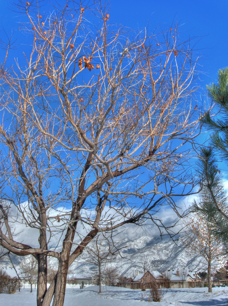
Trees are a pretty "standard" subject for nature photography. But what draws the line between an amateur picture of a tree, and an eye-grabbing, awesome picture? Here are some techniques to add interest to your tree photos.
1 - Don't just photograph the tree. Even if it's a really cool-looking tree, just taking regular lighting, slapping it in the frame, and hitting your shutter release is a recipe for a boring picture 99% of the time. Find what interests you about the tree (the shape, the color, etc.), and find a way to focus on that!
2 - Play with the lighting. When used carefully, side lighting can make for some really nice shots. It's especially effective if you're trying to emphasize the texture of the bark (or any texture, really). A nice silhouette with a dramatic sunset in the background can work wonders if the tree is particularly nicely shaped. Experiment.
3 - Get in closer. Something about how I'm hardwired makes me automatically want to try and find a way to fit the entire tree in the frame. Often, however, your picture will turn out better if you zero in on a specific aspect of the tree.
click to enlarge, or see it on Flickr
This photo was taken in open-shade lighting, which gave me a nice balanced look between texture and harsh shadows. The texture looks good because I'm pretty close to the tree, but the real focus of this shot is the odd lichen/moss growths on the trunk. From further back, it's hardly noticeable, and this tree looks boring. But once you get in closer, details like this tend to jump out.
Have some examples of good tree photos? Post a link in the comments!
All macro photographers face a common enemy: moving air. The misconception I had about macro photography is that since I wanted a smaller depth of field, I'd be at a wider aperture, and thus a faster shutter speed. Ideally, I thought, this would minimize any blur from minor movements. Reality quickly gave me a wake-up call on that. Since I prefer shooting macro in cloudy and diffuse lighting, that knocks me down about a stop. I also want my macro shots to have as little noise as possible, which means I'm shooting at the lowest ISO I have (currently 80). In general, this gives me an average shutter speed of about 1/50. Not overly slow, especially with a tripod, etc., but slow enough for minor movements to slip in and blur my shot.
To compensate, I usually take a minimum of three exposures (more if it's windier) in the hopes that at least one will have caught the subject in a moment of stillness. But this method isn't failsafe. Here's a photo I took about five times. This was the best of the batch, and even after my best efforts and careful sharpening, the results are somewhat disappointingly blurry.
click to enlarge, or see it on Flickr
Overall, not a bad photo. Just another casualty in the war between macro photographers and wind.
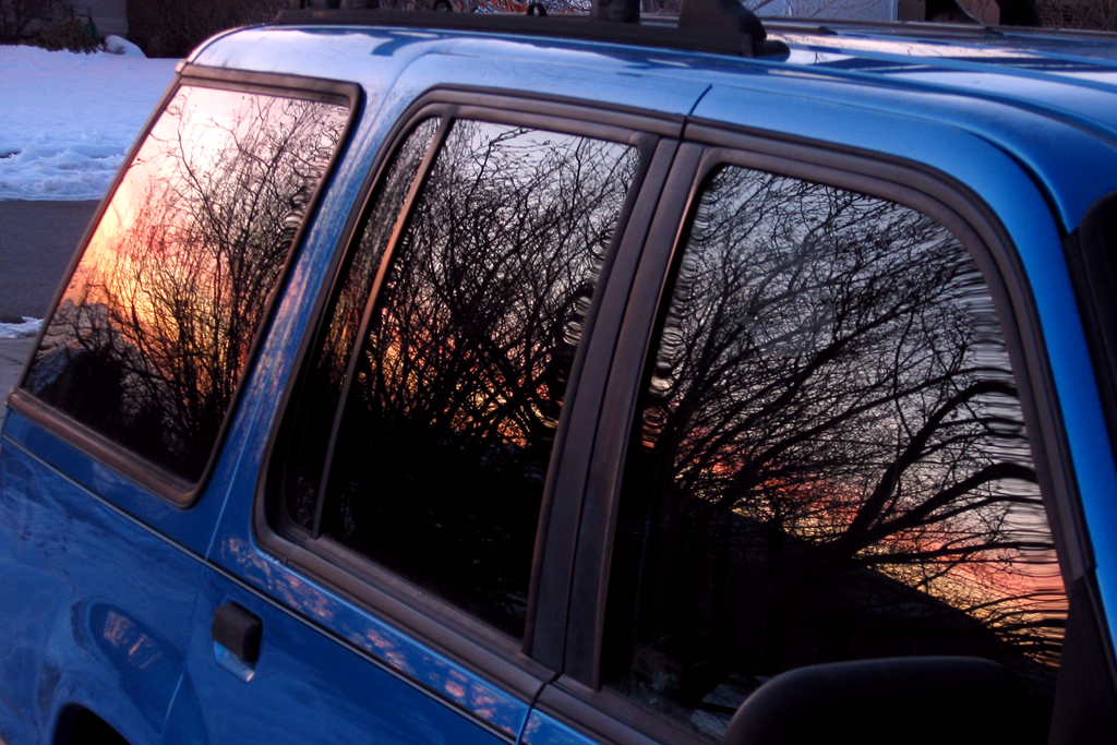
Sometimes, reflections can seriously hinder your photography (like when you're trying to shoot through a window and it's darker on the other side). But more often, reflections can provide a beautiful sense of symmetry.
When used correctly, a reflection will make your photo much more dynamic. Water in particular seems to reflect things beautifully, especially colors, but that's not the only thing. Reflecting things off of a curved mirror makes your subject more interesting, and catching a glare off of a shiny car window or something adds interest. Try experimenting with different effects you can achieve with reflections. Post links to any good images in the comments!
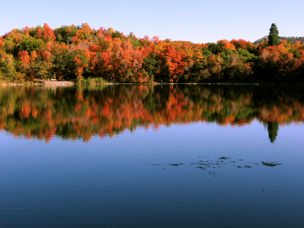
click to enlarge, or see it on Flickr
There are very few pictures that look better in black and white. I don't know if it's purely a matter of opinion or not, but most photos just look better in color. I can't tell you specifically what type of image looks better desaturated. Perhaps only images that are so tranquil that having loud colors would distract from the feeling? I don't know.In any case, here's one of the only pictures I've ever taken that I preferred in black and white.
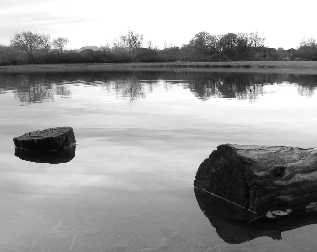
click to enlarge, or see it on Flickr
Seen (or taken) any great B&W shots? Post a link in the comments!
First off, I apologize for not getting a post out yesterday. I wasn't home much.
Anyway, every month, I do a featured photo that someone other than me took. November's shot has been chosen from Flickr user kw~ny's Photostream.
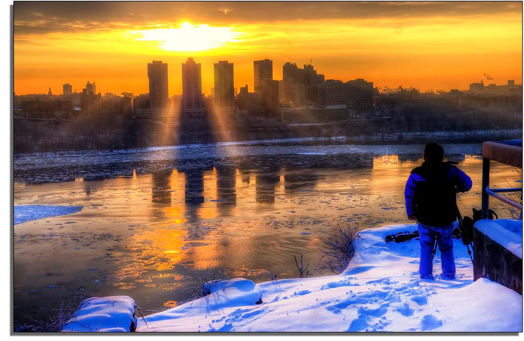
click to enlarge, or see it on Flickr
© Kevin Woods
This gorgeous shot of Manhattan literally leaves me lost for words. Well done, kw~ny. I would recommend that anyone reading this go over to Flickr and check out his Photostream. He's got tons of other fantastic shots in there.

