
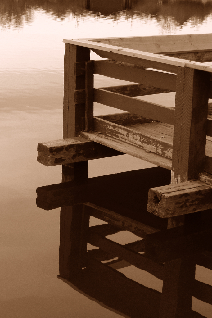
As I've said before, I think that the majority of pictures should be left in their original color. But this small lake provided a unique challenge: the colors were super dull and boring. Quite frankly, it's a disgusting lake. There's an unbelieveable amount of garbage in it, including an ATV that someone tried to drive out into the middle while it was frozen over a few years ago. This crappy color made for a good opportunity to try out some monochrome effects. The B&W picture in the linked post above turned out good, so I tried a sepia on this. I don't really have a philosophy on sepia tone except that it's overused, so this is the only image I've ever done in sepia.
click to enlarge, or see it on Flickr
I'm specifically looking for feedback here. Is the color of the sepia wrong? Is this picture not even good in sepia? I know the vertical alignment is off, so I'll fix that if I ever print this. Anyone who knows anything about sepia, feel free to help me out here.
If you have good sepia tone photos, feel free to post links in the comments.

I'm on the fence about sepia. Sometimes I like it, and sometimes it's overused, as you said. Sometimes I feel railroaded into using it; for instance, it may be a case of low lighting, or an instance where light is flat because of rain; and sometimes in PP changing to a monochromatic color space works. In your case - I love this photograph; great composition, nice reflection, a serene feel... I think I would prefer to see this photo in b/w rather than sepia. But I can also see that there was probably not a lot of color in the original to begin with; so perhaps you are forced into going with sepia or grey tones. I don't DISLIKE sepia, in some cases it works. In your case, keeping it in sepia might work really well if you add another texture or some graininess to the overall photo - to make it seem like an "old" photograph. I think that would look pretty cool. I use Adobe Lightroom which really gives you alot of options for monochromes and sepias.
ReplyDeletehttp://arkilander.blogspot.com/2009/12/december-12-2009.html
This post was from last week on my blog, and another example of being forced into using the sepia, because of low light, lack of sharpness and focus on the people, not to mention the old-fashioned theme of the Dickens carolers, I thought this photo worked with sepia tones.
Me again - something else I thought I should add. I don't know if you always make it a habit of shooting RAW; but if that is at all possible, you should. Converting to a monochromatic palate in PP translates much nicer in the RAW color space, and gives you much more control over your tones.
ReplyDeleteYolanda's right. Shoot with RAW if you can.
ReplyDeleteAbout the photo: Whatever color you choose, it depends on what emotion you want to show with the photo. Sometimes sepia works, but sometimes grayscale or black/white works, and sometimes the original works. It depends. :)