
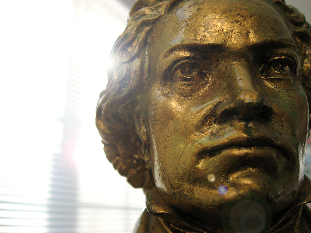
click to enlarge, or see it on Flickr
Aperture: f/2.6
Shutter Speed: 1/250
ISO: 80
Handheld
Decent. But I tried out the new method on it, this time casting it a slightly darker shade of gold, and using a less subtle bokeh texture, and a slightly harder vignette.
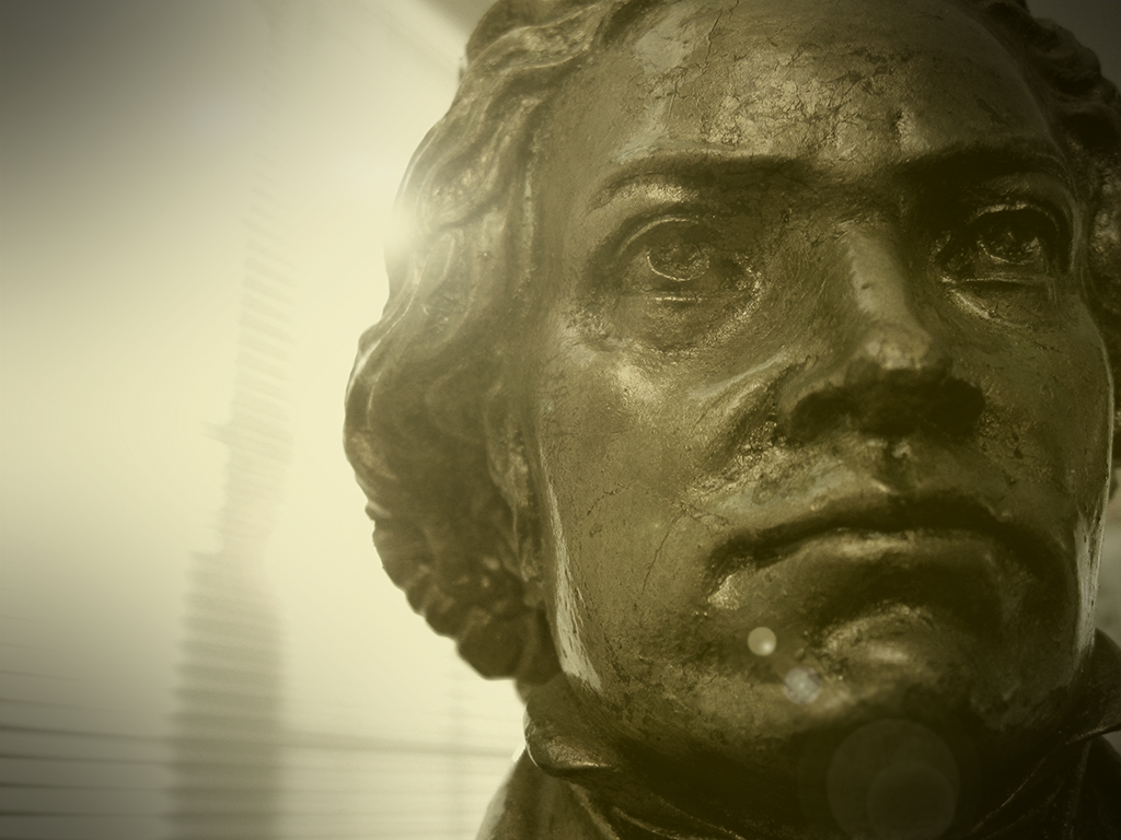
click to enlarge, or see it on Flickr
Every time I look at the two, I change my mind about which one I like better. On the one hand, the first one is definitely a more natural look. But the second one captures the feel of the photo more effectively in my eyes.
I like playing with this effect, but I don't like the idea of all my future photography being treated like this. I'm worried about crossing the already dubious line between "photography" and "post-processing art," if that makes any sense.
Help me untangle my thoughts here. First off, which do you like better? Second, why? Does this feel like homework? Sorry. I need your help.

Ah yes, the decisions. For me, I like the first one. I like the depth of the colors and the shadows on the face. It offers more dimension in my opinion. I like lens flare {shrugs} I think sometimes the lens flare adds to an image. And other times it can get in the way. I happen to like it in #1. NOW, there are things about #2 that I like as well.. I do like the soft bokeh, and the warmer light source - however the face is lacking the dimension that #1 has. I don't feel the vignette works in #2 - it seems to take away your subject, rather than drawing the eye in. Which brings me to the point of composition - for me, it's cut down the middle too much. I'm certainly not saying that we should NEVER break the rule of thirds, but in this case, it may work a little better if some of the left side were cropped out a tad, allowing your subject to dominate, rather than the window.
ReplyDeleteAgain, these are just thoughts - I like effects and elements about both images, but I am going with #1 :) (Yes, that felt like homework)... haha! I normally don't critique stuff, so don't take what I say as more than just a subjective opinion. Just remember my friend, that art IS very subjective, and you, and only you, as the artist must love what you produce. At the same time, I do understand the importance of feedback, advice, and approval of others, at it does help us to improve. Just don't let it steer your craft - keep doing what you are doing, I am a big fan of your work, and I enjoy reading your posts and learning!
Being extremely familiar with that bust of Ludwig (having received it 36 years ago), I have an expectation for what it should look like, and image #1 is the more faithful rendition (and, thus, is the one I prefer). However, as Yolanda points out, art doesn't have to be a faithful rendition of reality.
ReplyDeleteSo, perhaps a better answer to Andrew's question would be more questions: What were you trying to say [with this photograph]? and, then, which of the two images came closest to making your intended statement?