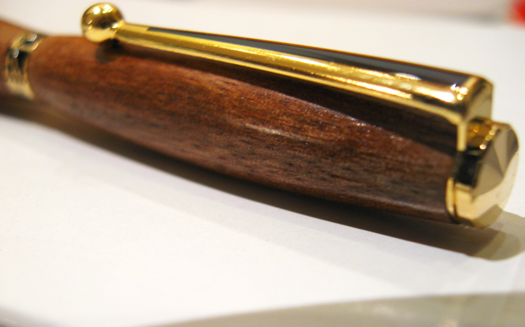
click to enlarge, or see it on Flickr
As far as straight-up photographic value goes, I don't like this one as much. It's rather out of focus in what I consider to be an important area of the photo. But the lighting is nice, and an unsharp mask in Photoshop helped a little.


No comments:
Post a Comment
Like what you see? Have a question? Leave me a comment!