A few days ago, I was taking macros of an amaryllis on the windowsill. Then I went outside to play with my new monopod. I didn't stay out long; maybe 5-7 minutes. When I came back in, the amaryllis had done a full 180° turn to face the sun.
Today, I decided to try and time-lapse it. I set up my tripod, got everything in order, and waited for the sunrise to begin. It started getting slightly lighter, so I started shooting at 1 photo per 8 seconds. Long story short, it was too cloudy for the sun to be seen at all, so the amaryllis pretty much stayed put. Even the slight movement you can see through the movie is due to heater vents blowing on it. I couldn't cover them well enough to prevent all movement.
Today's post is early because I'm going to be gone all day. The district honor choir of which I'm a part is performing Mozart's Requiem in Provo today, under the direction of Mack Wilberg! Yesterday I had a 7-hour rehearsal with him, and I'm leaving to an all-day rehearsal in about 10 minutes.
Yesterday when I was doing indoor macros, I got this shot, too. Not as satisfying, but it's one of the better indoor macros I've done.
click to enlarge, or see it on Flickr Aperture: f/2.6
Shutter Speed: 1/125
ISO: 80
Tripod
The flower area that I'm primarily interested in is sharply in focus. But the pollen is only somewhat in focus. This is, of course, a result of my f/2.6 aperture, but when I tried the same shot at wider apertures, I found I had the same problem. I discovered that the problem is actually my macro lens. It does great close-ups, but the widest depth-of-field I can get with it is roughly equivalent to f/2.8. So this may be another photo that requires two exposures with different focuses, and some careful masking in Photoshop, a la this post.
I feel like people are probably getting sick of bad attempts at stereo, kind of bad attempts at stereo, and guitars around here, so I decided to mix things up with a super creative nature macro.
click to enlarge, or see it on Flickr Aperture: f/2.6
Shutter Speed: 1/30
ISO: 80
Gorilla Pod, wrapped around a leg of my Tripod. Which is appropriate, if you think about it.
I actually like this photo a lot. The colors came out perfectly with no need for white-balance adjustments or added saturation. I'm learning to use the histogram more practically in my image optimization.
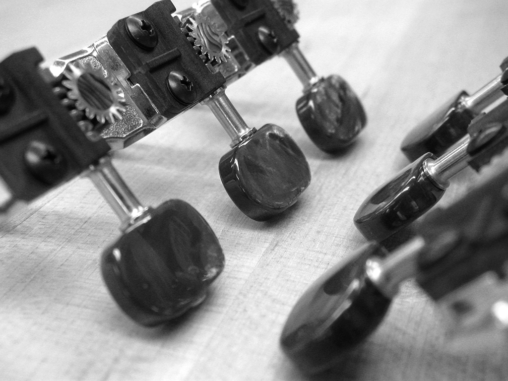
Yesterday as you know, I was in the woodshop working on my guitar. The guitar you saw hanging in yesterday's photo belongs to the guy who is letting me use his shop (and equipment... and sometimes wood... yeah). It's really close to being finished, and while I was there, he showed me the custom machine heads he had made for it. They are absolutely gorgeous. Luckily, I had my camera with me.
click to enlarge, or see it on Flickr Aperture: f/2.6
Shutter Speed: 1/40
ISO: 80
Gorilla Pod
These are 24k gold-plated nickel, with a 16:1 gear ratio (in case that means something to any of you out there who are guitar players), real abalone inserts, and tuning pegs coated in real mother-of-pearl, which has been dyed black. They ran my friend a hefty $350. To put that in perspective, I paid just over half that amount for all the materials used in my entire guitar.
When I got home and opened it in Photoshop, I played around with the saturation, and realized that it was one of the rare photos that would look good in black and white. The irony is that I took the photo in the first place to capture the beautiful colors of the machine heads. But I cannot resist the siren call of monochrome very well, so I went with my gut. I'm happy with how this turned out. But I was unhappy that I didn't have a photo showcasing the beautiful colors.
Except that I did. Luckily, I took a few different macros of the machine heads. Photographically, this picture isn't as good, but I wanted something to have colors in it, so I figured it was worth the few minutes I spent on it in post.
click to enlarge, or see it on Flickr Aperture: f/2.6
Shutter Speed: 1/15
ISO: 80
Gorilla Pod
Notice the gorgeous abalone insert. Absolutely lovely. The mother-of-pearl pegs aren't portrayed very well here; they look more like chrome. But they have these nice, deep purple highlights coming off them in real life, and that holographic quality that makes them highly reflective and awesome. These heads weren't cheap, but if I ever build myself a luxury classical guitar for some reason, I'll definitely keep them in mind.
Well, mostly. I worked on my guitar today (in case I haven't said anything about it yet, I've been building a custom guitar in a friend-of-family's shop since about July '09), and decided that the shop would be a cool place to try and do some stereo. Lots of objects at various depths.
I don't know what I did right here, but it seems to have worked. The only place I have trouble seeing is the lower left corner area. I can see it if I re-focus on my unfinished guitar back or the bandsaw table, but I can't see the entire image in focus and in 3d all at once.
click to enlarge, or see it on Flickr Aperture: f/4.5
Shutter Speed: 1/15
ISO: 80
Monopod
I'm pretty happy with this. One thing that I read was putting a thicker border usually helps quite a bit. Other than that, I just did my best to line up the pictures in Photoshop before setting them into different sides of the image. I'll have to see if I can find some kind of software that specifically helps make stereo photos.
This photo is essentially the same as the one in this post. The difference is, I stood back further and used telephoto to fill the frame similarly rather than getting up close like a macro. This negated the actual difference in angles between shots, which apparently makes the photo a little easier on the eyes. The other thing it did is seemingly make it work better.
click to enlarge, or see it on Flickr Aperture: f/5.0
Shutter Speed: 1/6 (both)
ISO: 1600
Monopod
My minimum aperture at the focal length I used was f/5.0, so I had to really crank the ISO to get a shutter speed I could use. Since this is an exercise more than anything, I didn't worry about that too much. If I wanted to get a print-worthy shot like this, I would be more controlling with the lighting.
Anyway, this one worked a little better, or at least seemed easier on my eyes. Let me know what you think. I have a few more tricks up my sleeve that I'll be trying out sometime later.
This one isn't very good. My dad told me to try standing further back from the subject and use the telephoto function instead of getting up close. Counter-intuitive from what I'm used to, but I'll have to give it a shot. Anyway, here it is.
click to enlarge, or see it on Flickr Aperture: f/5.6
Shutter Speed: 1/80 (both)
ISO: 80
Monopod
Someday I'll perfect this technique so I can get awesome stereos like this one.
As I'm pretty sure I mentioned, I got a monopod for my birthday. With this new addition to my arsenal, I felt pretty good about taking another shot at stereo. My approach is to use my monopod to take the first shot, with the viewfinder of the camera at my right eye, a specific point in the photo centered, and any sort of horizon carefully straightened. Then I move the monopod so that the viewfinder is at my left eye, center the same point, and make sure the horizon is lined up. In theory, I figured, this would closely emulate what my eyes were seeing, which is kind of the point of stereo.
click to enlarge, or see it on Flickr Aperture: f/2.6
Shutter Speed: 1/5 (both)
ISO: 400
Monopod
If you're familiar with viewing techniques for stereophotography, you'll see that it kind of worked. Pretty much like every other photo of this type that I've tried. Kind of isn't good enough for me, so if anyone has suggestions, ideas, tips, etc. for getting this right, both in taking the photos, and in post, please let me know.
Before you start laughing, I just want to say that this photo is crap. It's a pathetic attempt at HDR. After I post it, I'll explain everything that went wrong.
But that being said, I think HDR has some serious potential for dramatic portraiture. I love what it does to clouds, especially the little halo it creates around a person for whatever reason. Most of the problems with this are easy to avoid, especially now that I know about them.
click to enlarge, or see it on Flickr Aperture: f/2.6
Shutter Speed: (three exposures)
ISO: 80
Handheld
What went wrong: - I was holding the camera. And I'm a moving subject. Two bad things if you're taking three exposures to combine. There was some truly awful ghosting, the worst of which I cloned out in Photoshop. - I was shooting a reflection. Unfortunately, Photomatix saw some of the stuff in my car that was barely visible through the window despite the reflection, and decided it liked it better than my black shirt. So that explains the random clutter inside my torso. - Most of my face is covered up. This isn't an HDR mistake, just a portraiture mistake. - There's a lot of clutter in the background. This wasn't really planned, I just saw the difference in the dynamic range my eyes were seeing and the dynamic range my camera was seeing, and decided to try an HDR on a whim while I was shooting this.
Anyway, I learned something from this. I'll have to try again when I can get shots from a tripod-mounted camera in quick enough succession to eliminate (or at least minimize) ghosting. And I'll probably need to find a volunteer. Self-portraits aren't suited to HDR at all.
I've been intrigued with doing time-lapse photography for a couple of months now. I always thought I would have to wait until I got a DSLR, because of the limitations presented by my camera not supporting any type of intervals or cable release. About a week ago, I did a little math in my head and figured out that with some patience, I could get moderately long time-lapses by hand. So I tried one. I took about a picture a second (shooting at 640x480 resolution, and only my second-best quality). It worked, but even with my tripod as stable as possible and my button-pushing at its most careful, it looked like the person holding the camera was on meth when the video was played.
Luckily, I discovered that one picture per second creates more frames than I really want to use, which in turn creates a somewhat slow and boring time-lapse.
This was a good exercise. I was just shooting from outside my school, near the parking lot. There was a lot of obstruction, so my composition is iffy. Also, I was trying to shoot the sunrise, but there were clouds in the way. On the bright side, using a two-second timer on my camera eliminates the minute differences in angle between frames; stabilizing the video. And I think I got a lot closer to the framerate I want.
I took this photo yesterday, and got a little bit of a surprise when I took it into Photoshop: I didn't ever look closely enough at the cards to see that they were textured. Amazing what you can discover with macro. :)
click to enlarge, or see it on Flickr Aperture: f/2.6
Shutter Speed: 1/60
ISO: 80
Gorilla Pod
Anyway, as I'm sure you've figured out by now, this is for the "red" mosaic I'm working on. I know I said I wouldn't show you these all, but I have a lot to do today, and not much time to do the post I had in mind. Maybe tomorrow.
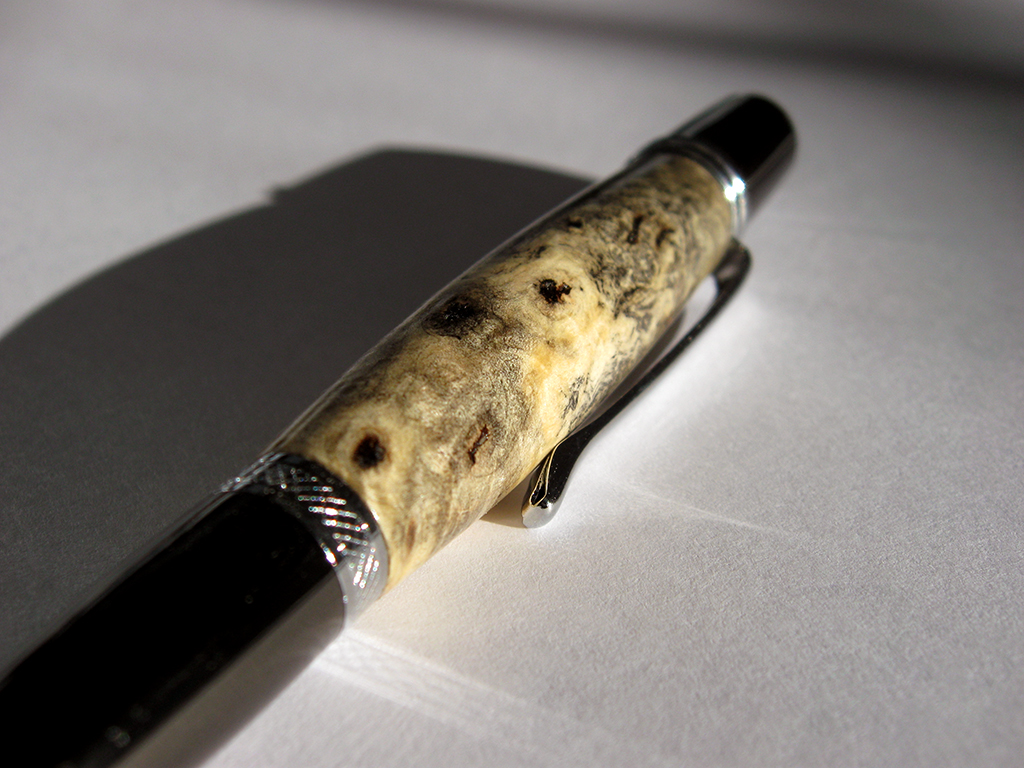
I decided that if my red mosaic is going to be interesting, then I can't show you all every photo before I finish and upload the mosaic. So today's photo is a macro of a pen I turned yesterday. The pen kit type is called the Wall Street II, and the wood is Buckeye Burl.
I've had this piece of Buckeye Burl sitting around for about three years. When I first got it, I was still relatively new to woodturning. I thought it looked ugly, and it's extremely porous, so I doubted it would polish well. Today, I looked at it and figured that, since it was burl, it would look much better sanded and under polish. The turning was easy because it's a light punky wood. The sanding was easy because for some reason, it seemed eager to sand to a very smooth sheen. I sealed it using cyanoacrilate glue (superglue). I actually had to seal it twice to fill all the air inside the wood. Then I finished sanding, polished it, and voila:
click to enlarge, or see it on Flickr Aperture: f/2.8
Shutter Speed: 1/1250
ISO: 80
Gorilla Pod
Enough about the woodworking though. This is a photo blog. From a photographic standpoint, I didn't do much to this in post. I shot it in direct sunlight, on top of a piece of regular 8.5x11" printer paper in an attempt to reflect some of the light more evenly. I'm not sure if that worked, but the lighting seems fine. I really liked the shadow cast by the pen, so I kept it. I didn't crop or change the saturation. All I did was use the following trick to get the white-balance exactly right. By exactly right, I mean that the tones showing on the monitor (at least my monitor) match the tones that your eye would see if you were looking at the pen in real life. This is useful when you want your photography to convey precisely accurate representations of what an object looks like. To achieve lifelike white-balance, follow these steps:
1. Create a new transparent layer over your background. Call this layer "Difference." 2. Edit>Fill the "Difference" layer with 50% gray. 3. Change the blending mode of the "Difference" layer to "Difference." 4. Your picture should look like a funky negative. Don't worry. It goes away. 5. Zoom in as far as your computer will allow. 6. Hunt for black pixels. Not just really really dark pixels. You need one that registers a hex code of #000000. I use the eyedropper tool to sample pixels until I get a black one. 7. Mark the pixel using the Color Sampler tool. To get the Color Sampler tool, right click on the eyedropper tool in your toolbar. It should be directly under. 8. Now delete the "Difference" layer. You only needed it to locate a pixel that was exactly 50% gray in your photo. 9. Add a Levels Mask Layer. In the box that pops up, make sure you click on the little eyedropper icon that is between the other two. 10. Click on your marked pixel. Press "Okay." 11. Flatten your image. Your white-balance should be perfectly neutral.
It's a bit late for the DPS weekend challenge, but I got the spirit of the challenge in (namely taking blue photographs during the weekend). I like these mosaics so much that I think I'm going to do one for every primary and secondary color. Sorry, but I think you guys have seen all of these already. Oh, well. They look better together.
I had a shoot planned up Provo Canyon today, but the weather snuffed that idea. It snowed about an inch, then froze, making the roads an absolute nightmare. Needless to say, my urge to drive in the canyon dwindled quickly after that.
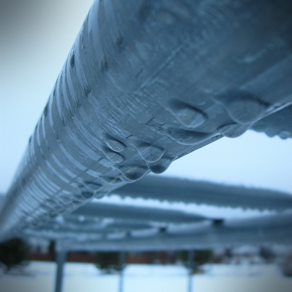
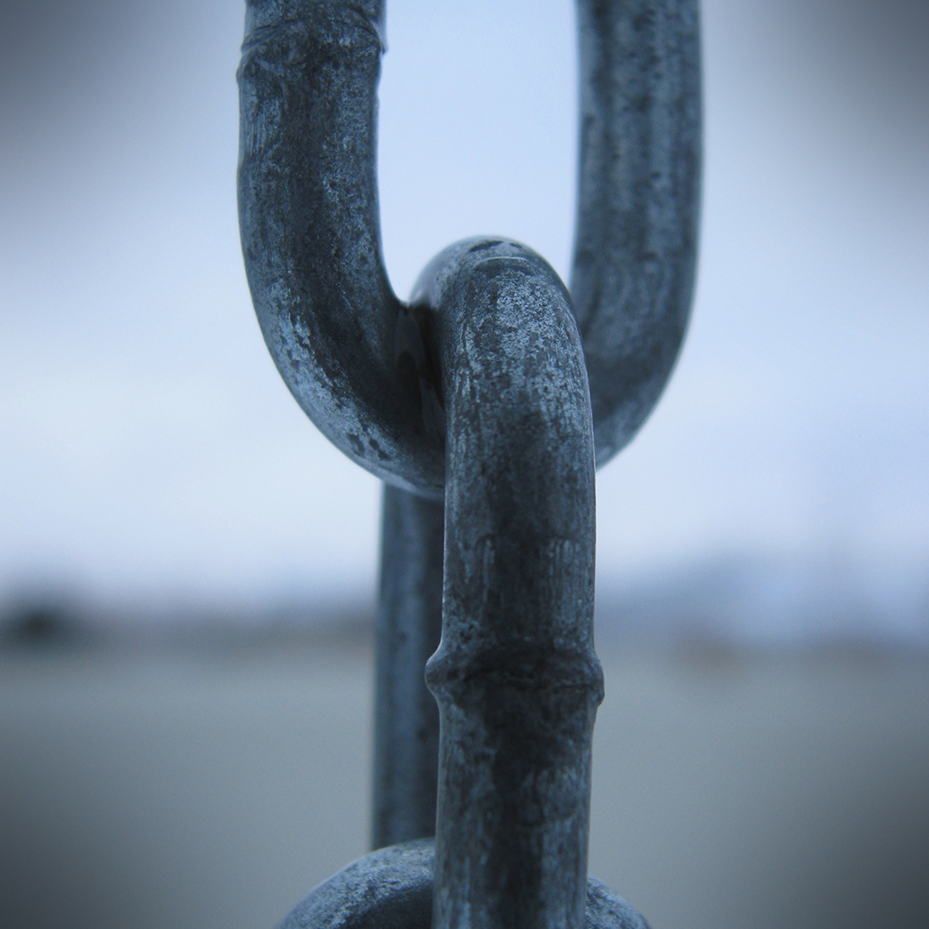
Instead, I went outside and took some photos of my swing set. The monkey bars had a cool line of water drops, and I thought the chain that the swings hang from would make a cool macro too. Since it was cloudy, and early in the morning, there was a very defined blue tint to the light. I set my white balance to "Cloudy," and my photos were still really blue. I probably should have set it to Tungsten or something to compensate, but I figured with "Cloudy," I would be getting an accurate representation of the light temperature.
click to enlarge, or see it on Flickr Aperture: f/2.6
Shutter Speed: 1/40
ISO: 80
Tripod
click to enlarge, or see it on Flickr Aperture: f/2.6
Shutter Speed: 1/60
ISO: 80
Tripod
The first photo was unadulterated as far as color goes. I didn't touch the levels, saturation, or anything else that affects color. I just added a bit of contrast and slapped on a vignette.
The second photo, which I'm much happier with, was played with more. I took some blue and a little green out and added a bit of red via the Levels box, and bumped the contrast down a little. It wasn't until after I cropped to square and added the vignette that I realized how close this looked to a Max Ash photo, whose effect I tried to copy in this post. Actually, I have a sneaking suspicion that his photos are HDR processed first, and THEN converted to monochrome, etc. I'll have to try that sometime.
Either way, not bad to have one and a half keepers from a shoot that consisted of 10 photos in my backyard. These will go into my "blue" mosaic, which will be similar to the "green" mosaic I did in this post, which is why I cropped to 1:1. I hope to do a lot of themed mosaics, as they're fun to put together.
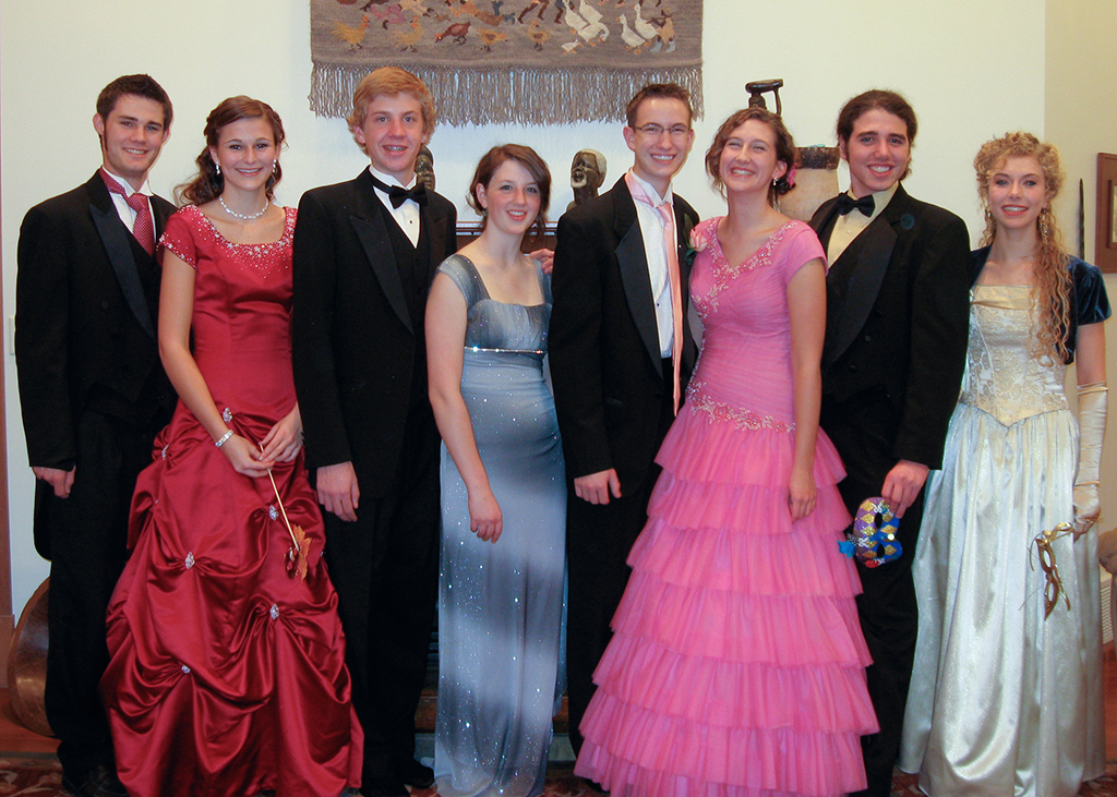
Once again, I volunteered to do the pictures for the group I was in for my school's Preference dance last night. And once again, the original plan to shoot outside was assassinated by too little light, and waiting too long before meeting up to do pictures. So I got to shoot inside.
click to enlarge, or see it on Flickr Aperture: f/2.6
Shutter Speed: 1/6
ISO: 100
Tripod
The white balance in the house was a nightmare. Without a flash, I was using shutter speeds in excess of 1 second, which was not an option. With a flash, I could go to 1/6—still significantly shorter than I like to shoot any kind of moving subject in, but it was doable. Unfortunately, flash lighting and Incandescent bulbs are two very different flavors of light. So I basically gave up on getting the WB right in-camera, and fixed it in Lightroom afterwards. It turned out okay. I still would have rather shot these outside.
I had to bump my ISO up to get those extra fractions of a second for my shutter speed. Normally I try to shoot ANYTHING I'm considering printing in 80 ISO, but I had to compromise somehow. I used my flash on it's dimmest setting, mostly as a fill flash, because, it being an in-camera flash, anything over the dimmest setting gives you awful glares that make portraits look horrendous. Since I'm only printing these at 5x7, I felt okay with shooting at 100. I'm reasonably happy with how they turned out, considering my difficult situation. They lack the really "professional" look you get when you shoot with a super wide aperture to blur the background, and the WB is merely acceptable, but I feel okay about it. At least it gave me some more portraiture experience. And if I take nothing away from my last two dance-photo attempts other than "SHOOT OUTSIDE WHILE THERE'S STILL LIGHT," then the effort hasn't been wasted.
The DPS challenge I talked about in my last post sounded interesting, so today I started taking pictures of blue stuff for the weekend. I got a chance to try out my new monopod that I got for my birthday (woot!), and got lucky with a nice capture right off the bat.
click to enlarge, or see it on Flickr Aperture: f/3.5
Shutter Speed: 1/640
ISO: 80
Monopod
Normally I strongly dislike tilted shots like this with the horizon purposely skewed. But I kind of like how it made the picture feel. It's a swing; you're not supposed to be perfectly level.
Hopefully I'll get enough shots to do another collage, this time in blue. I've started tagging all my photos with the dominant color so I can do things like that a little more easily. And by "easily," I mean "with less wading through folders looking for specific photos."
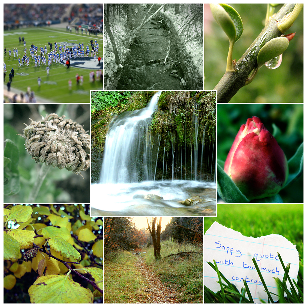
Probably most of you have seen the example photo on today's DPS post, but I really liked the mosaic idea. I decided to try my own. Their theme is blue, but I'm doing mine green. I figured since I have mostly nature photos, green would be the easiest to put together from photos I already took.
I know this is kind of cheating, but I really liked the concept. Try it out, it's pretty easy in Photoshop (and probably doable in MS Paint with enough patience).
This stunning HDR shows the true power of High Dynamic Range when utilized by a skillful hand. The effect is not overdone, yet the image is extremely high-impact and dynamic. The composition is fantastic, the colors are beautiful, and the subject is fascinating.
Yesterday I went on a short walk through a ravine near my house. One good photo came from the shoot—it was a macro shot of a poky-looking weed that I thought would be interesting up close. I had heard something about getting everything you want in focus via some program that takes multiple exposures at different focus distances and combines them, but I don't have any such program. The idea seemed sound though, so I went ahead and took two of the exact same photo, just with a focus adjustment. Between the two images, I had the entire subject in focus, but the background was still a nice bokeh.
click to enlarge, or see it on Flickr Aperture: f/2.6
Shutter Speed: 1/160
ISO: 80
Gorilla Pod
I pasted one image over the other in Photoshop, and then meticulously masked out the unfocused areas from the one on top. in a few places, the background was a slightly different color in one image due to the amount of lens blur on the pixels, but a little bit of healing brush fixed that quickly. It took kind of a long time, but now I have a nearly perfect depth of field: one that encompasses my entire subject (almost; there are still a few spots out of focus), but one that still throws the background into a nice, non-distracting bokeh.
After the masking was completed, I flattened the image and treated it like a single photo to continue post-processing.
Have any good depth of field shots? They don't have to be DoF hacks, just post links in the comments!
I've used a few different methods for changing an image to black and white over the course of my photography experience. Any built-in camera features should be... ignored. You can do a much better and more customizable job in Photoshop later. Straight-up desaturation is a quick way, but doesn't always give you the best results. I find it tends to flatten photos that had a lot of depth before. A Channel Mixer Mask layer gives you a lot of control, but I have trouble getting it to do what I want. This method gives you a surprising amount of control without being overly complicated. Here's a photo I used this method on.
click to enlarge, or see it on Flickr Aperture: f/2.6
Shutter Speed: 1/8
ISO: 80
Tripod
Actually, I think this photo looked better in color, with some saturation added. It was taken back in October 2009, and I dug it up today in a quest for a suitable image to monochrome for this post. But I needed something that showed the effects of this method, and this photo certainly does. Here's how it works:
1. Crop your photo to desired size. 2. Optimize it as you normally would (any levels adjustments, brightness/contrast, etc.) Leave out any saturation adjustments. 3. Duplicate the background layer. Name this layer "Hue." 4. Desaturate the "Hue" layer. 5. Change the blending mode of the "Hue" layer to "Hue." 6. Select the Background layer (should be on bottom) 7. Open the Image>Adjustments>Hue & Saturation dialogue box (cmd+u on Mac, ctrl+u on Windows) 8. Change the hue of the background layer around. You'll notice that some areas will go darker and some will go lighter, but since the monochrome layer on top is masking the color, all you see is adjustments in the brightness. I usually stop when I find a nice contrast-y setting that doesn't make my image look flat. Try playing with Saturation, too; it gives some interesting effects. 9. When you're happy, flatten your image and open Image>Adjustments>Brightness & Contrast. 10. Adjust your brightness and contrast as desired. I find that extra contrast helps solve the "flatness" problem that B&W images sometimes have. If you use this method to black and white a photo and want to share it, feel free to post a link in the comments!
Hi to all my readers! I'm entering a local photo contest, but I need your help to choose which photo to enter. I'll be entering two or three categories (Definitely entering "Nature" and "Man & Nature," maybe entering "Bird Wildlife" if I can get a bird photo in time). I've already chosen which photo to use for "Man & Nature," but I've narrowed it down to three choices for "Nature." Here they are.
click to enlarge
click to enlarge
click to enlarge
All three of these have been posted on my blog, with the exception of the second one. My original method of post-processing removed a lot of the saturation, which gave me the result in this post, but the rules of the museum contest state that "no digital alteration is allowed on images, beyond standard optimization."
So if you have a preference, please help me choose which one to submit! Thanks.
I've been noticing the aspen trees in our front yard for a few days now, and meaning to photograph them. I love the look and feel of aspen trees with their texture-y white bark, especially against a snow backdrop.
Anyway, there was a somewhat boring sunset today, but it cast a nice orange light, so I figured I'd go out and give it a try.
click to enlarge, or see it on Flickr Aperture: f/2.6
Shutter Speed: 1/60
ISO: 80
Handheld
There are a few things I'm dissatisfied about with this, but a few elements I really like. The flare wrapping around the tree is cool, and it's a nice focal point. The textures and translucent lighting of the flaky parts of the bark are nice. But the house in the background has to go. Unfortunately, this tree is on the top of a small landscaped hill, so I couldn't shoot up or I would miss the sun. Shooting down inevitably led to shooting across the street into someone's driveway with a car, or their house. I also don't like the color of the bark. It is the natural color, but it's not a color I normally associate with aspen bark. It's supposed to be white. I don't know why this is brown.
Maybe sunset lighting and white aspen bark aren't very compatible with a snow background... the snow also looks pretty blue because it's in shadow, and I can only set white balance for one thing.
All in all, an okay picture and a good learning experience.
click to enlarge, or see it on Flickr Aperture: f/2.6
Shutter Speed: 1/80
ISO: 80
Handheld
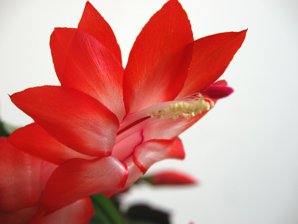
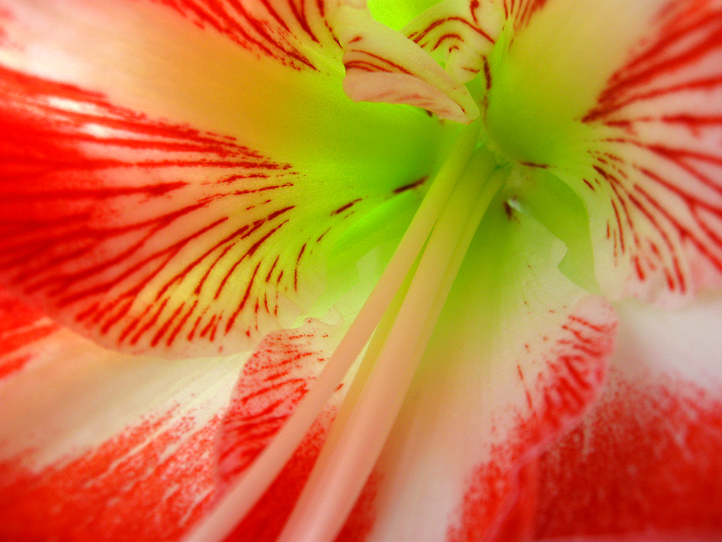
And I think I got it pretty well in focus. About time.
I loved the colors, so I added a bit of saturation and contrast. Not too much though, most of that color is natural. The subject was backlit, so I had some weird exposure issues. I compensated by taking about 30 identical pictures with various metering modes, etc. This one turned out best. I also tried kind of a reverse-vignette thing. I added a layer on top which was a white-to-transparent radial gradient with its origin in the center of the flower. The blending mode was set to "Soft Light" and the layer opacity was only about 20%, but I think it helps draw my eye in a little better, especially considering the main focus of the shot isn't as well in focus as some other areas, and isn't in the center of the photo.
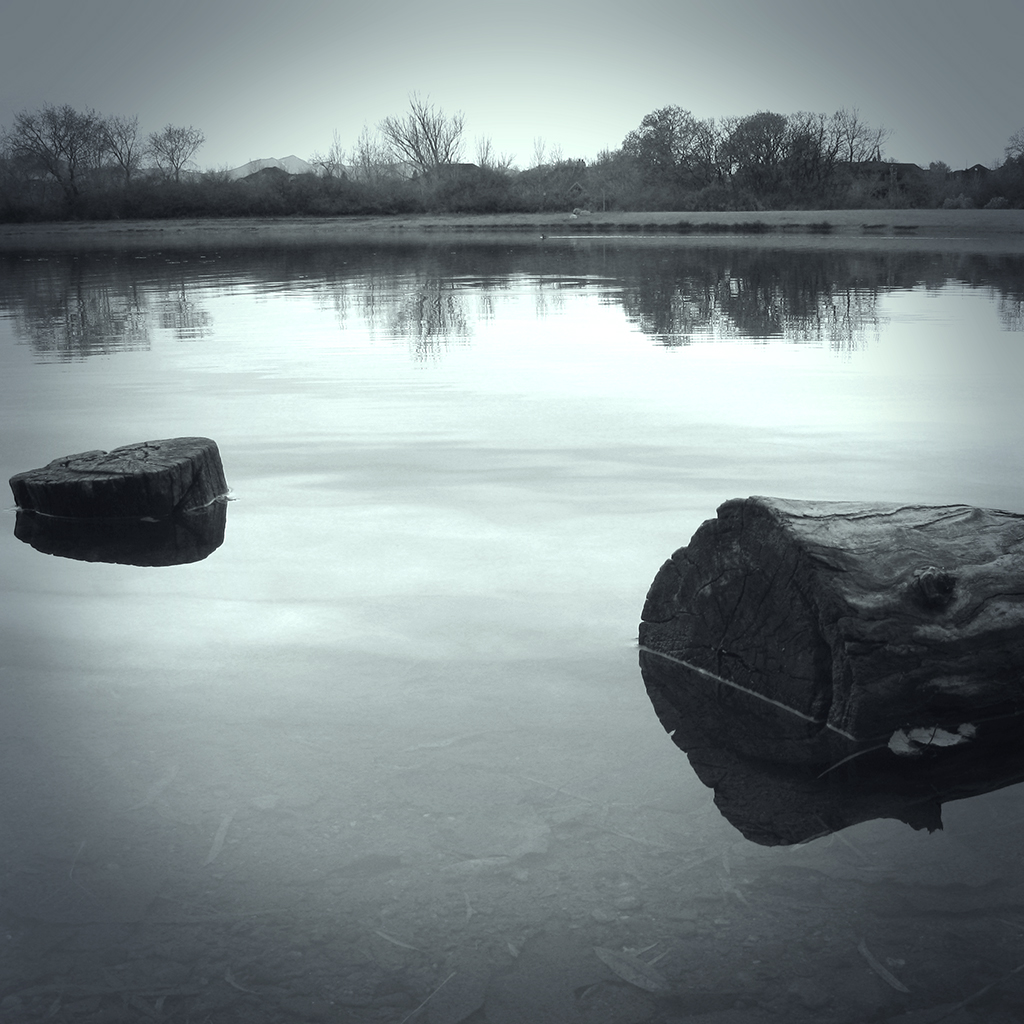
I just discovered the photography of Max Ash. In short, it's spectacular. His photostream can be found here. Beware, only two sets are up right now—the one that inspired this post, called "Echoes," and another called "Sensuality" or something that's artistic nudes. So if you're not into that, stick with Echoes.
I decided I wanted to try to duplicate the effect. It quickly became clear to me that I would have to use a picture that would look good in B&W (or monochrome in general), and one that was a landscape. I didn't have any new photos that were unedited which fit that criteria, so I used an old one that you've already seen one flavor of. It's the lake scene from this post. I just dug up the original SOOC file and started over. Here's the result of my first attempt, followed by the steps I took to get it like that.
click to enlarge, or see it on Flickr Aperture: f/4.5
Shutter Speed: 1/40
ISO: 80
Tripod
1. Cropped to square. I believe all of Max's "Echoes" photos are square. 2. Corrected color balance using a technique I learned today that I'll show you in some future post.
3. Black & Whited image using a technique I learned today that I'll show you in some future post. Yeah, I went on a DPS Post-Processing post archive binge. 4. Played around with some Orton Effect to try and get the mysterious, misty quality his photos have. 5. Realized that his photos have that quality because of actual mist in the shot, not tricky post-processing blurs.
6. Applied a Solid Color mask layer, and strove desperately to get the exact shade of blueish grayish greenish as well as the same opacity that Max uses. Failed, but continued anyway. 7. Applied a vignette. Max appears to use one that is moderately strong, and moderately large. I think mine is actually a little too intrusive in this image. Something to fix next time. Also, after a little head-scratching, I figured out that his vignette is color-cast as well, not black. 8. Applied a Levels Adjustment mask layer to fix my color and get it closer to his. Finally got the color pretty dang close. 9. Flattened and partially desaturated to get all qualities of my color cast matched up with Max's as precisely as possible. Got pretty close.
I think that's about it. A very difficult effect to reproduce, but for a first attempt, I'm quite happy. I think part of the reason his effect is so high-impact is that he uses it for every image in the series. So I think I'll shoot my own "Max Ash Effect" tribute series sometime. I've got a trip to Glacier National Park coming up in not too long, so hopefully I can get some good material from that.
If any of you want to try the effect, feel free. Hopefully you can get closer than I did. Post your results in the comments!
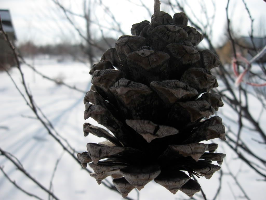
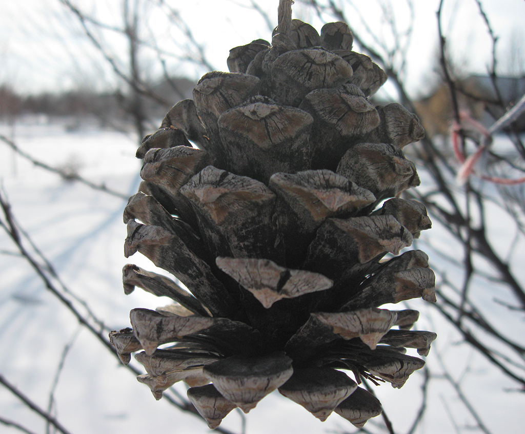
I took a shot just before I went inside after coming home from school today. Because of the angle I was shooting at, I had a hard time seeing my LCD display due to glare. So I just set the exposure to what my light meter said was correct, and fired. As a result, the subject of my picture was underexposed because of how bright the background was. The light meter had compensated to avoid what it saw as overexposing the background.
click to enlarge
Luckily, I had just read a tutorial on using masks to do partial corrections in Photoshop. Here's how it works:
1. Make a duplicate copy of your background layer. 2. On the duplicate layer, make changes based on the area you want to correct. For example, the pine cone was too dark in this photo, so I upped the brightness, and adjusted the shadows until the pine cone looked good. The background was out of wack by then though. 3. Add a mask to your duplicate layer. 4. Use the paintbrush tool with black and white to paint out the area you want to show through. Remember "black conceals and white reveals." I used a soft brush with an appropriate size to paint away the background that was overexposed show that the original photo in the background layer showed through.
Here's my final result:
click to enlarge, or see it on Flickr Aperture: f/2.6
Shutter Speed: 1/800
ISO: 80
Handheld
Despite my having what some people who know me would swear is a moderate case of ADHD, the title not referring to an inability to focus on the task at hand in photography. No, today my problem was getting things in focus that I wanted in focus.
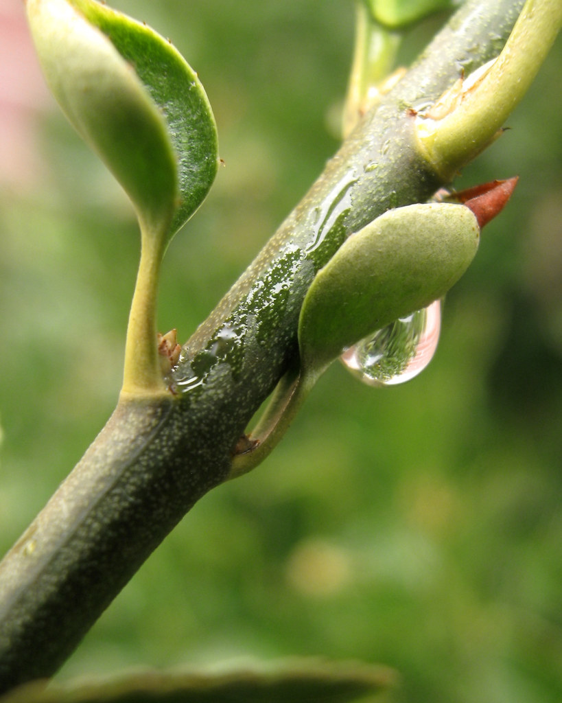
I went outside during 4th period and started taking close-ups of some hedges that were wet from the rain. I had good subject material, but I just couldn't get the correct areas of the photos in focus very well.
click to enlarge, or see it on Flickr Aperture: f/2.6
Shutter Speed: 1/30
ISO: 100
Tripod
You'll notice I was shooting at ISO 100 instead of 80—this was because a slight breeze was blowing my subjects, and I needed that little bit of extra shutter speed to freeze it. The lighting was great, but not as bright as I like it. Too many dark gray clouds, not enough general "overcast" type clouds. I'm slightly proud to say that I was actually able to see the difference between 80 and 100 ISO in some areas.
Obviously, the main point of interest in this photo is the droplet. And also obviously, the droplet is not in focus. My autofocus sensor is partially blocked by the tube I use to mount lenses and filters (like macro lenses...). I think the Canon PowerShot A590 IS was not designed with aftermarket parts in mind. So I usually use Manual focus, but I had the tripod extended well above my head to shoot this subject, which was some 7 feet or so off the ground. My camera is not an SLR, so Manual focus means two things: setting different focuses with buttons on the back, and trying to decide which minute differences are optimal focus by looking at an LCD. Not my favorite thing to do anyway, but I couldn't see the LCD for this shot at all. I made the tactical decision and turned the job over to my autofocus, which, of course, rather missed the point.
Not a disappointing picture by any means, but I might just return to that spot on a rainy day sometime in the future, this time armed with an SLR. Or at least something to stand on so I can see my LCD.
I read this great list on DPS today, and decided to take one of their suggestions: I'll be making a monthly calendar desktop for free download if anyone wants to use it. Whether or not anyone actually wants it, I still want to do it, so here's January's submission.
Feel free to distribute as desired, this is free for anyone to use however they want. Also, if there's a monitor size anyone needs that isn't up there, let me know and I'll throw one together.
I'll try to get these up as close to the beginning of each new month as I can. Happy 2010!
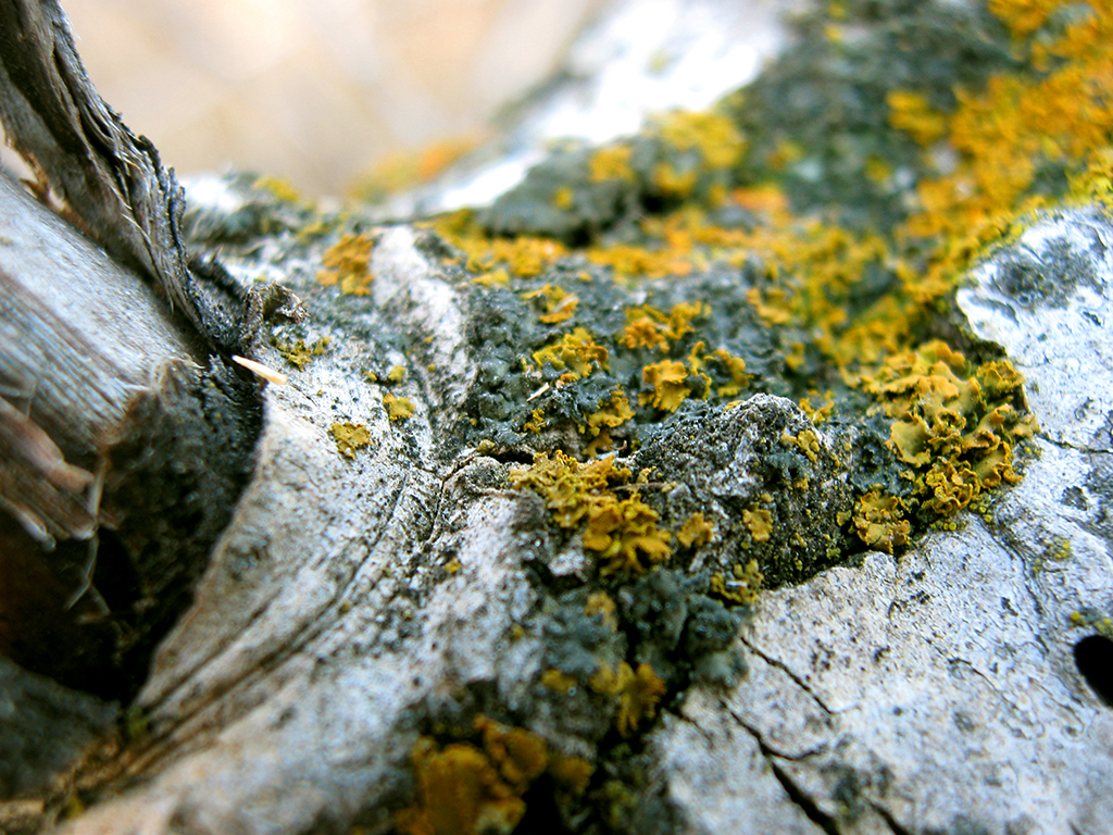
Sometimes I feel like this blog is almost predictable. My two favorite types of photography are nature photography, and macro photography. This photo is an example of both.
click to enlarge, or see it on Flickr Aperture: f/2.6
Shutter Speed: 1/20
ISO: 100
Tripod
I'm not sure why I was at ISO 100 instead of 80 if I was using a tripod. Possibly I had set it to 100 to get a slightly faster shutter speed for some previous handheld shooting on the same trip, and then forgotten to set it back. I like how the depth of field worked out, and I'm pretty happy with the saturation on the yellow lichen. The composition is iffy though.
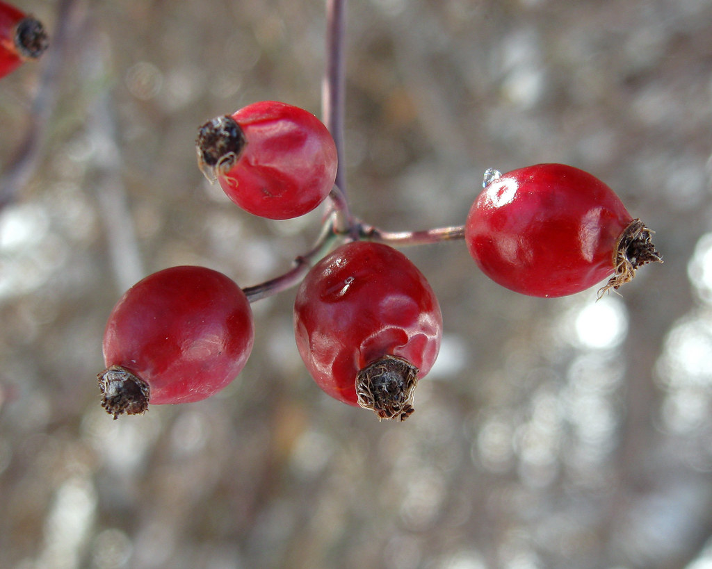
During my architecture-turned-nature shoot on New Years' Eve, I got this nice macro of a little cluster of red berries hanging from a tree. Obviously you can see that in post-processing, I partially desaturated it.
click to enlarge, or see it on Flickr Aperture: f/2.6
Shutter Speed: 1/80
ISO: 80
Handheld
But what I noticed a little later was that the background has some absolutely awesome bokeh. Bokeh, for anyone who doesn't know, is pinpoints of light that are out of focus. They become these nice orbs. Bokeh textures are often added to other photos.
I read in this post on Nasyarobby's photoblog that it's possible to shape your bokeh. I'll definitely be experiementing with this technique.
In the meantime, feel free to share any great bokeh pictures in the comments. That would be photos that have bokeh occurring in them, or photos that you used a bokeh texture on.
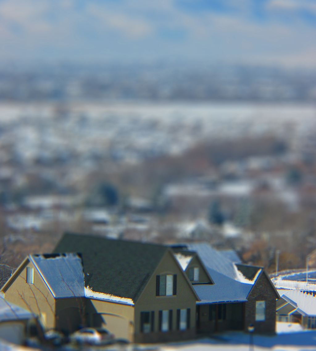
This is the first big landscape picture I've taken with tilt-shift as the intended result.
click to enlarge, or see it on Flickr Aperture: f/8.0
Shutter Speed: 1/500
ISO: 80
Handheld
There are some things about this picture that I specifically like, some things that I specifically don't like, and one thing that I can't decide whether or not I like.
I like that the effect came off strongly. I had a definite subject to keep in focus while composing the picture, and that really helped with the "miniature" feeling. I don't like that the colors are kind of dull. I always boost the saturation and contrast when tilt-shifting a photo in Photoshop, because it contributes to the idea that the subject is a toy or a model. But even after boosting the saturation to near-posterization, the colors are basically still gray, black and white.
What I can't decide on is how I feel about the background. On the one hand, it's enormous compared to the house. That's good. It makes the house seem even smaller. But on the other hand, there are elements, like the sky, that can't really by miniaturized. The fact that there's sky in the shot stubbornly refuses to let the viewer's brain believe that it really is a scale model, and that, to some extent, ruins the effect. Unfortunately, if I crop the sky out, it messes up my composition, and doesn't even really solve my problem. Just like the impossibility of miniaturizing the sky, it's hard to believe that someone created a model of a gigantic landscape. Again, it denies the effect. As I type this, I'm now remembering the first guide I ever read on tilt-shift. I think it said not to include a horizon in your shot. Gotta remember that in the future.
Hello all, and welcome to my first post of 2010. This year I hope to continue my one-post-daily trend. I've started an "official" Photo365 project, although this blog will not follow it. By that I mean I won't be numbering each photo, or posting a photo every day whether I took a good one or not. Ideally, some days I will manage to take more than a single good photo, so I won't run out of material for posting every day. But I will be taking at least one photo every day, even if I don't post it on this blog.
I went on my "architecture and abandoned buildings" shoot yesterday. It degenerated into a regular nature shoot, but with a couple friends. I guess that's what happens when you see a bird within shooting distance during the trip, and then notice that the berries growing on the tree where the bird was would make good macros, and then forget all about the building altogether. Oh, well.
It was a very sunny day, so when I was shooting the aforementioned bird, I threw on my polarizer, then my telephoto lens. Later, I wanted to shoot some close-ups, so I took off the telephoto lens and replaced it with my macro lens. Normally when I shoot macros with the polarizer, I mount the filter over the lens to protect the lens, rather than putting the lens over the filter. I can't do this with my telephoto lens, because the diameter is larger than 52mm at the business end. Turns out when I shoot with my macro lens over my polarizer (or my UV filter, I have to assume), I get a vignette in the corners.
click to enlarge, or see it on Flickr Aperture: f/2.6
Shutter Speed: 1/500
ISO: 80
Handheld
I generally prefer a much more subtle vignette, like the one in this post. But when I opened this up in Photoshop, it seemed like a harder vignette suited this photo better. The photo is called "Fenced In." Obviously, that's because it's a fence. But also, the mountains and blue skies that you can just make out are beyond the fence. The fence is keeping the viewer from getting there. The vignette is so strong that it seems almost annoying, and limits your view. A subtle vignette may subconsciously draw your eye to the center without you noticing, but this vignette helps perpetuate the feeling of being trapped and limited.
Have a hard vignette photo you want to show us? As always, I invite you to link to relevant photos in the comments.
Andrew Broekhuijsen has been living in Utah since the age of -9 months. He enjoys long walks on the beach, and flexing shirtless in the mirror. Oh, and photography. That too.


