click to enlarge, or see it on Flickr
Aperture: f/8.0
Shutter Speed: 1/500
ISO: 80
Handheld
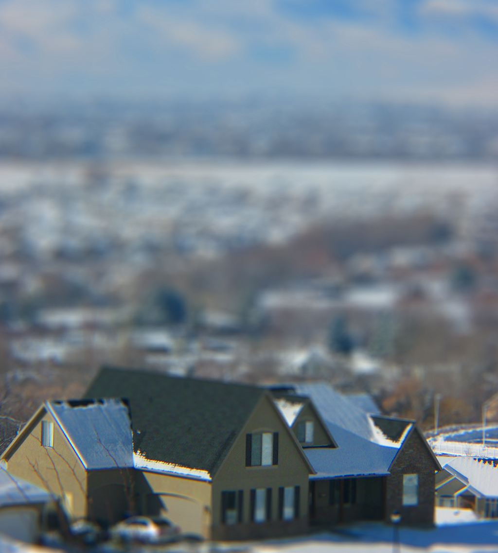
There are some things about this picture that I specifically like, some things that I specifically don't like, and one thing that I can't decide whether or not I like.
I like that the effect came off strongly. I had a definite subject to keep in focus while composing the picture, and that really helped with the "miniature" feeling. I don't like that the colors are kind of dull. I always boost the saturation and contrast when tilt-shifting a photo in Photoshop, because it contributes to the idea that the subject is a toy or a model. But even after boosting the saturation to near-posterization, the colors are basically still gray, black and white.
What I can't decide on is how I feel about the background. On the one hand, it's enormous compared to the house. That's good. It makes the house seem even smaller. But on the other hand, there are elements, like the sky, that can't really by miniaturized. The fact that there's sky in the shot stubbornly refuses to let the viewer's brain believe that it really is a scale model, and that, to some extent, ruins the effect. Unfortunately, if I crop the sky out, it messes up my composition, and doesn't even really solve my problem. Just like the impossibility of miniaturizing the sky, it's hard to believe that someone created a model of a gigantic landscape. Again, it denies the effect. As I type this, I'm now remembering the first guide I ever read on tilt-shift. I think it said not to include a horizon in your shot. Gotta remember that in the future.
Please share your tilt-shifts in the comments!


Holy cow, that is so cool. I have to try this!!
ReplyDeleteDo not include a horizon in your shot. Thanks.. Gotta remember that too...
ReplyDeleteI love the color of the house... It's dull, but that strengthen the scale model effect...