Monday, November 30, 2009

Textures, Part I

Textures are a great way to add a feel to a photo. They can take a relatively average photo and turn it into a great one. Here's a fairly boring picture I took today. It's a macro (just the camera's built-in setting though, I didn't have my macro lens attached) shot of some torn up bark. Because of the angle of the sun, it's quite contrasty, which I felt could be augmented by texturing a bit.


click to enlarge, or see it on Flickr


To utilize a texture, you must first have a texture. I would recommend doing what I did: spending about an hour wandering around somewhere, taking all the textures you can. I came up with quite the collection at the school. Good textures are everywhere. To expose a nice texture, you want it to be fairly uniform, and frame-filling, as well as uniformly lit. Generally, a nice neutral color is also desirable, although that depends on your taste. Also, you obviously can't use a texture taken with an 8 megapixel camera on an uncropped image taken by a 12 megapixel camera. So if you upgrade cameras... go on another texture rampage.

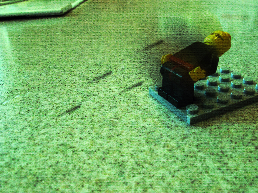
With a wide selection of textures at my disposal, I chose a very close-up shot of some linen. The fibers were individually visible. Here's how to apply the texture:

1. Finish any color corrections, cropping, etc. you want done on your image.
2. Open the texture file.
3. Copy it and paste it into a new layer over your image.
4. Size it to fit your image if it doesn't already.
5. Change the blending mode of the texture layer to "Overlay," "Multiply," etc. Whichever gives an effect you like for that image. For the above image, I used "Soft Light."
6. Play with the opacity. This is definitely a matter of personal preference. Mine is set to 60% in the above image.
7. Use a large, soft, low-opacity eraser to tone down any areas you think are a little overdone. I knocked some of the opacity off of the areas that were out of my depth of field (and therefore blurry) because they showed the texture a little too much.
8. Layer>Flatten Image

Have some good textured images? Post links in the comments.

Sunday, November 29, 2009

Tilt-Shift Photography, Part II

I went to a football game yesterday, and got some pretty cool stadium shots. First of all, let me just say that I'm extremely impressed with the Image Stabilization technology on my PowerShot A590. I was at 4x optical zoom, shivering with cold, and without even a monopod, shooting with a shutter speed of about 1/25th. My results were still this clear.

Anyway, turns out stadiums are perfect fodder for applying fake tilt-shift. I like my New York shot better from a purely photographic standpoint, but as far as faking the tilt-shift effect, this picture turned out quite a bit better.


click to enlarge, or see it on Flickr


This photo is slightly too busy to view in such a small size, so I highly recommend the larger view.

Anyway, I decided to go ahead and give a quick-and-dirty tutorial on how to fake tilt-shift in Photoshop.

1. Get an appropriate photo. Big shots taken from high up of large amounts of landscape tend to work best, as they are cool to see in "miniature."
2. Do any cropping or editing you wanted to do before you apply the tilt-shift effect. I would recommend leaving the color corrections out; as that is changed while applying the effect anyway.
3. Go to Quick-Mask mode.
4. Select the reflected (cylindrical) gradient tool.
5. Make sure your foreground and background colors are set to default (black and white).
6. Click and drag, starting from where you want the in-focus part to be, out to the edge of the photo. Follow the natural "line" of the photo. In most cases, this line should be pretty close to vertical. In the above photo, I tilted it a bit to the left. In any case, once you're done, you should see a red gradient covering your photo
7. Get out of Quick-Mask mode. This converts your gradient to a selection.
8. Apply a Filter>Blur>Lens Blur with whatever setting you feel appropriate. I think mine was set to about 90% strength. If you have an earlier version of Photoshop, a Gaussian blur will do (you just won't get that kind of "bokeh" look). This blur simulates a very narrow depth of field which your brain associates with macro photography. It's what tricks your eyes into thinking the shot is of a miniature.
9. If you don't like the way the blur turned out, undo it and try again. Otherwise, boost the saturation on your image by quite a bit. This makes the subject(s) look plastic-y, and contributes to the "scale model" feel. Do the same with contrast. If you have "toys" in mind as your desired result, you shouldn't have a problem finding the right saturation and contrast.


Congratulations! I would love to see some of the tilt-shifts you guys make. They're a lot of fun. Post links in the comments.

Saturday, November 28, 2009

Portraits, Part I

I have a very cute cousin. She is extremely difficult to capture indoors, because she doesn't like to stay in one place for more than a second or two. This is compounded by the fact that I don't have a DSLR. My widest aperture is 2.6, and I can't go above 400 ISO without getting into the range of unbearable grain. So basically I was stuck with 1/25ish shutter speeds. After several action shot attempts, I gave up and asked her to just pose for a second. Luckily, she complied.


click to enlarge, or see it on Flickr


Despite my best efforts, it's still a bit blurry. The background is super distracting, and the composition is iffy. But I'm kind of a portrait noob, so improvements will come, all in good time.

I just realized how similar this post is to Gallow's latest. I promise I took this before I saw your new one.

Friday, November 27, 2009

Vignettes

Vignettes come in two flavors: real and fake. Real vignettes happen when a part of your lens blocks the imaging sensor in the corners, and in extreme cases, the edges, from being exposed. Fake vignettes happen when you wish there was a real vignette, but there's not. Just Photoshop.

Vignettes are nice because they draw your eye naturally to the center of the image. The biggest thing to remember with vignettes is that they can be easily overdone. A little goes a long way. Here's how I do them in Photoshop:

1. Do all edits on your image you want done. Vignetting comes last. For the image in this post, I did some minor rotating and cropping, and added a very subtle texture.
2. Make a new layer. Name it "Vignette."
3. Fill the Vignette layer with white.
4. Set the Vignette layer's blending style to "Multiply."
5. Use the elliptical marquee tool to select the area you want vignetted. I usually start dragging from one corner to the opposite to insure I get a symmetrical selection, then Select>Modify>Expand as desired.
6. Invert the selection.
7. Fill the new selection with black.
8. Filter>Gaussian Blur. I use 250 pixels (maximum).
9. Dial down the Opacity of the Vignette layer. I used 50%.
10. Flatten your image. Voila!


click to enlarge, or see it on Flickr


Let's see it: post links to your well-vignetted images in the comments.

Thursday, November 26, 2009

Ice Shooting - Tips?

I went out specifically looking for ice to take pictures of yesterday. Lo and behold, I found some fantastic ice. Unfortunately, I was having trouble getting a good photo out of it. The stream I found was only partially frozen, which made for some very interesting ice structures, but also for some very difficult photography. I tried to get down on the level of the ice, but even with a gorilla pod flat out, I had to sacrifice some comfort (in the form of warm, dry knees) to see my LCD display and get the shot in focus. The worst part was that it didn't even turn out particularly good. So I didn't classify any of my exposures from that viewpoint as "keepers" and finalize them.


So I'm asking for not only a critique of what could be done to make this photo better (it's my best photo from the shoot, but it's not particularly great), but what I can do to get better pictures of the ice in general. I know the interest of the subject is there; it's just presenting a unique challenge as far as how to photograph it. Suggestions?


click to enlarge, or see it on Flickr


P.S. Happy Thanksgiving everyone!

Wednesday, November 25, 2009

Mix Up Your Point of View

We don't always get the chance to shoot at an unusual subject. In fact, the great majority of my pictures are of pretty average subjects. The challenge is in making an average subject into a great photo. One way to help accomplish this is mixing up your point of view.

Do something creative. Don't take a picture of flowers from above, take it from below. One way to help you come up with ideas for more interesting points of view is deciding on some other object to "be," rather than a guy holding a camera. How would a bug sitting on the top of a blade of grass see that fence in the distance? How would a child see that statue?


click to enlarge, or see it on Flickr


I don't have any specific idea of who's point of view this is, but it added some interest to an otherwise pretty boring subject. Aside from the slightly too high saturation, and more than slightly too high contrast (both mistakes I used to make a lot), I like this photo.

As always, I invite you to post links to any photos with an interesting point of view in the comments. Happy shooting!

Tuesday, November 24, 2009

Fun With Light Painting, Part II

Here, as promised, is my awesome planned light-painting shot. To heighten the suspense, I'll put my process before I post the photo.

As I stated before (I think), my maximum shutter speed is only 15 seconds. So for a project of this magnitude, I substituted sheer manpower in place of a bulb setting. For the center subject, I had two "painters" with lighters. For the left subject, there was one painter, and for the right subject, I ran over and started painting after firing the flash. Also, one painter was laying on the ground firing the laser everywhere. If you look carefully, the ambient light outlined his legs somewhat, as well as the faces of the two center subject painters.

Step 1: Pose three subjects.
Step 2: Herd painters out of the frame, and tell them to close their eyes to avoid temporary flash-induced blindness (which wastes precious seconds of exposure).
Step 3: Close eyes, open shutter, fire flash.
Step 4: Open eyes, shout "go" to painters.
Step 5: Painters and I sumble forwards in the pitch black darkness, trying not to step on feet, drums, or people.
Step 6: Use remaining 12 seconds or so to simultaneously paint instruments in thin air.

Step 7: Crowd around the LCD screen on the tripod to see the photo (after about 10 seconds of processing).
Step 8: Combine best elements from each exposure into one image in Photoshop.

Step 9: Try fruitlessly to eliminate noise from shooting at 800 ISO; long for a DSLR with a larger imaging sensor.
Step 10: Flickr. Blog.

Here it is, in all its glory:


click to enlarge, or see it on Flickr


Got any good light paintings? Post links in the comments!

Monday, November 23, 2009

Sometimes the First Photo is the Best Photo

Recently, I've taken to carrying my camera gear with me wherever I go. Since "wherever I go" these days means either on a photography shoot (where having camera gear is generally a good idea), or school, it hasn't been much of a hassle. And today was one of the times it was nice to have a camera available for a sudden photo opportunity.


click to enlarge, or see it on Flickr


As is my custom, I took several exposures with various compositions and whatnot. This shotgun approach generally guarantees me at least one keeper if the subject is good enough. Strangely enough, when I got the pictures onto the computer, the best one was the first one. That's never happened to me before, but I guess there's a first time for everything.

Sunday, November 22, 2009

Well-Behaved Subjects

Let me tell you two contrasting stories—my (to date) two serious attempts at animal photography.

Once upon a time, I tried to take some pictures of my cat. He wandered all around everywhere, wouldn't hold still, and seemed to be purposefully ruining my lighting with every tiny movement.


Once upon a time, I was on my way to a little creek area near my house. I stopped at a neighbor's enclosure where they keep goats. The goats were the perfect subjects. They seemed genuinely interested in my photography efforts.


click to enlarge, or see it on Flickr


Although the photo turned out slightly overexposed near the top, the subject and lighting couldn't have been better. I shot with my white balance set to "cloudy," and my flash's dimmest setting to fill in the faces a bit. Lovely. Thank you, goats!

Saturday, November 21, 2009

Fun with Light Painting, Part I

One photography technique I feel is overlooked is light painting. For those of you who don't know what light painting is, allow me to fill you in (photography pun alert). Light painting is accomplished by shooting in (ideally) a pitch black room. You set your camera's focus with the lights on and your subject in place, then turn the lights off. Your subject poses, and you begin a long exposure, starting with a flash. The flash captures the pose of your subject, and then someone (usually the subject) spends the rest of the exposure time with a lighter, LED, flashlight, or some such device, painting in the air. You can write words, draw pictures, etc.

I was with a few friends tonight, and we were starting to get really creative with our ideas. One friend suggested that we try posing him in a "scared" position, fire the flash, and then have another person step into the frame. We then drew lines all over BEHIND the second subject, outlining him like an ominous ghost. Here's the result:


click to enlarge, or see it on Flickr


This image has been rather heavily processed (darkened a bit, lowered the contrast, and removed most of the color). Pretty cool. An interesting lesson I learned from this is that even something you would think was a mistake can make a shot better. In the last two seconds or so of exposure, someone opened the door (to the left and behind), letting in light from the outside. I thought this would wash out the shot, but it only gave a little light to my background and subject, and cast a better shadow of the second subject.

The second subject had a great light-painting idea on our way out of the building. I won't tell you what, but when we take the image, I'll be sure to do a post about it. If we bring it off, it will be awesome in epic proportions.

Go out there and start painting! Link to your good images in the comments.

Friday, November 20, 2009

The Wonderful World of Indoor Nature Macro

A couple of posts ago, I spent the whole time whining about wind interfering with my macro shots. So I decided to do something about it - we have some plants growing inside, and one had some nice flowers.

Even on the best of days, delicate macro subjects will be moved by minor air currents. Not much... but enough to spoil a shot. However, when I tried shooting indoors, this problem was eliminated entirely.


click to enlarge, or see it on Flickr

Thursday, November 19, 2009

Photographing Trees

Trees are a pretty "standard" subject for nature photography. But what draws the line between an amateur picture of a tree, and an eye-grabbing, awesome picture? Here are some techniques to add interest to your tree photos.

1 - Don't just photograph the tree. Even if it's a really cool-looking tree, just taking regular lighting, slapping it in the frame, and hitting your shutter release is a recipe for a boring picture 99% of the time. Find what interests you about the tree (the shape, the color, etc.), and find a way to focus on that!

2 - Play with the lighting. When used carefully, side lighting can make for some really nice shots. It's especially effective if you're trying to emphasize the texture of the bark (or any texture, really). A nice silhouette with a dramatic sunset in the background can work wonders if the tree is particularly nicely shaped. Experiment.

3 - Get in closer. Something about how I'm hardwired makes me automatically want to try and find a way to fit the entire tree in the frame. Often, however, your picture will turn out better if you zero in on a specific aspect of the tree.


click to enlarge, or see it on Flickr


This photo was taken in open-shade lighting, which gave me a nice balanced look between texture and harsh shadows. The texture looks good because I'm pretty close to the tree, but the real focus of this shot is the odd lichen/moss growths on the trunk. From further back, it's hardly noticeable, and this tree looks boring. But once you get in closer, details like this tend to jump out.

Have some examples of good tree photos? Post a link in the comments!

Wednesday, November 18, 2009

The Unfortunate Effect of Wind on Macro

All macro photographers face a common enemy: moving air. The misconception I had about macro photography is that since I wanted a smaller depth of field, I'd be at a wider aperture, and thus a faster shutter speed. Ideally, I thought, this would minimize any blur from minor movements. Reality quickly gave me a wake-up call on that. Since I prefer shooting macro in cloudy and diffuse lighting, that knocks me down about a stop. I also want my macro shots to have as little noise as possible, which means I'm shooting at the lowest ISO I have (currently 80). In general, this gives me an average shutter speed of about 1/50. Not overly slow, especially with a tripod, etc., but slow enough for minor movements to slip in and blur my shot.

To compensate, I usually take a minimum of three exposures (more if it's windier) in the hopes that at least one will have caught the subject in a moment of stillness. But this method isn't failsafe. Here's a photo I took about five times. This was the best of the batch, and even after my best efforts and careful sharpening, the results are somewhat disappointingly blurry.


click to enlarge, or see it on Flickr


Overall, not a bad photo. Just another casualty in the war between macro photographers and wind.

Tuesday, November 17, 2009

Using Reflections to Your Advantage

Sometimes, reflections can seriously hinder your photography (like when you're trying to shoot through a window and it's darker on the other side). But more often, reflections can provide a beautiful sense of symmetry.

When used correctly, a reflection will make your photo much more dynamic. Water in particular seems to reflect things beautifully, especially colors, but that's not the only thing. Reflecting things off of a curved mirror makes your subject more interesting, and catching a glare off of a shiny car window or something adds interest. Try experimenting with different effects you can achieve with reflections. Post links to any good images in the comments!


click to enlarge, or see it on Flickr

Monday, November 16, 2009

Black and White, Part I

There are very few pictures that look better in black and white. I don't know if it's purely a matter of opinion or not, but most photos just look better in color. I can't tell you specifically what type of image looks better desaturated. Perhaps only images that are so tranquil that having loud colors would distract from the feeling? I don't know.

In any case, here's one of the only pictures I've ever taken that I preferred in black and white.


click to enlarge, or see it on Flickr


Seen (or taken) any great B&W shots? Post a link in the comments!

Sunday, November 15, 2009

Featured Photo of November

First off, I apologize for not getting a post out yesterday. I wasn't home much.

Anyway, every month, I do a featured photo that someone other than me took. November's shot has been chosen from Flickr user kw~ny's Photostream.


click to enlarge, or see it on Flickr
© Kevin Woods


This gorgeous shot of Manhattan literally leaves me lost for words. Well done, kw~ny. I would recommend that anyone reading this go over to Flickr and check out his Photostream. He's got tons of other fantastic shots in there.

Friday, November 13, 2009

Tilt-Shift Photography, Part I

Tilt-shift photography is usually accomplished using a specialized lens type that I don't have. Fortunately, the effect can be faked. What it does is take a large landscape type image, and use blurs to trick your brain into perceiving it as a scale model. It's a lot harder to explain with words than with pictures, so here you go.


click to enlarge, or see it on Flickr


I faked that image in Photoshop; it really is just a picture of a street in New York from a high vantage point. As you can see, I didn't do a perfect job on it—if you look up faked tilt-shift pictures, you'll find ones that are done much more convincingly. This group on Flickr, for example, has a number of excellent shots.

There are a number of ways to fake tilt-shift photography, none of which I want to explain. There are tutorials out there for Photoshop, but the easiest way is to just use Tilt-Shift Maker. I've never tried it personally, but I've seen an image that came out of it, and it was quite well-done.

Feel free to leave me feedback, especially constructive criticism (that goes for all my posts; it's why I started this blog). And if you have a great tilt-shift picture to show the world, post a link to it in the comments!

Thursday, November 12, 2009

Selective Desaturation

I'm hesitant to bring this up so quickly, because it is among the most abused techniques used by amateur photographers. And with the feature some point-and-shoots have to set one color range for the camera to be sensitive to, it's becoming even more of a problem. So before I tell you how to do it, let me first try to dissuade you from doing it too much. The photo I have as an example in this article is not a particularly good photo; it's just the only photo I have that demonstrates this effect. Overusing this effect is tacky. Save it only for the best of your photos, and the ones that will really be improved a lot by implementing a selective desaturation.

Selective desaturation is a misnomer. It should be called selective saturation, because when you're done, most of your image will be in black and white. Only a few details will be left in color. Essentially, you start with a photograph which has already been optimized (color corrected, etc.), choose a couple of elements that you want to remain in color, and select them (via the lasso, magic wand, or what have you). Invert the selection, and desaturate. Presto, you have a selectively desaturated image.


click to enlarge, or see it on Flickr


I wanted the leaves to be left in color for the above picture. Rather than meticulously selecting each leaf with the lasso, I just noticed that they were all pretty close to the same color. I used the select color range tool, and set the tolerance to as high as I could go without including non-leaf areas in the selection. The result is that it looks rather sloppy - some leaves aren't selected entirely, as they had areas of shadow that weren't similar enough to my sample color to be included in the selection.

Bear in mind that you can manually select different elements; they don't have to be the same color.

Wednesday, November 11, 2009

Getting Lucky

It's frustrating to go on a shoot with some really good ideas in mind, and come home to find that all your shots are duds. On the other end of the spectrum, It's great to go on a shoot feeling rather uninspired, take some obligatory exposures, and return to find a gem upon uploading from your card.

I can't claim credit for the way this photo turned out. The lighting happened all on its own, and it looks awesome.


click to enlarge, or see it on Flickr


Although the area behind the tree is rather overexposed, it's small enough not to be too distracting. The colors go together really nicely, and I love the way the sun sort of wraps around the trunk. But really, the only thing I can take credit for in this photo is the composition, which, quite frankly, is about two steps (or stops, if you appreciate nerdy photography humor) above mediocre.

Tuesday, November 10, 2009

Setting the Mood of a Photo

One of my favorite ways to give a picture more impact is to give it a definite mood. Most photos have a fairly obvious subject, which usually gives them a general "feeling." The trick is to take this feeling, and then enhance it by editing different properties of the photos.

For instance, if you have a picture of a dead flower, it will create a generally gloomy feeling. To really emphasize that mood, you could partially desaturate the image. Be careful though—if you completely desaturate the image, you get black & white, which doesn't necessarily make a picture seem more melancholy.


click to enlarge, or see it on Flickr

As you can see, the colors are still there (especially in the green leaves), just very muted.

A slightly more advanced idea is to change the lighting. This is primarily done while composing the shot, but you still have at least a little influence over the lighting in Photoshop. For example, this picture of a leaf was taken on an overcast day.


click to enlarge, or see it on Flickr

While I was optimizing it on the computer, I noticed that the wet patch on the leaf, combined with the damp ground, made the leaf look like a survivor of a recent rainstorm. To accentuate this effect, I added quite a bit of blue tinge in the Levels adjustment, and voila—it looks like the photo was taken on a rainy day. Had I noticed this mood possibility while I was taking the photograph, I might have tried a white-balance adjustment to give me a more natural-looking blue cast.

Just as images can be partially desaturated to make them gloomier, saturation can be added to make them seem more vibrant and happy. Similarly, light and white-balance adjustments can cool down an image or warm it up.
Don't go overboard though—the image should still appear pretty natural once editing is over, rather than looking like it just made a daring escape from the Piknik factory. I usually take one image with a correct white balance in case the artistic one doesn't turn out, and then several with various other white balances (flourescent, daylight, etc.).

Tinker around with your composition, white-balance, levels, lighting, saturation, curves, and contrast to help set the mood of your photos. As you get better, your photo quality will increase, and your images will start to be more eye-catching.

Monday, November 9, 2009

Macro Photography, Part I

I use a Canon PowerShot A590 IS, for which Opteka makes a very nice macro lens. I don't have a whole lot to say about macro in general. But here's a nice picture I took of a pine cone.


click to enlarge, or see it on Flickr

Sunday, November 8, 2009

Tricks of the Light

I prefer to do my photography on cloudy days. The clouds diffuse the light wonderfully, making for "open shade" lighting everywhere. Unfortunately, I don't control the weather, and the percentage of days like this is relatively low. But sunny days are great too, if you know how to use the light. Front lighting, back lighting, side lighting, and anything in between can all make for great shots.


click to enlarge

This shot is fun - the color of the leaves and the lines all make for a warm, peaceful, happy shot. But be warned: this is cutting it close. You should never point a camera directly at the sun. It is extremely bad for your image sensor - too much direct light at that intensity will destroy it, rendering your camera useless.

Saturday, November 7, 2009

Making a Shot More Personal

One tip I picked up recently was to get down on the level of your subject. In most cases, photographing a subject (particularly a small subject) from above makes for a rather boring shot. When you get down and dirty, your shot will instantly become more personal, which makes it eye-catching. I took this photo while laying on my stomach in the road, but my short sacrifice of dignity rewarded me with a photo much better than if I had set up even a miniature tripod to take this exposure.


click to enlarge


Another nice thing about this photo is how the background, though blurred by a small depth of field, provides a stark contrast between the "importance" of the leaf, and the "importance" of the mountains. Something not so nice about this photo: that stupid light pole. A very distracting line that leads your eye to nowhere. And I'm not sure how I feel about the mountains being truncated at the top. Feedback?

Friday, November 6, 2009

When Inspiration Doesn't Strike

Last post I discussed what you should do when you're somewhere that you can't bust out a camera, but the good ideas in your brain are reproducing like rabbits. Today's post will be about the exact opposite of that: what to do when you're holding a camera, but can't think of anything to take a picture of.

The answer is fairly obvious. If you write down the ideas you have as you have them, and carry a list around with your camera, you'll always have some to fall back on. For instance, one of the ideas I had yesterday in Calculus was an album entitled "The Matrix in Still Life." Today I got started on it. Here's the first completed picture of the set:


I used a rather gritty texture I exposed myself (I'll write a tutorial on how to get your own textures later, but for now, this one from Digital Photography School is excellent), gave the photo a greenish tinge, and added some motion-blur bullets for effect. Is it a little overdone? Perhaps. But if that's the reaction I get from the general community, I'll know to tone it down for the rest of the pictures that will be in the set. More to come!

Thursday, November 5, 2009

When Inspiration Strikes

Whether it pertains to photography, music, writing, or any other form of art, we've all experienced a wave of inspiration. If you're lucky, it happens while you're in the middle of a photo shoot. If you're not lucky, it happens in the middle of a Calculus class. Luckily, paper and pencils tend to be abundant in Calculus class, so I went ahead an wrote down a LOT of nice ideas. I won't share them all with you, because it will ruin the surprise. But one of the ideas I had was to do an album of school-related photographs. Here's the first of the set; hopefully there will be more to come.


Tuesday, November 3, 2009

Introduction, Part II

I need your help deciding on a few things for this blog. To the three of you that read this, know that you are making some important decisions for the rest of my future readers (a number I estimate will reach several million within a few weeks). Some options:

Should I use this blog to showcase my own photography exclusively, or feature others' photography now and then?

Should I use this blog only as a photography display case, or also include informative tutorials and tips on how to make better photographs as I get better myself?

Less ranting, or more (like my last post)?

Feedback please. And also know that I'm always looking for feedback on my posts. I want to be continually improving, so if you have any photography tips for me, let me know. If you have any issues with the blog or how I run it, let me know. I want to appeal to my readers.

The Kind of "Photography" I Hate

I may not be a professional photographer, but at least I try. Too many people (primarily teenage girls with a Nikon CoolPix) love to say that they're "really into" photography, without knowing anything about it. So I have compiled a quick list of things that make someone a real photographer.

1. Knowing how to use manual - Even if you aren't fortunate enough to have a camera that can revert to full manual, you should know how to use it.
2. Knowing how to edit photos - Not all of us can afford Photoshop. But there are freeware programs out there that can do the job just about as well (like GIMP). It's knowing the theory that counts.
3. Knowing the basic rules of composition - There is no excuse for telling people you're a photographer if you don't at least know what the rule of thirds is.

Along with this list, I have compiled a list of things that automatically disqualify anyone from rightfully bearing the title of "Photographer."

1. Relying on filters that are built-in to their camera - These were put on your CoolPix so that it would appeal to the teenage girls that buy the CoolPix. Not for real photography. If you want to change how your photo looks, edit it after you take it.
2. Taking MySpace pictures - When you hold the camera at an odd angle away from your body, tilt it 45 degrees, and take a picture of yourself pouting, you no longer qualify to be a real photographer.
3. Taking corny pictures - Specifically ones that feature the word "love" spelled out in human hands.
4. Using Piknik - Just don't. Ever.

With the rant section of this post concluded, I have taken a photo that accurately expresses my feelings about such awful photography.


Monday, November 2, 2009

My First Manual Pictures

I won't claim that I've been serious about photography for more than a couple months. Here is one of the first pictures I ever took in full manual mode with my camera, way back in... September. I think it turned out quite nicely.


Introduction

Hello everyone. As you can see, I've decided to create a photo blog. It is called Nature's Mugshots because I'm obscenely creative. However, nature photography isn't the only type of photography I will be posting here.

Here is some stuff to remember when reading this blog:

1. This blog template can only support pictures that are not very wide. That's a crappy way to look at photography, so every single photo I ever post will be a link to a higher resolution image.
2. All of my photography is copyrighted. However, I'm not a jerk. So if you want to print a picture, just email me. I'll give you a full-resolution TIFF file. And don't worry, it won't have a watermark of my name on it or anything.
3. I just typed a whole big sales pitch to try and get you to commission me to take senior pictures and stuff. But then I deleted it. Because, come on, Andrew. So yeah. Never mind.

This should be the only post I have that doesn't actually include pictures.

By the way, check out my DeviantART account here. At this stage in the proceedings, I'm not sure whether or not I'll uploading only my best work here, and the "good" work to DeviantART, or some other arrangement. But I'll figure that out eventually.