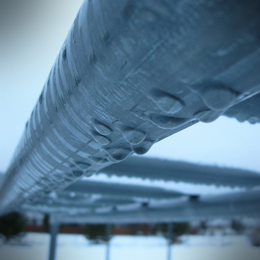
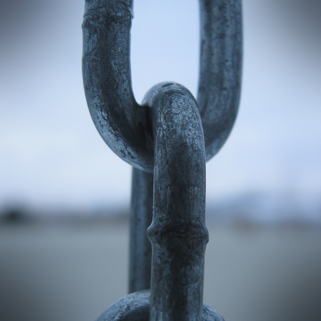
Instead, I went outside and took some photos of my swing set. The monkey bars had a cool line of water drops, and I thought the chain that the swings hang from would make a cool macro too. Since it was cloudy, and early in the morning, there was a very defined blue tint to the light. I set my white balance to "Cloudy," and my photos were still really blue. I probably should have set it to Tungsten or something to compensate, but I figured with "Cloudy," I would be getting an accurate representation of the light temperature.

click to enlarge, or see it on Flickr
Aperture: f/2.6
Shutter Speed: 1/40
ISO: 80
Tripod

click to enlarge, or see it on Flickr
Aperture: f/2.6
Shutter Speed: 1/60
ISO: 80
Tripod
The first photo was unadulterated as far as color goes. I didn't touch the levels, saturation, or anything else that affects color. I just added a bit of contrast and slapped on a vignette.
The second photo, which I'm much happier with, was played with more. I took some blue and a little green out and added a bit of red via the Levels box, and bumped the contrast down a little. It wasn't until after I cropped to square and added the vignette that I realized how close this looked to a Max Ash photo, whose effect I tried to copy in this post. Actually, I have a sneaking suspicion that his photos are HDR processed first, and THEN converted to monochrome, etc. I'll have to try that sometime.
Either way, not bad to have one and a half keepers from a shoot that consisted of 10 photos in my backyard. These will go into my "blue" mosaic, which will be similar to the "green" mosaic I did in this post, which is why I cropped to 1:1. I hope to do a lot of themed mosaics, as they're fun to put together.


I really like them both. What editing program do you use? I've seen you talking about white balance in a few posts -- you know that's easy to change in post, right? If you open it as a RAW file (even if you didn't shoot in RAW, which you should if you have the option), you can adjust exposure and white balance and a bunch of other stuff really easily. But I like the cool light in both of these. I wouldn't change a thing.
ReplyDeleteI found your blog via ^^ Amy's. I like both these shots, but number two really speaks to me - great work! Do you use a macro lens on this? Lovely shots!
ReplyDeleteI like the chain too! Sometimes it's the simple form that makes such an impact in a photo. I like the first one too - it has an industrial feel to it, but the water dripping from it makes it so interesting to look at! Nice job with the cool tones and the vignettes - I think these will look very cool in your mosaic!
ReplyDelete