
I decided I wanted to try to duplicate the effect. It quickly became clear to me that I would have to use a picture that would look good in B&W (or monochrome in general), and one that was a landscape. I didn't have any new photos that were unedited which fit that criteria, so I used an old one that you've already seen one flavor of. It's the lake scene from this post. I just dug up the original SOOC file and started over. Here's the result of my first attempt, followed by the steps I took to get it like that.
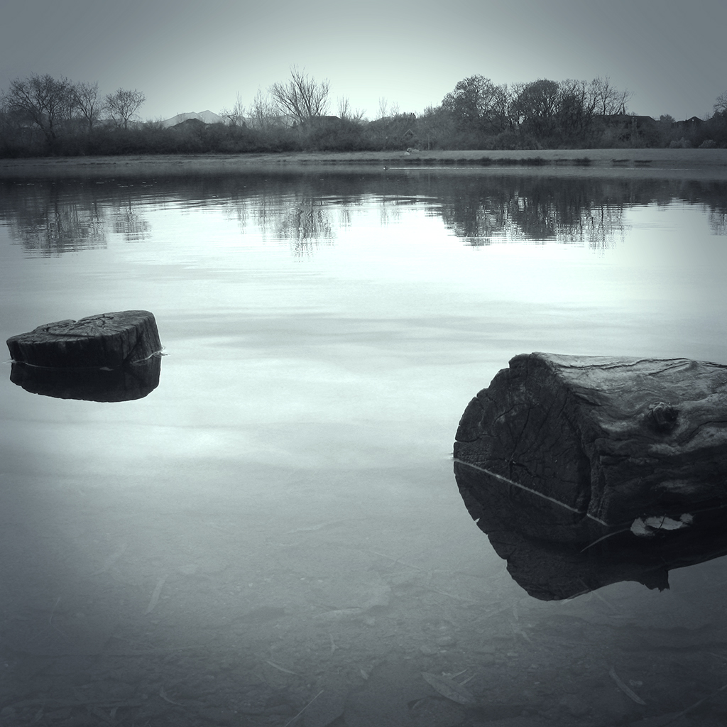
click to enlarge, or see it on Flickr
Aperture: f/4.5
Shutter Speed: 1/40
ISO: 80
Tripod
1. Cropped to square. I believe all of Max's "Echoes" photos are square.
2. Corrected color balance using a technique I learned today that I'll show you in some future post.
3. Black & Whited image using a technique I learned today that I'll show you in some future post. Yeah, I went on a DPS Post-Processing post archive binge.
4. Played around with some Orton Effect to try and get the mysterious, misty quality his photos have.
5. Realized that his photos have that quality because of actual mist in the shot, not tricky post-processing blurs.
6. Applied a Solid Color mask layer, and strove desperately to get the exact shade of blueish grayish greenish as well as the same opacity that Max uses. Failed, but continued anyway.
7. Applied a vignette. Max appears to use one that is moderately strong, and moderately large. I think mine is actually a little too intrusive in this image. Something to fix next time. Also, after a little head-scratching, I figured out that his vignette is color-cast as well, not black.
8. Applied a Levels Adjustment mask layer to fix my color and get it closer to his. Finally got the color pretty dang close.
9. Flattened and partially desaturated to get all qualities of my color cast matched up with Max's as precisely as possible. Got pretty close.
I think that's about it. A very difficult effect to reproduce, but for a first attempt, I'm quite happy. I think part of the reason his effect is so high-impact is that he uses it for every image in the series. So I think I'll shoot my own "Max Ash Effect" tribute series sometime. I've got a trip to Glacier National Park coming up in not too long, so hopefully I can get some good material from that.
If any of you want to try the effect, feel free. Hopefully you can get closer than I did. Post your results in the comments!

I like what you ended up with. Lovely image. I disagree with you about the vignette. It looks right to me.
ReplyDeleteI like this too. I think the vignette works here, and I do love the 1:1 cropping. I find myself using that format quite a bit, and especially for printing. I love this image in b/w and it has some great reflection and serene feel. I think you achieved a great result from your inspiration images!
ReplyDeleteMax Ash's photos are "wow". It pops to my eyes.
ReplyDeleteAbout cropping, I think 1:1 ratios is great, but you have to put the point of interest in the center. Or you can place it somewhere else in the photo, but you have to lead the viewer to it, maybe with line or any objects that'll lead the audience's eyes to your POI.
Sorry I haven't posted a comment for a while. This week has been very crazy. I've been getting ready for another show today. I just finished printing matting and framing a lot of photos.
ReplyDeleteI always enjoy your blog, and the work that you are doing. Keep up the great work. I'm learning a lot from you.
I like this photo and what you have done with it.