skip to main |
skip to sidebar
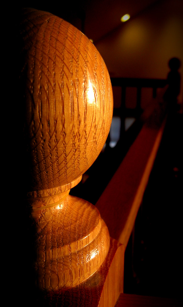
I took this photo yesterday during the sunset, and I liked it okay. The subject was good, but there was a lot of unavoidable clutter in the background. So I cropped it kind of weird to minimize background clutter, and then darkened the background out heavily.

click to enlarge, or see it on Flickr
Aperture: f/2.6
Shutter Speed: 1/30
ISO: 80
Monopod
The side lighting (due to the fact that this was taken at sunset) gives the banister some nice dramatic lighting. I cranked the contrast up in Photoshop a little, but not a lot.
To darken the background, I just masked out the parts I wanted to keep at original brightness using Quick Mask mode and a relatively hard brush, then duplicated the selected area into its own layer. It wasn't perfect; if you look at the top right "corner" area of the base (below the large sphere part), you'll notice some odd ghosting that happened from using too soft of a brush in that area.
Once I duplicated out the foreground, I really took down the darkness on the rest of the photo (in the original layer). Then I flattened and added a vignette.
Pretty easy, but I'm happy with how it turned out.
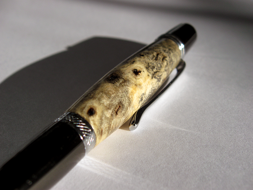
I decided that if my red mosaic is going to be interesting, then I can't show you all every photo before I finish and upload the mosaic. So today's photo is a macro of a pen I turned yesterday. The pen kit type is called the Wall Street II, and the wood is Buckeye Burl.
I've had this piece of Buckeye Burl sitting around for about three years. When I first got it, I was still relatively new to woodturning. I thought it looked ugly, and it's extremely porous, so I doubted it would polish well. Today, I looked at it and figured that, since it was burl, it would look much better sanded and under polish. The turning was easy because it's a light punky wood. The sanding was easy because for some reason, it seemed eager to sand to a very smooth sheen. I sealed it using cyanoacrilate glue (superglue). I actually had to seal it twice to fill all the air inside the wood. Then I finished sanding, polished it, and voila:

click to enlarge, or see it on Flickr
Aperture: f/2.8
Shutter Speed: 1/1250
ISO: 80Gorilla Pod
Enough about the woodworking though. This is a photo blog. From a photographic standpoint, I didn't do much to this in post. I shot it in direct sunlight, on top of a piece of regular 8.5x11" printer paper in an attempt to reflect some of the light more evenly. I'm not sure if that worked, but the lighting seems fine. I really liked the shadow cast by the pen, so I kept it. I didn't crop or change the saturation. All I did was use the following trick to get the white-balance exactly right. By exactly right, I mean that the tones showing on the monitor (at least my monitor) match the tones that your eye would see if you were looking at the pen in real life. This is useful when you want your photography to convey precisely accurate representations of what an object looks like. To achieve lifelike white-balance, follow these steps:
1. Create a new transparent layer over your background. Call this layer "Difference."
2. Edit>Fill the "Difference" layer with 50% gray.
3. Change the blending mode of the "Difference" layer to "Difference."
4. Your picture should look like a funky negative. Don't worry. It goes away.
5. Zoom in as far as your computer will allow.
6. Hunt for black pixels. Not just really really dark pixels. You need one that registers a hex code of #000000. I use the eyedropper tool to sample pixels until I get a black one.
7. Mark the pixel using the Color Sampler tool. To get the Color Sampler tool, right click on the eyedropper tool in your toolbar. It should be directly under.
8. Now delete the "Difference" layer. You only needed it to locate a pixel that was exactly 50% gray in your photo.
9. Add a Levels Mask Layer. In the box that pops up, make sure you click on the little eyedropper icon that is between the other two.
10. Click on your marked pixel. Press "Okay."
11. Flatten your image. Your white-balance should be perfectly neutral.
I've used a few different methods for changing an image to black and white over the course of my photography experience. Any built-in camera features should be... ignored. You can do a much better and more customizable job in Photoshop later. Straight-up desaturation is a quick way, but doesn't always give you the best results. I find it tends to flatten photos that had a lot of depth before. A Channel Mixer Mask layer gives you a lot of control, but I have trouble getting it to do what I want. This method gives you a surprising amount of control without being overly complicated. Here's a photo I used this method on.

click to enlarge, or see it on Flickr
Aperture: f/2.6
Shutter Speed: 1/8
ISO: 80Tripod
Actually, I think this photo looked better in color, with some saturation added. It was taken back in October 2009, and I dug it up today in a quest for a suitable image to monochrome for this post. But I needed something that showed the effects of this method, and this photo certainly does. Here's how it works:
1. Crop your photo to desired size.
2. Optimize it as you normally would (any levels adjustments, brightness/contrast, etc.) Leave out any saturation adjustments.
3. Duplicate the background layer. Name this layer "Hue."
4. Desaturate the "Hue" layer.
5. Change the blending mode of the "Hue" layer to "Hue."
6. Select the Background layer (should be on bottom)
7. Open the Image>Adjustments>Hue & Saturation dialogue box (cmd+u on Mac, ctrl+u on Windows)
8. Change the hue of the background layer around. You'll notice that some areas will go darker and some will go lighter, but since the monochrome layer on top is masking the color, all you see is adjustments in the brightness. I usually stop when I find a nice contrast-y setting that doesn't make my image look flat. Try playing with Saturation, too; it gives some interesting effects.
9. When you're happy, flatten your image and open Image>Adjustments>Brightness & Contrast.
10. Adjust your brightness and contrast as desired. I find that extra contrast helps solve the "flatness" problem that B&W images sometimes have.
If you use this method to black and white a photo and want to share it, feel free to post a link in the comments!
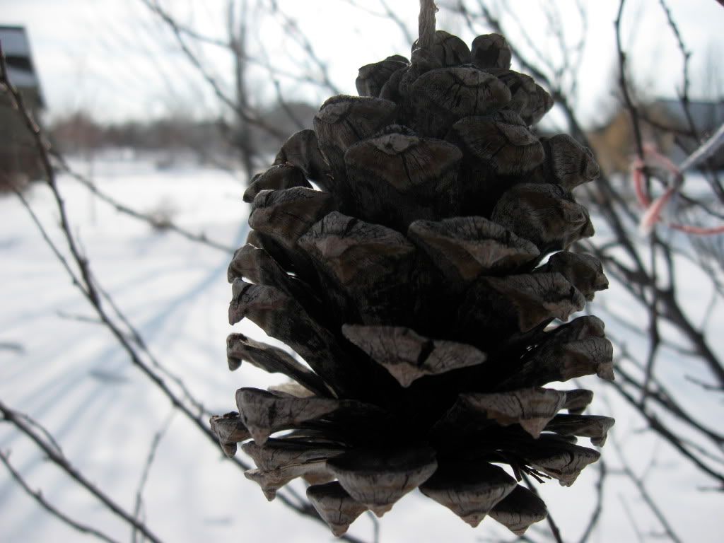
I took a shot just before I went inside after coming home from school today. Because of the angle I was shooting at, I had a hard time seeing my LCD display due to glare. So I just set the exposure to what my light meter said was correct, and fired. As a result, the subject of my picture was underexposed because of how bright the background was. The light meter had compensated to avoid what it saw as overexposing the background.

click to enlarge
Luckily, I had just read a tutorial on using masks to do partial corrections in Photoshop. Here's how it works:
1. Make a duplicate copy of your background layer.
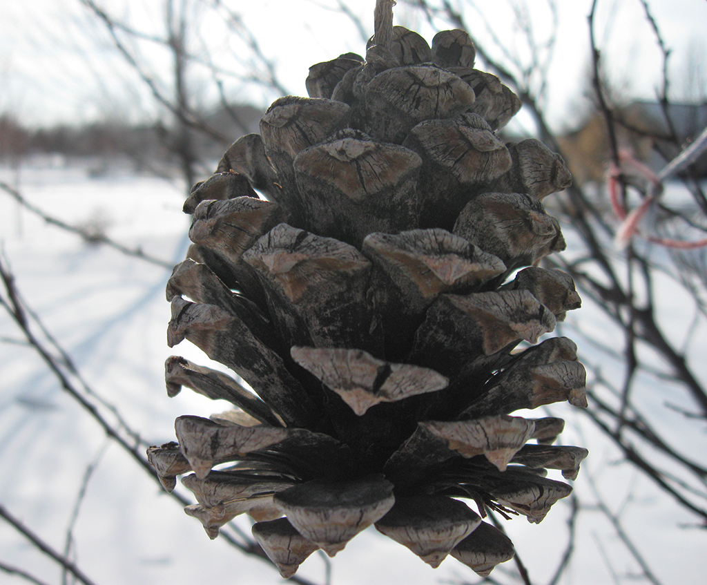
2. On the duplicate layer, make changes based on the area you want to correct. For example, the pine cone was too dark in this photo, so I upped the brightness, and adjusted the shadows until the pine cone looked good. The background was out of wack by then though.
3. Add a mask to your duplicate layer.
4. Use the paintbrush tool with black and white to paint out the area you want to show through. Remember "black conceals and white reveals." I used a soft brush with an appropriate size to paint away the background that was overexposed show that the original photo in the background layer showed through.
Here's my final result:

click to enlarge, or see it on Flickr
Aperture: f/2.6
Shutter Speed: 1/800
ISO: 80
Handheld
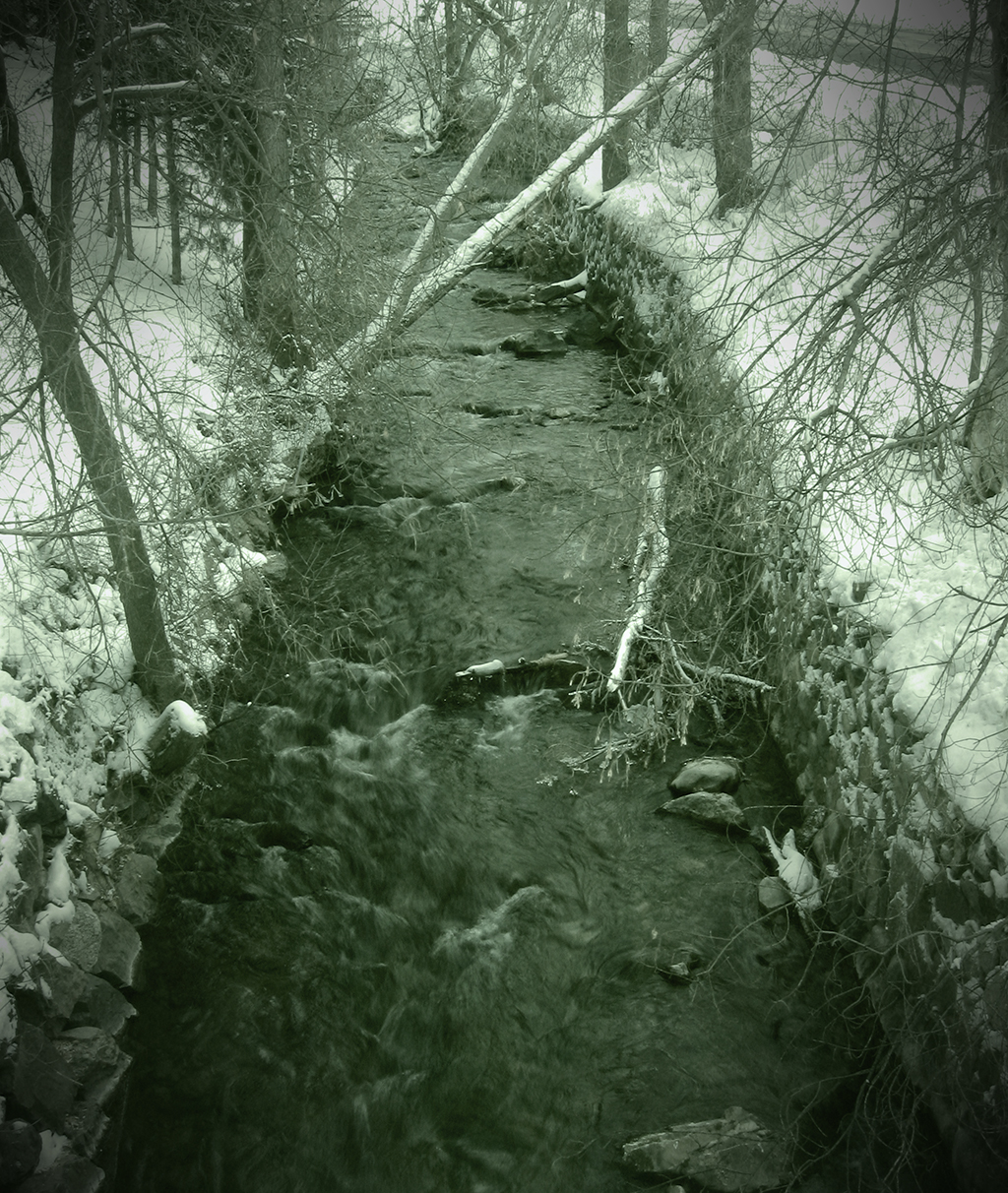
I went up the canyon near my house a couple days ago, and was able to snap one keeper before Mother Nature forced me back into the safety of my heated car. Having read about some cool post-processing tricks earlier, I decided to try one out. Quite frankly, it was more because I wanted to try the new technique out than because I thought it would look particularly good on this specific photo, but I'm pretty happy with the result.

click to enlarge, or see it on Flickr
Aperture: f/8
Shutter Speed: 1/8
ISO: 80
Handheld
When I first took the photo, I wasn't thinking with post-processing in mind, which actually led to some problems down the road. I wanted to increase the "cold" feel of the picture, so I shot with Tungsten white-balance. This added a lot of blue, but when I got it onto the computer, it looked kind of fake.
To get the effect, here are the steps I took in Photoshop.
1. Duplicate background layer.
2. B&W second layer with a Channel Mixer mask layer.
3. Put a Solid Color mask layer over at whatever opacity I used. I picked a dark green olive-ish color.
4. Flatten that out so I'm down to two layers again (1 original untouched image, 1 green monochrome).
5. Added a texture to my green monochrome image. It's super subtle. I think I only used 10% opacity.
6. Used the Levels box to remove some of the blue from my background layer. I took out enough that it probably posterized pretty badly, but that was taken care of in the next step.
7. Changed the blending mode on my green monochrome layer to Hue, played with opacity until the colors (olive green and cold blue) mixed to produce the color you see in the image.
8. Flattened, added a vignette.
This technique is really really fluid in that you can play with blending styles, colors, levels, opacity, or even paint-mask out parts of the colors if you want. I didn't even touch the Brightness/Contrast box after the final image was done, though in hindsight, I probably should have.
If you're crazy enough to try this technique (or a similar one), post a link in the comments. I'd love to see your results.
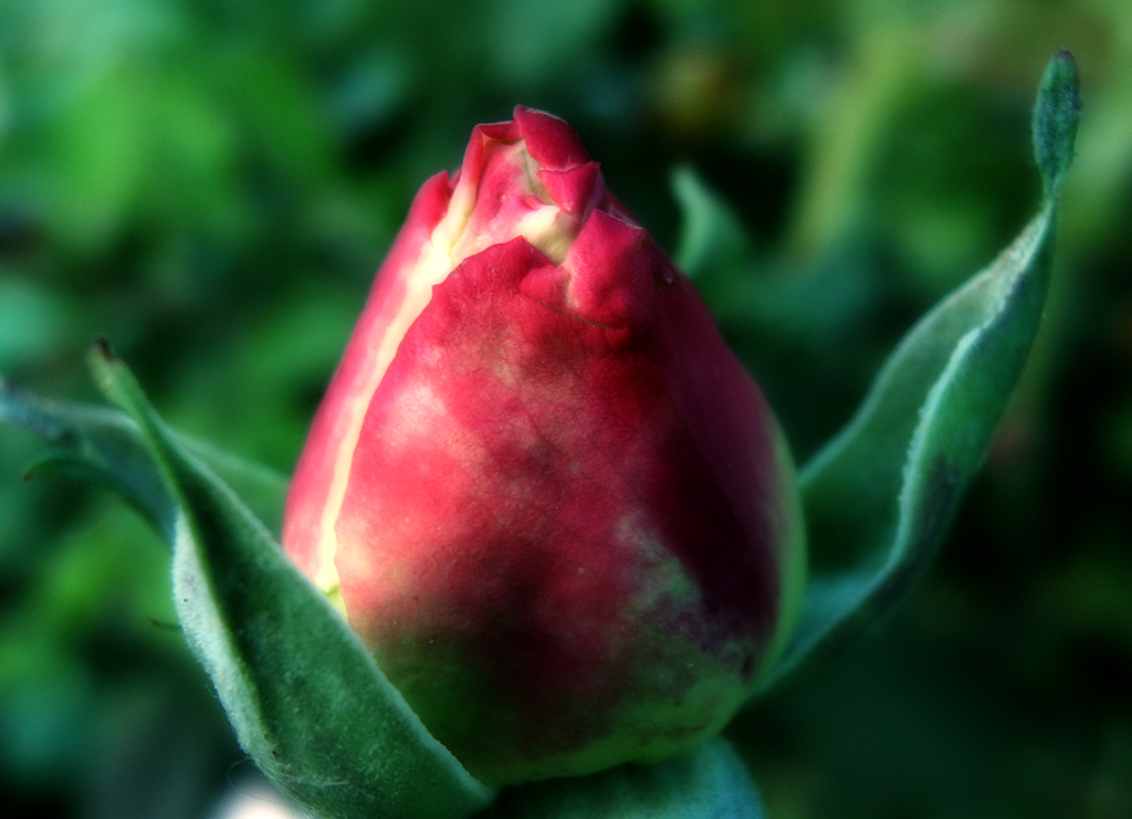
Remember the rose from this post? I figured since it wasn't as sharp as I generally like my macro photos to be, it would be a good one to try the Orton Effect on. I'm very happy with the results.

click to enlarge, or see it on Flickr
I've refined my Orton technique somewhat since my last post. Here's the process I used for this photo:
1. Finish any pre-Orton Effect editing you want to do (color corrections, curves, cropping, etc.)
2. Duplicate the Background layer. Name this layer "Screen."
3. Change the blending mode of the "Screen" layer to, you guessed it, "Screen."
4. Merge the two layers again. It should look overexposed—don't worry, this is not a mistake.
5. Duplicate the Background layer again. Name this layer "Blur."
6. Apply a Gaussian blur to the "Blur" layer. It should be strong enough to erase the details without erasing the general shape. This is one step where you can have some artistic license--more blur will result in a more impressionistic image.
7. Change the blending mode of the "Blur" layer to "Multiply."
8. Flatten your image.
9. Go back and re-adjust brightness and contrast as desired.
Again, this is a pretty subjective effect—one person might love what another person hates. So play around with layer opacity, blending modes, etc. I'd love to see your results in the comments!
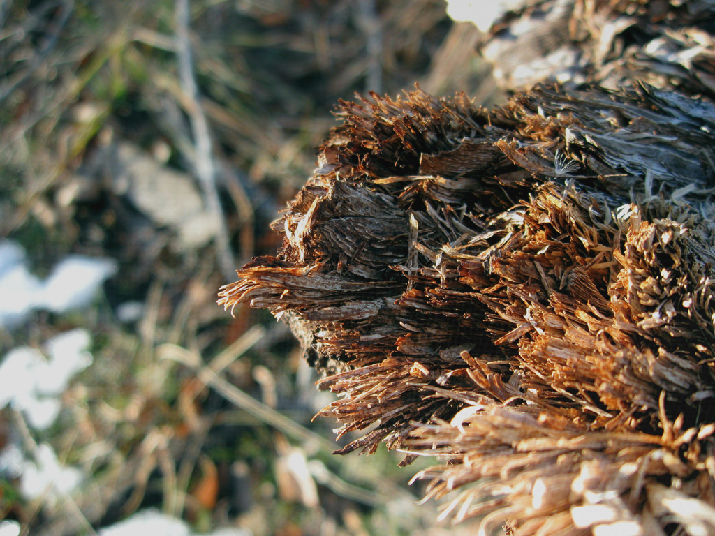
Textures are a great way to add a feel to a photo. They can take a relatively average photo and turn it into a great one. Here's a fairly boring picture I took today. It's a macro (just the camera's built-in setting though, I didn't have my macro lens attached) shot of some torn up bark. Because of the angle of the sun, it's quite contrasty, which I felt could be augmented by texturing a bit.

click to enlarge, or see it on Flickr
To utilize a texture, you must first have a texture. I would recommend doing what I did: spending about an hour wandering around somewhere, taking all the textures you can. I came up with quite the collection at the school. Good textures are everywhere. To expose a nice texture, you want it to be fairly uniform, and frame-filling, as well as uniformly lit. Generally, a nice neutral color is also desirable, although that depends on your taste. Also, you obviously can't use a texture taken with an 8 megapixel camera on an uncropped image taken by a 12 megapixel camera. So if you upgrade cameras... go on another texture rampage.
With a wide selection of textures at my disposal, I chose a very close-up shot of some linen. The fibers were individually visible. Here's how to apply the texture:
1. Finish any color corrections, cropping, etc. you want done on your image.
2. Open the texture file.
3. Copy it and paste it into a new layer over your image.
4. Size it to fit your image if it doesn't already.
5. Change the blending mode of the texture layer to "Overlay," "Multiply," etc. Whichever gives an effect you like for that image. For the above image, I used "Soft Light."
6. Play with the opacity. This is definitely a matter of personal preference. Mine is set to 60% in the above image.
7. Use a large, soft, low-opacity eraser to tone down any areas you think are a little overdone. I knocked some of the opacity off of the areas that were out of my depth of field (and therefore blurry) because they showed the texture a little too much.
8. Layer>Flatten Image
Have some good textured images? Post links in the comments.
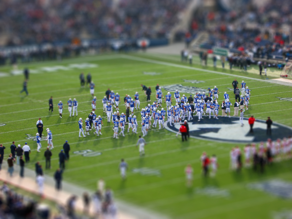
I went to a football game yesterday, and got some pretty cool stadium shots. First of all, let me just say that I'm extremely impressed with the Image Stabilization technology on my PowerShot A590. I was at 4x optical zoom, shivering with cold, and without even a monopod, shooting with a shutter speed of about 1/25th. My results were still this clear.
Anyway, turns out stadiums are perfect fodder for applying fake tilt-shift. I like my New York shot better from a purely photographic standpoint, but as far as faking the tilt-shift effect, this picture turned out quite a bit better.

click to enlarge, or see it on Flickr
This photo is slightly too busy to view in such a small size, so I highly recommend the larger view.
Anyway, I decided to go ahead and give a quick-and-dirty tutorial on how to fake tilt-shift in Photoshop.
1. Get an appropriate photo. Big shots taken from high up of large amounts of landscape tend to work best, as they are cool to see in "miniature."
2. Do any cropping or editing you wanted to do before you apply the tilt-shift effect. I would recommend leaving the color corrections out; as that is changed while applying the effect anyway.
3. Go to Quick-Mask mode.
4. Select the reflected (cylindrical) gradient tool.
5. Make sure your foreground and background colors are set to default (black and white).
6. Click and drag, starting from where you want the in-focus part to be, out to the edge of the photo. Follow the natural "line" of the photo. In most cases, this line should be pretty close to vertical. In the above photo, I tilted it a bit to the left. In any case, once you're done, you should see a red gradient covering your photo
7. Get out of Quick-Mask mode. This converts your gradient to a selection.
8. Apply a Filter>Blur>Lens Blur with whatever setting you feel appropriate. I think mine was set to about 90% strength. If you have an earlier version of Photoshop, a Gaussian blur will do (you just won't get that kind of "bokeh" look). This blur simulates a very narrow depth of field which your brain associates with macro photography. It's what tricks your eyes into thinking the shot is of a miniature.
9. If you don't like the way the blur turned out, undo it and try again. Otherwise, boost the saturation on your image by quite a bit. This makes the subject(s) look plastic-y, and contributes to the "scale model" feel. Do the same with contrast. If you have "toys" in mind as your desired result, you shouldn't have a problem finding the right saturation and contrast.
Congratulations! I would love to see some of the tilt-shifts you guys make. They're a lot of fun. Post links in the comments.
Vignettes come in two flavors: real and fake. Real vignettes happen when a part of your lens blocks the imaging sensor in the corners, and in extreme cases, the edges, from being exposed. Fake vignettes happen when you wish there was a real vignette, but there's not. Just Photoshop.
Vignettes are nice because they draw your eye naturally to the center of the image. The biggest thing to remember with vignettes is that they can be easily overdone. A little goes a long way. Here's how I do them in Photoshop:
1. Do all edits on your image you want done. Vignetting comes last. For the image in this post, I did some minor rotating and cropping, and added a very subtle texture.
2. Make a new layer. Name it "Vignette."
3. Fill the Vignette layer with white.
4. Set the Vignette layer's blending style to "Multiply."
5. Use the elliptical marquee tool to select the area you want vignetted. I usually start dragging from one corner to the opposite to insure I get a symmetrical selection, then Select>Modify>Expand as desired.
6. Invert the selection.
7. Fill the new selection with black.
8. Filter>Gaussian Blur. I use 250 pixels (maximum).
9. Dial down the Opacity of the Vignette layer. I used 50%.
10. Flatten your image. Voila!

click to enlarge, or see it on Flickr
Let's see it: post links to your well-vignetted images in the comments.