skip to main |
skip to sidebar
I don't recall if I've posted about my guitar on this blog or not, but I finally generated a nice photo of it.
Long story short, I started building a custom guitar for myself about 18 months ago (last July). Lots of things like school, etc. got in the way of my having as much time as I wanted to work on it, so it took a really long time. But now it is very nearly finished. I am expecting to sand flat the last 10 coats of lacquer and then cut polish to a finish this Wednesday.
But for the time being, the guitar looks awesome in the sunlight. The slightly excessive amount of lacquer on it is extremely reflective, but not yet flat; so the reflections take on interesting textures.

Aperture: f/2.8
Shutter Speed: 1/125
ISO: 100
Focal Length: 50mm
Handheld
I'm proud of the guitar, and have been enjoying playing it—the tone worked out to be exactly how I planned it back when I was first selecting my materials.
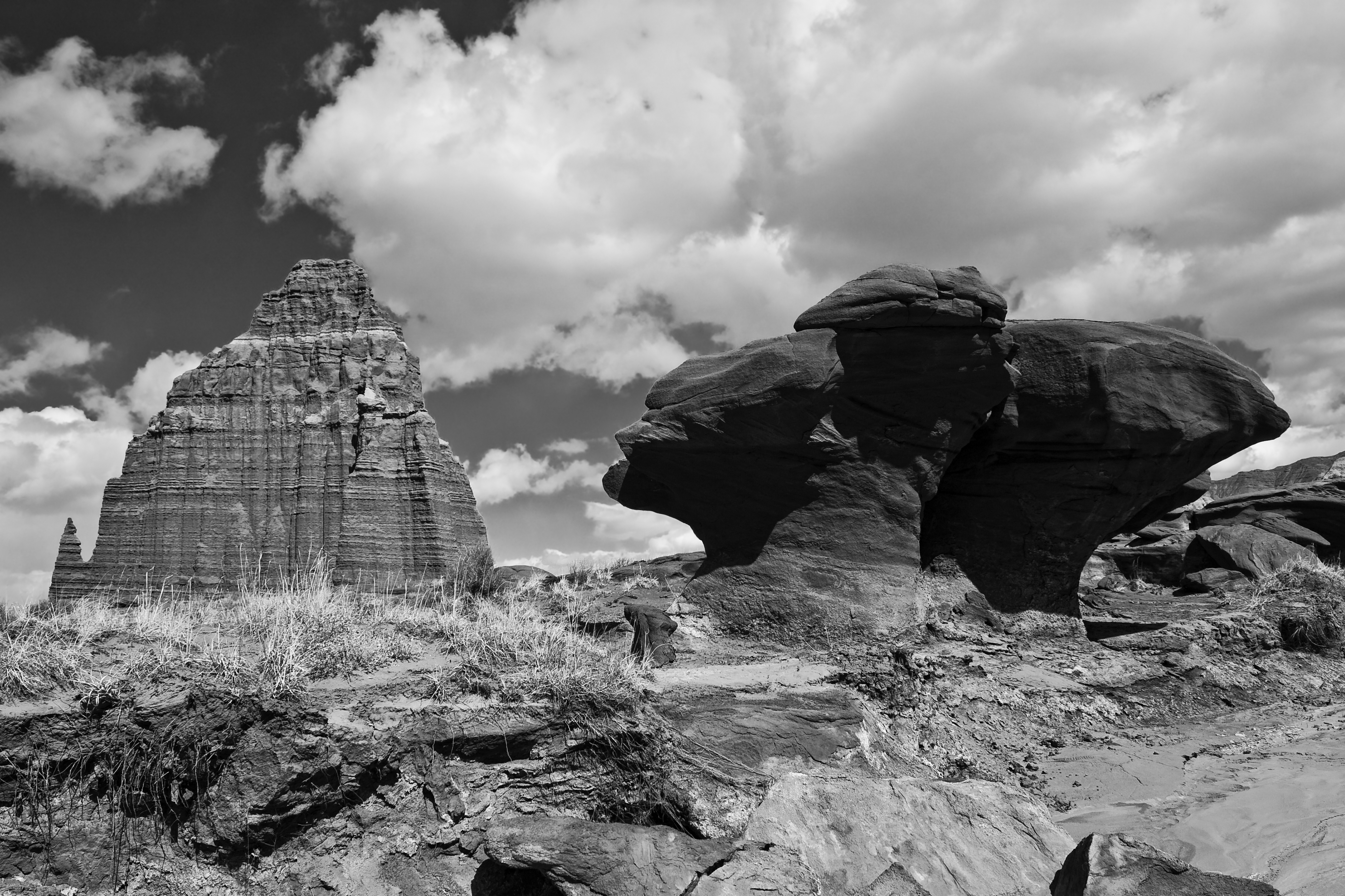
I just got back from a lovely vacation with my dad, where we hit various photo locations, saw family, etc. One of my favorite pictures from the trip was taken at Seal Beach in Orange County, California.

Aperture: f/16
Shutter Speed: 1/20
ISO: 100
Focal Length: 18mm
Tripod
It was an uncharacteristically cloudy and rainy day at the beach, which had several nice side-effects: diffuse light, awesome moody clouds (recovered from the RAW file via Lightroom), and very few people at the beach to clutter up my shot. The one guy standing about halfway down the pier kind of bothers me, but he fits in with the shot okay, and I didn't want to spend an hour cloning him out.
Anyway, I got this and a whole bunch of other shots I'm very happy with on the trip. More to come as I get around to editing them.
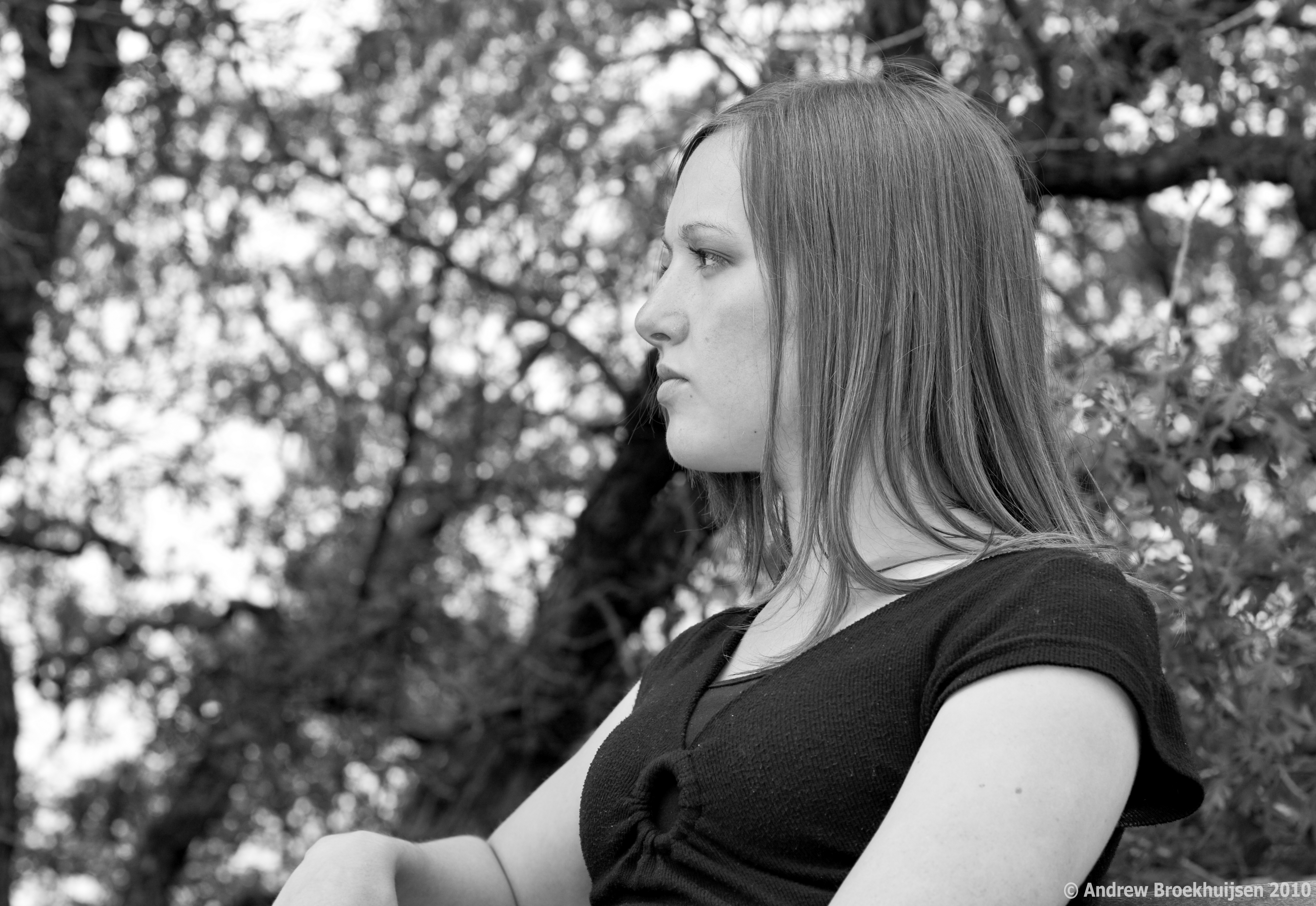
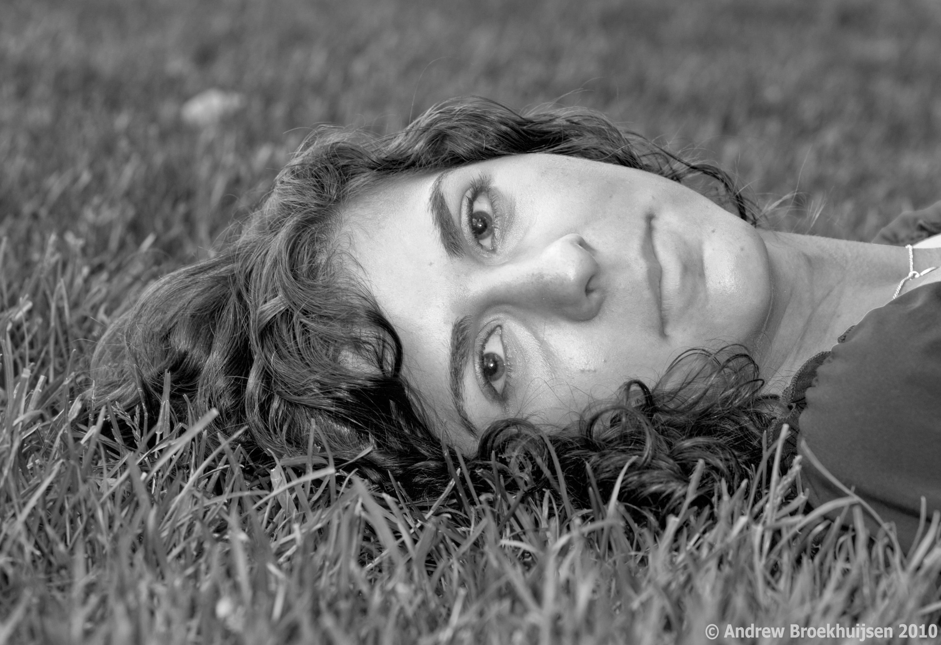
To finalize and round-off my portfolio before I print it, I've been going portrait crazy for the past week. I decided I had enough "standard" style portraits in there, so I went for a couple of different-ish ones.

click to enlarge, or see it on Flickr
Aperture: f/5
Shutter Speed: 1/200
ISO: 100
Focal Length: 50mm
Monopod

click to enlarge, or see it on Flickr
Aperture: f/4
Shutter Speed: 1/100
ISO: 100
Focal Length: 50mmHandheld
I mostly decided to go black & white because it makes the photo's tone a little more serious and reflective, which helps compensate for models that have a hard time not smiling. :)
Anyway, these are the last two portraits I'll show you for a while. Last night I did some fun light painting with a new remote shutter release I bought (infrared) at a sick discount from the camera store where I work. Makes things very fun. And in case you were interested, tomorrow I buy a joystick-style ball head for my tripod and monopod. Buying camera gear is the bomb.
In other news, today I began construction on my official website at http://www.andrewbphotography.com. There's a link on the side of this page if you don't feel like typing. It won't be done until sometime this week probably. I am also looking at a real domain name (andrewbphotography.com) and pricing for a host, etc. So this site might not be around for very long. We'll see. Hopefully this will help me get some paid portraiture work over the summer and kind of jump-start my semi-pro photography "career."
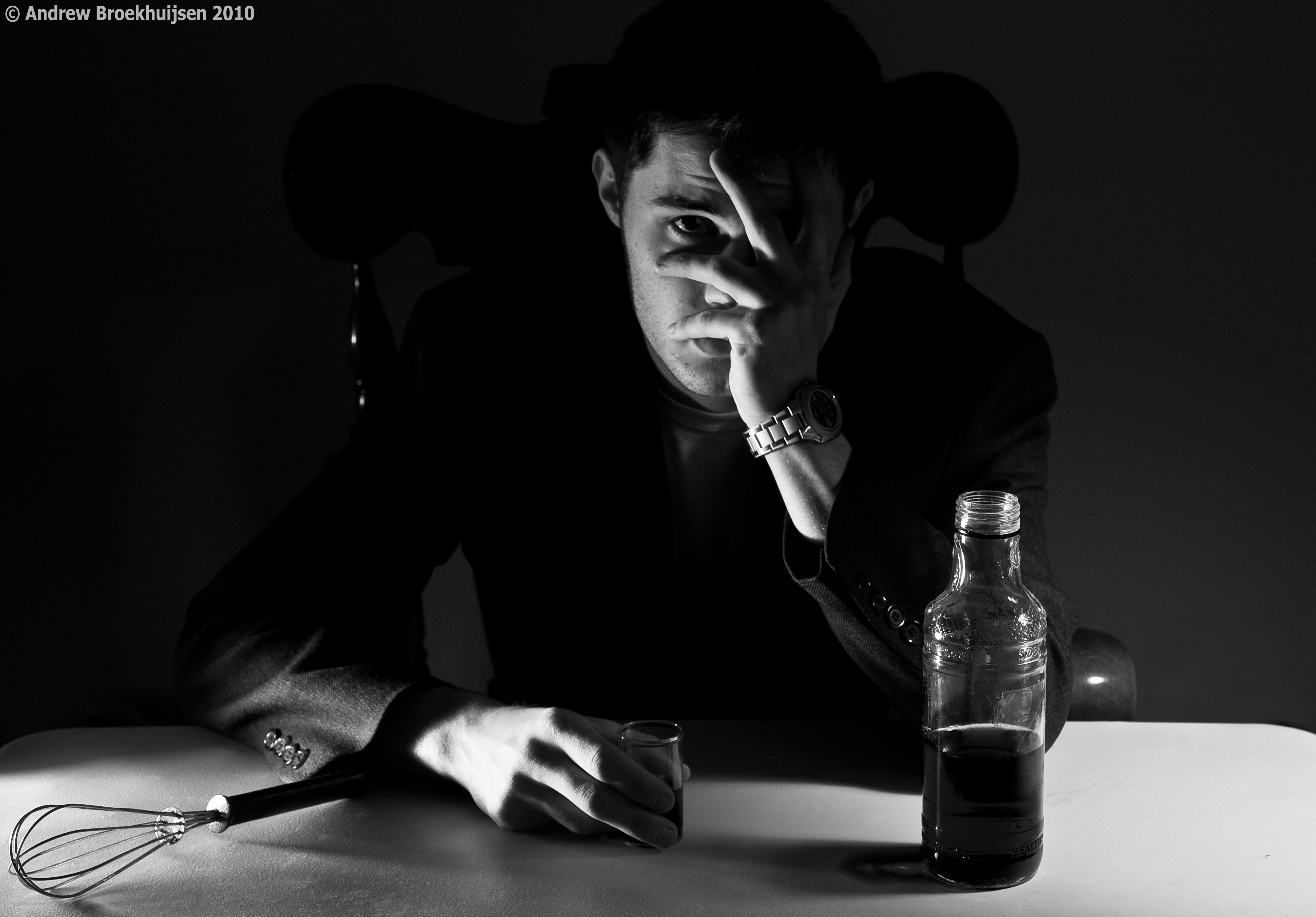
I was in a creative mood today, so I decided to try something interesting. Before I go any further with this post, I've realized that I need to explain what "Assassin" is, which will both help this photo make a lot more sense, and explain the title of the photo from this post.
Assassin is a game being played at my school by about 70 people right now. Essentially, we are given a "target" by the person running the show, and our job is to eliminate that target using a whisk. Then we report our kill, and receive a new target. We are also being constantly hunted by someone else, but we are not told who. I always need to be watching my back. Last man standing wins $50. It's a blast.
Anyway, I decided to take somewhat of a satirical picture showing what might happen to us all psychologically in the long run.

click to enlarge, or see it on Flickr
Aperture: f/5.6
Shutter Speed: 0.6 seconds
ISO: 100
Focal Length: 42mm
Tripod
The lighting and setup for this shot was ridiculously complicated. I used three separate desk lamps, each with a custom-shaped DIY snoot. One was about 10 feet to the left of the camera, about the height of my head, pointing at my face and the chair. That light provided the illumination on the right side of my face. There was another one just to the left of the camera, barely above the level of the table, and pointing slightly up. That one provided the illumination on my right hand and the wire whisk. The last light was on the right side of the camera, higher up, lighting the back-right corner of the table, which provided most of the ambient light as well. Other than those three directional desk lamps, the room was pitch black.
The "beverage" was actually just water with green food coloring. I chose green because there was no other green anywhere else in the shot, so I figured it would give me very independent control over the tone of the liquid. That idea worked out nicely.
I'm extremely pleased with the way the lights behaved. It took a lot of effort and experimentation. I had no assistant, which meant I was stuck with guessing at pre-focusing, setting the self-timer, hitting the shutter release, running to the chair and posing, then checking out the results. Then I would tweak the lighting slightly, rinse, and repeat. In the end though, it paid off. It's nice when plans come together perfectly, with the lighting, pre-planning of drink color, etc. for post processing, and everything else that went into the creation of this shot.
Up front, I'll apologize for not getting posts out recently. I was gone on a hike all day Friday and Saturday. On the bright side, I got a few good photos on the way. Also, if the weather decides to cooperate instead of snowing again (yes, in MAY), I'll have a new calendar out tomorrow.
Anyway, here's my favorite photo from the trip.

click to enlarge, or see it on Flickr
Aperture: f/11
Shutter Speed: 1/250
ISO: 100
Focal Length: 18mm
Handheld
I love the way the clouds look when you shoot at a wide angle. One of the first lenses I will buy is a really, really wide one for shooting breathtaking landscapes.
This was taken about 2/3s of the way through the 18-mile hike. It was grueling, and it really put things in perspective for me when I could be standing on top of the most recent hill, take a photo like this, and then realize that about an hour or so previous, we were beyond the farthest mountain visible in the shot. I'm glad I did it though, it was a cool experience.
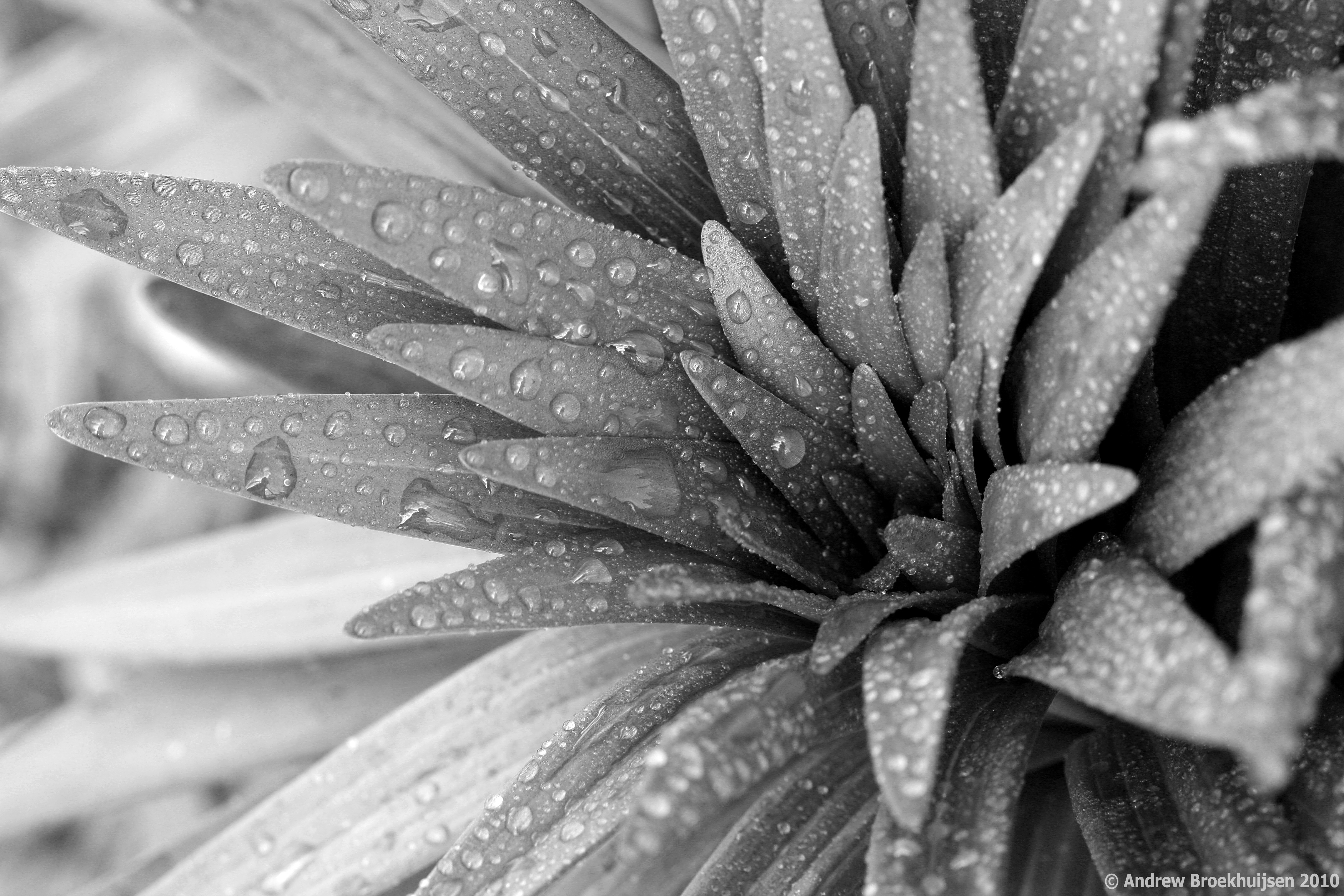
In celebration of Earth Day, I went way out of my comfort zone and took a nature macro photograph. Sadly, I forgot to shoot in RAW as I had left my settings on JPG last time I used the camera. Bummer, especially since this was a planned B&W conversion.

click to enlarge, or see it on Flickr
Aperture: f/8
Shutter Speed: 1/10
ISO: 100
Focal Length: 100mm
Tripod
I'm still pretty happy with how it turned out though. Not as much contrast as I like due to the JPG format, but I'm okay with that. Since I used my newest friend, the spray bottle, to take this, I should have no problem going for a redux later on.
One really interesting thing to do is zoom in to 100% on the full-res image by clicking the photo itself. Check out individual droplets. A lot of them have silhouettes of the tripod, me, the camera, etc. in them.
First of all, an exciting announcement: I finally buckled and bought a Pro account on Flickr. The cool part of this is, (among other things) I can now upload my photos in their original resolution. Woot!
So one thing I learned while reading up on how to take better landscape photos is that you need to consider the foreground of the shot as well as the background. Having one point of interest in each area of the photo allows for a better picture that people are more inclined to look at for a long time.

click to enlarge, or see it on Flickr
Aperture: f/11
Shutter Speed: 1/250
ISO: 100
Focal Length: 18 mm
Monopod
I'm not as happy with this photo as I was with this one, but it didn't turn out too bad, and it's a good one to illustrate this concept.
Here's a really simple technique that I had fun experimenting with. With film SLRs, you could literally expose your film twice. You would just leave the camera on a tripod, underexpose a photo by one stop, rewind the film, move something in the photo, and expose the same frame again. With digital, it's pretty hard to do that in-camera. But it's really easy to do it in Photoshop (or GIMP, or any other editor that supports layers).

click to enlarge, or see it on Flickr
Aperture: f/3.5 (both frames)
Shutter Speed: 4 seconds (both frames)
ISO: 100 (both frames)
Focal Length: 23 mm (both frames)
Tripod
First, set up your camera on a sturdy tripod. For the best results, you need to keep the camera perfectly still between shots, otherwise you'll end up with ghosting. For this reason, I chose to shoot inside, because it was a rather windy day. It was kind of dark in this room, which explains the long shutter speed.
Anyway, for digital "double exposure" photos, you don't need to worry about underexposing by a frame or anything like that. Just take two photos with the subject (in the example above, it's me) moving between them.
Then load into Photoshop. I converted to black and white because the color temperature and stuff looked really awful. The technique would probably work just as well in color. Once you have any corrections done (make sure they're exactly the same for each photo), simply copy and paste one photo over the other in a new layer. The blending mode should stay on "Normal." Then change the opacity of the top layer to 50%. This will make a balance between the exposure of your subject in each frame. If you wanted one to be fainter, adjust the opacity accordingly.
That's it! Flatten the image and crop if desired. I think I will be having a lot of fun with this technique.
This is one of the best landscapes I think I have ever produced.

click to enlarge, or see it on Flickr
Aperture: f/11
Shutter Speed: 1/250
ISO: 100
Focal Length: 18 mm
Tripod
It really needs to be viewed as large as possible. I wish I could offer more than 1024 pixels wide, but yeah, Flickr. The custom black & white controls in Lightroom and shooting in RAW made all the difference here. I'm seriously considering getting this printed in a large-ish size.
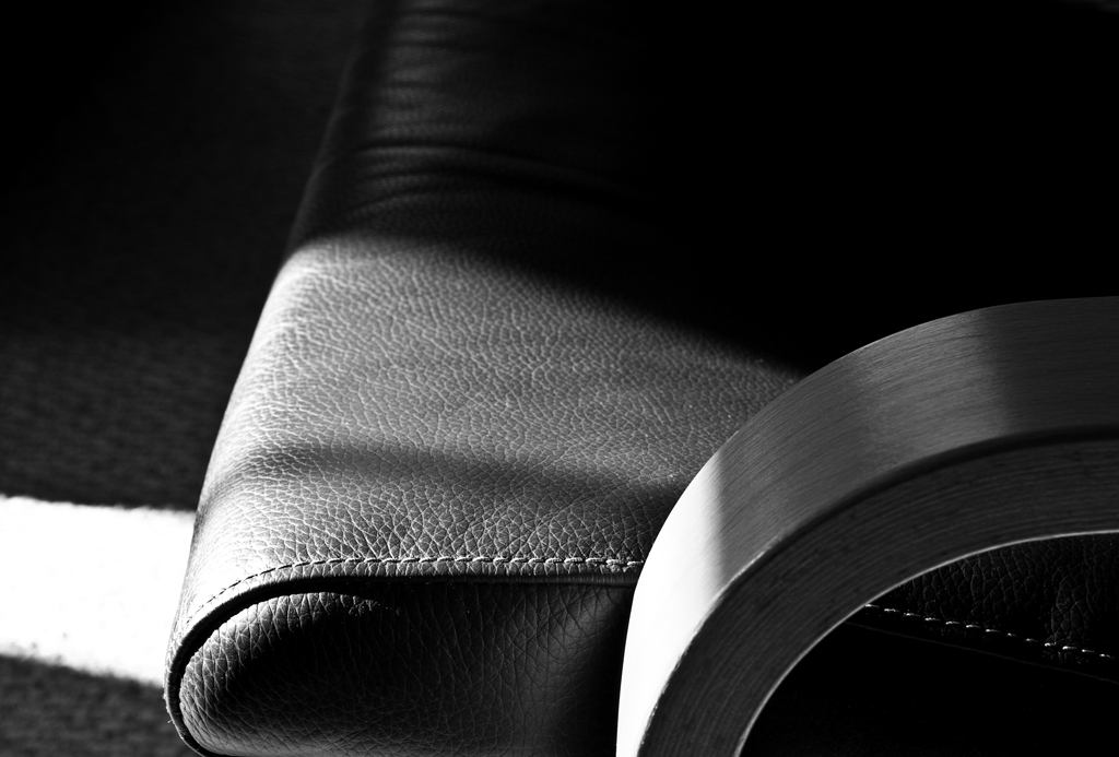
I was reading tips on how to take better still-life photos a while back, and one site said that, especially if you're planning on converting to monochrome, contrasty side lighting is usually desirable. Today, I noticed that a piece of furniture in our house was getting hit with some powerful side lighting from the sun shining through our windows.
So I busted out the camera and tripod and tried it out. I must say I'm pleased with the results.

click to enlarge, or see it on Flickr
Aperture: f/11
Shutter Speed: 1/10
ISO: 100
Focal Length: 49 mm
Tripod
The sun provided much stronger light (and therefore even more contrast) than the desk lamp I use for artificially lighting smaller subjects ever could. The texture on the chair really stood out with the side lighting (which, now that I think about it, is something I learned in my digital photography class: side lighting enhances texture).
The only thing I'm not super happy with is the composition. Too much going on in the bottom right, not enough in the top left. But oh, well. You can't win them all.
Anyway, on an unrelated note, at about 5:00 today I'm heading out to shoot Prom photos for a few of my friends and their dates. I read up all about how, and my dad showed me what I need to know about using his speedlight, so I should be set to get some very good results. I'll almost definitely post about that tomorrow.
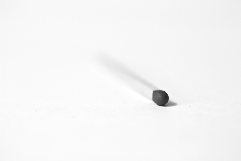
The weekend photograph challenge at DPS right now is titled Less is More.
I decided to participate.
Anyway, here's my submission:

click to enlarge, or see it on Flickr
Aperture: f/2.8
Shutter Speed: 1/8
ISO: 100
Focal Length: 100 mm
Tripod
I took this as simply as possible. Just a white background (paper), a very simple subject, a small depth of field, black and white with no tint, no crop, no vignette, and centered composition. And I'm now completely convinced that Less really is More. I prefer taking and looking at simpler photos in general. Perhaps that's why I like macro so much; it tends to exclude noisy or busy details and really focus in on just one thing.
Let me start by saying, I'm not particularly pleased with this shot. I don't think it's very good. It's not bad, it's just not great.
Anyway, an exciting day in the construction of my guitar. I've moved on to assembling the box, which means I'll be done soon, and finally able to play it. This is just a photo of the fretboard (which I finally finished inlaying, and sanded flush). It's boring in black and white, but it was even more boring in color.

click to enlarge, or see it on Flickr
Aperture: f/9
Shutter Speed: 1/20
ISO: 400
Focal Length: 55 mm
Monopod
The dust-looking stuff is probably mahogany sawdust. The worktable was pretty covered in it.
Anyway, hopefully I'll be more inspired to take an interesting photo tomorrow.
Oh, boy. I borrowed my dad's 100mm macro lens yesterday, and it reminded my why I love macro so much. With a combination of live view, careful and fine-tuned manual focusing, the amazing macro lens, careful lighting, my tripod, and shooting in RAW, I was able to get this shot:

click to enlarge, or see it on Flickr
Aperture: f/5
Shutter Speed: 6 seconds
ISO: 100
Focal Length: 100 mm
Tripod
The lens is beautifully sharp. When zoomed in to 100% magnification on the full-res image, I could not detect any blur at all. RAW, as usual, gave me optimal control over my tones in B&W. I kind of wish I had been more creative with the lighting, but oh, well. At least I got some nice depth.
This makes me even more excited to get my own macro lens. The one I'm looking at is the f/2.8 50 mm made by Canon, and I'll probably pick up an extension tube with it to get closer focusing distances.
While shooting a redux still life a couple of days ago, I found out something that has rocked my photography world. It may sound obvious to you more seasoned photographers out there, but it has completely changed the way I think of this kind of photography:
When you're the guy setting up objects for the shot, you get to be the guy controlling the light, too. All of it.
When I put it to words, it sounds like something that should be followed up with a quick "uh... yeah. Duh." But seriously. I was re-trying the chess piece shot from this post in an attempt to make it better, and it kind of hit me that I wanted to control where the shadows from the chess pieces went. I went and grabbed a portable light that I use in the woodshop and tried a whole bunch of different configurations. It was really fun. Eventually, I decided that this one was the keeper:

click to enlarge, or see it on Flickr
Aperture: f/7.1
Shutter Speed: 1/5
ISO: 100
Focal Length: 33 mm
Tripod
An interesting story about this photo: I tried editing it in the style of my series, Motionless. I absolutely hated what it did to my photo. Something in me strongly objected the to vignette and the tint, to the point that I just couldn't leave it that way. I deleted that version and started over until I got it how I liked it.
So a good day for photography. I learned that controlling the light = win, and that in post-processing, the photo really is the boss.
This is just another B&W still life shot in RAW. I've ranted about the benefits of monochrome shot in RAW enough, I think. You get the idea.

click to enlarge, or see it on Flickr
Aperture: f/8
Shutter Speed: 2 seconds
ISO: 100
Focal Length: 43 mm
Tripod
Once again, I hate the composition on this. I guess that's a good thing about shooting B&W photos though: I tend to notice things like that more, and it should force me to become a better photographer, which is the whole point.
I think I'm going to try experimenting with some color tints on my still lifes, just to give them a bit of flavor. We'll see where this goes.
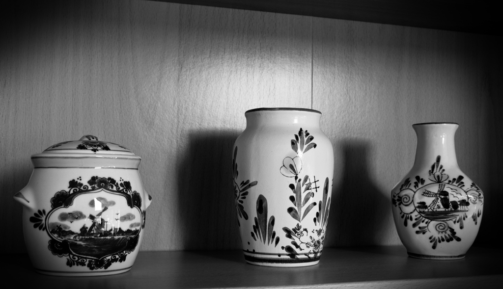
I have fallen in love with another specific form of photography. Monochrome still-lifes. Monochrome in general is so lovely when I have the flexibility of RAW. I've noticed a HUGE difference.

click to enlarge, or see it on Flickr
Aperture: f/11
Shutter Speed: 0.6 seconds
ISO: 100
Focal Length: 27 mm
Tripod
I'm not extremely happy with the composition on this. Lines, etc. become even more important than usual when you shoot monochrome, because there isn't color to distract your eyes. So in an attempt to mask some of the lines that are leading the eye in stupid directions, and just generally keep the focus on the center, I added a not-so-subtle vignette. It helped, but I still need to figure out better composition when shooting things like this.
I really like the contrast though, and the shadows behind the vases looks pretty good, as well as the kind of flare of light on the wood.
Man, Nature Macro photography is going to be so jealous.
Ansel Adams, for those of you who don't know, is probably the most famous black and white photographer of all time. I recently read an article about him, which described his approach to photography, and his "zone system."
I won't go into great detail, but basically, Adams was about getting the sharpest possible images of landscapes, and then expanding the tonal range of the photo to get stunning results.
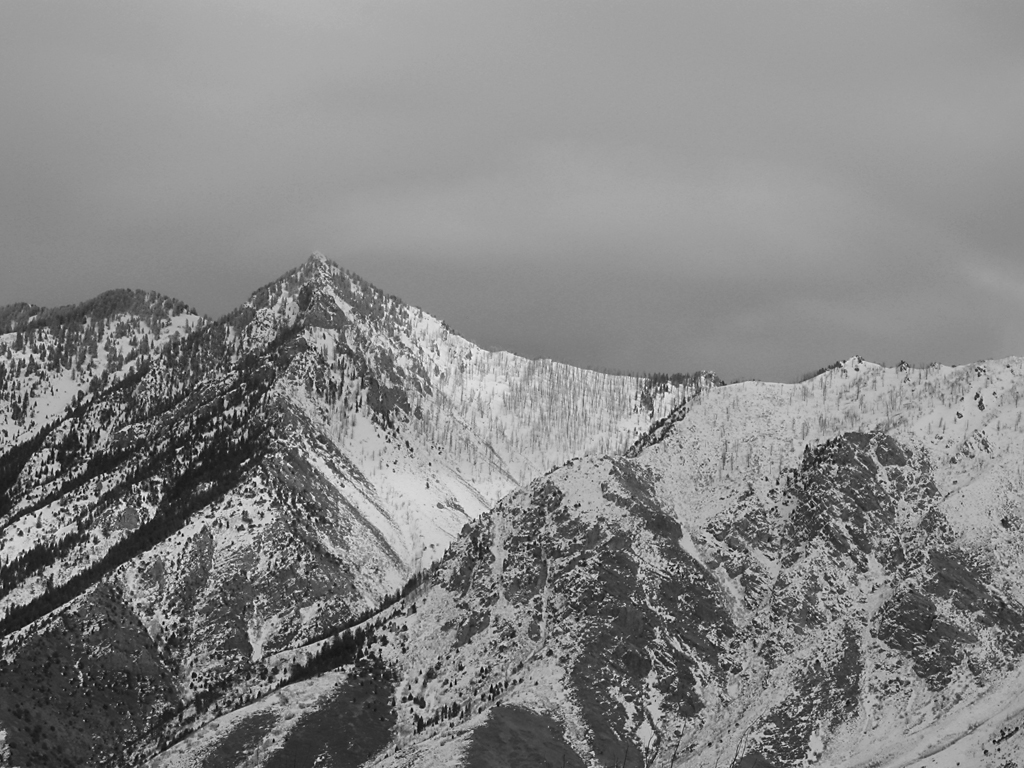
I wanted to try an Ansel Adams-style B&W today. Here's how it turned out.

click to enlarge, or see it on Flickr
Aperture: f/7.1
Shutter Speed: (5 exposures)
ISO: 80
Tripod
The way around the relatively low (compared to an eye) dynamic range of a digital camera is similar to HDR. So similar, in fact, that I use the same program as I do for HDR: Photomatix. Apparently, snow should be exposed at Zone 7 if possible, which basically means it should be very white, and close to losing detail, but not washed out. So to expose this image, I used "spot" metering on my camera, and pointed it at the brightest spot in the image. It's pretty close to the center; right where the snow is purest. Your camera's meter wants you to expose everything at Zone 5, which is a "proper" exposure. Every stop on your camera is a Zone, so to get Zone 7 snow, I bumped it up two stops from what the meter told me to. From there, I took another photo at every stop going down until my histogram had no more white pixels. For this photo, that was 5 exposures.
In post-processing, I put the 5 images into Photomatix, and told it to "average." This gave me a nicer-looking image, but more importantly, expanded the number of tones I had to work with. From there, I applied a Channel Mixer Mask layer to desaturate the image, and bumped up the contrast quite a bit (which I could now do without worrying about posterization). Now I had my Zone 7 snow, but the trees were in Zone 2 or 3—dark, but with some detail. This is better than just getting an "average" exposure where my snow is probably at Zone 6, and my trees and rocks are at Zone 4 or 5.
Finally, I applied an Unsharp Mask to really make the details pop, just like Ansel Adams liked it. I know you're not supposed to do this until you're ready to print, because it's a destructive editing technique, but I have no plans to print this. It's kind of a poor photograph—not a very good vantage point, and nothing interesting in the foreground. I just wanted to test out the Ansel Adams approach to landscape photography.
Link me any images you try with this technique in the comments.
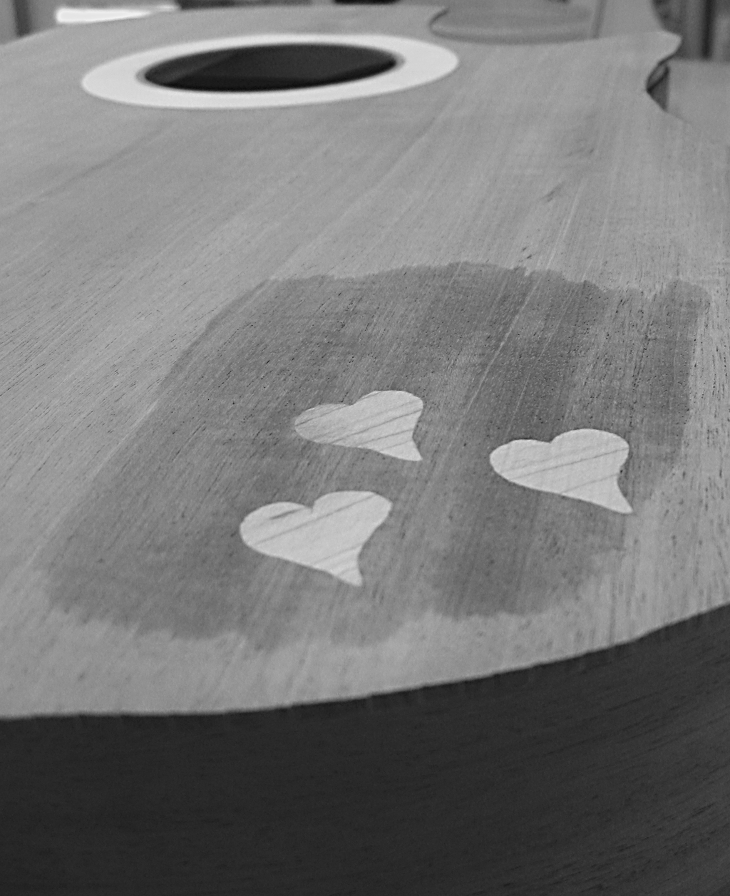
The last guitar-related picture I posted was a picture of machine heads that weren't intended for my guitar (and actually, wouldn't even work for it, as I'm not building a classical guitar). But this photo is actually one of my own guitar. It looks like the main body of the guitar is completed, but it's not. I just put the back on the table, the sides (which aren't completely done being bent, but really close) on top of that, and the soundboard on top of that, to get a rough feel for what it would look like completed.

click to enlarge, or see it on Flickr
Aperture: f/2.6
Shutter Speed: 1/80
ISO: 80
Handheld
I started this shoot off just wanting a few pictures of my guitar for documentation purposes. Then I figured I might as well try to get some shots of real photographic value. I was in kind of a hurry though, so I didn't put on my macro lens. That's why this isn't as sharp as most of my macros—I was a little too close for my camera's built-in setting.
The wet spot is due to me putting water on the guitar. It gives a fair approximation of what the wood will look like under polish, so I just wanted to see what that area would look like. The wood in the soundboard is Honduras Mahogany, and the inlaid hearts (and rosette) are hard rock maple.
I liked it better in monochrome, so I stuck with that. Other than that, I just wish I had composed this a little more carefully. I was able to crop out most of the clutter-y, distracting background, but not all of it.
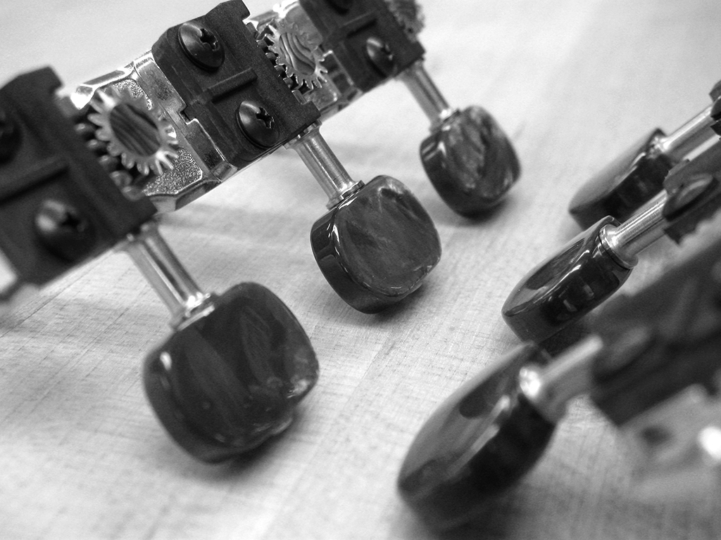
Yesterday as you know, I was in the woodshop working on my guitar. The guitar you saw hanging in yesterday's photo belongs to the guy who is letting me use his shop (and equipment... and sometimes wood... yeah). It's really close to being finished, and while I was there, he showed me the custom machine heads he had made for it. They are absolutely gorgeous. Luckily, I had my camera with me.

click to enlarge, or see it on Flickr
Aperture: f/2.6
Shutter Speed: 1/40
ISO: 80
Gorilla Pod
These are 24k gold-plated nickel, with a 16:1 gear ratio (in case that means something to any of you out there who are guitar players), real abalone inserts, and tuning pegs coated in real mother-of-pearl, which has been dyed black. They ran my friend a hefty $350. To put that in perspective, I paid just over half that amount for all the materials used in my entire guitar.
When I got home and opened it in Photoshop, I played around with the saturation, and realized that it was one of the rare photos that would look good in black and white. The irony is that I took the photo in the first place to capture the beautiful colors of the machine heads. But I cannot resist the siren call of monochrome very well, so I went with my gut. I'm happy with how this turned out. But I was unhappy that I didn't have a photo showcasing the beautiful colors.
Except that I did. Luckily, I took a few different macros of the machine heads. Photographically, this picture isn't as good, but I wanted something to have colors in it, so I figured it was worth the few minutes I spent on it in post.

click to enlarge, or see it on Flickr
Aperture: f/2.6
Shutter Speed: 1/15
ISO: 80
Gorilla Pod
Notice the gorgeous abalone insert. Absolutely lovely. The mother-of-pearl pegs aren't portrayed very well here; they look more like chrome. But they have these nice, deep purple highlights coming off them in real life, and that holographic quality that makes them highly reflective and awesome. These heads weren't cheap, but if I ever build myself a luxury classical guitar for some reason, I'll definitely keep them in mind.
I've used a few different methods for changing an image to black and white over the course of my photography experience. Any built-in camera features should be... ignored. You can do a much better and more customizable job in Photoshop later. Straight-up desaturation is a quick way, but doesn't always give you the best results. I find it tends to flatten photos that had a lot of depth before. A Channel Mixer Mask layer gives you a lot of control, but I have trouble getting it to do what I want. This method gives you a surprising amount of control without being overly complicated. Here's a photo I used this method on.

click to enlarge, or see it on Flickr
Aperture: f/2.6
Shutter Speed: 1/8
ISO: 80Tripod
Actually, I think this photo looked better in color, with some saturation added. It was taken back in October 2009, and I dug it up today in a quest for a suitable image to monochrome for this post. But I needed something that showed the effects of this method, and this photo certainly does. Here's how it works:
1. Crop your photo to desired size.
2. Optimize it as you normally would (any levels adjustments, brightness/contrast, etc.) Leave out any saturation adjustments.
3. Duplicate the background layer. Name this layer "Hue."
4. Desaturate the "Hue" layer.
5. Change the blending mode of the "Hue" layer to "Hue."
6. Select the Background layer (should be on bottom)
7. Open the Image>Adjustments>Hue & Saturation dialogue box (cmd+u on Mac, ctrl+u on Windows)
8. Change the hue of the background layer around. You'll notice that some areas will go darker and some will go lighter, but since the monochrome layer on top is masking the color, all you see is adjustments in the brightness. I usually stop when I find a nice contrast-y setting that doesn't make my image look flat. Try playing with Saturation, too; it gives some interesting effects.
9. When you're happy, flatten your image and open Image>Adjustments>Brightness & Contrast.
10. Adjust your brightness and contrast as desired. I find that extra contrast helps solve the "flatness" problem that B&W images sometimes have.
If you use this method to black and white a photo and want to share it, feel free to post a link in the comments!