skip to main |
skip to sidebar
I don't recall if I've posted about my guitar on this blog or not, but I finally generated a nice photo of it.
Long story short, I started building a custom guitar for myself about 18 months ago (last July). Lots of things like school, etc. got in the way of my having as much time as I wanted to work on it, so it took a really long time. But now it is very nearly finished. I am expecting to sand flat the last 10 coats of lacquer and then cut polish to a finish this Wednesday.
But for the time being, the guitar looks awesome in the sunlight. The slightly excessive amount of lacquer on it is extremely reflective, but not yet flat; so the reflections take on interesting textures.

Aperture: f/2.8
Shutter Speed: 1/125
ISO: 100
Focal Length: 50mm
Handheld
I'm proud of the guitar, and have been enjoying playing it—the tone worked out to be exactly how I planned it back when I was first selecting my materials.
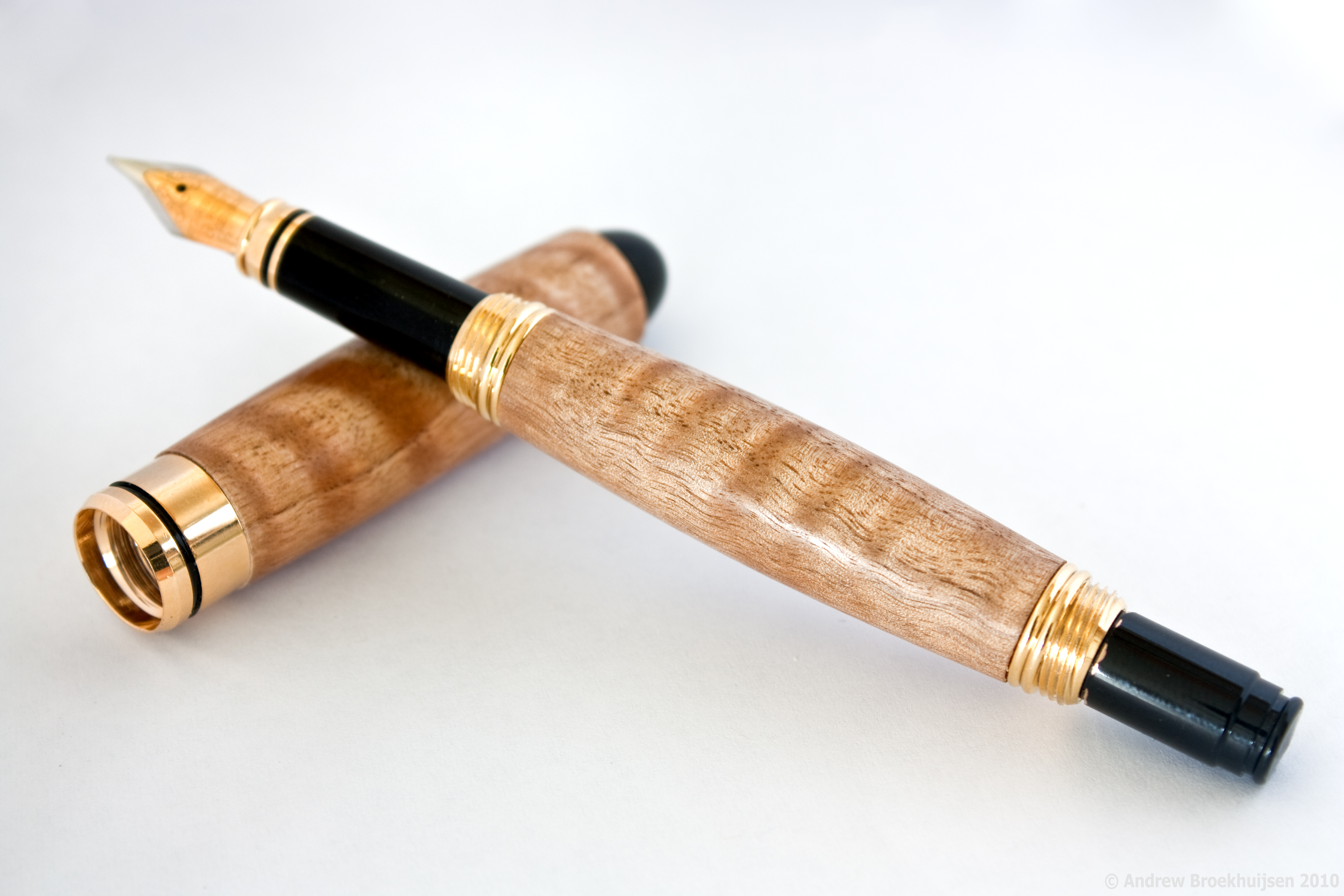
Now that we're FINALLY starting to get some nicer weather around here, we have kind of "re-opened" our wood shop. As it's nearing the end of the school year, I have begun to make pens for some of my teachers. One teacher in particular (who teaches the Newspaper class, as well as some English classes) really enjoys writing. As in, poetry. I figured she would probably appreciate a fountain pen. But I wanted one that would really fit her personality. She's unique, not not in a negative, weird way. She's just awesome. So is Fig-Asian Satinwood, as I discovered.

click to enlarge, or see it on Flickr
Aperture: f/7.1
Shutter Speed: 0.3 seconds
ISO: 100
Focal Length: 53mm
Tripod
Even though I was working with a light tent, I wanted some directional light to try and capture the "holographic" effect the flame in this wood gives, especially under polish. I don't think I did it justice, but facing the open side of the softbox into the light helped a little bit. It also gave me that rather obnoxious glare coming off the main barrel of the pen. I guess that's a fair trade off.
Also, because I haven't been very good with keeping up with this blog (or photography in general) the past few days, I have already noticed a really big oversight in the process of taking this photo. I got to the "pick the best photo to use" stage of post-processing and realized... I shot all of my exposures at f/7.1. I didn't vary the aperture once. f/7.1 happened to be a reasonably good aperture for the job though. If it hadn't, I would have gone back and shot again. I need to be doing photography, every day, otherwise I start slipping. It doesn't take long.
One final piece of news: I got hired at a camera store nearby! Dream job, here I come. I start work in... 2.5 hours. Woot!
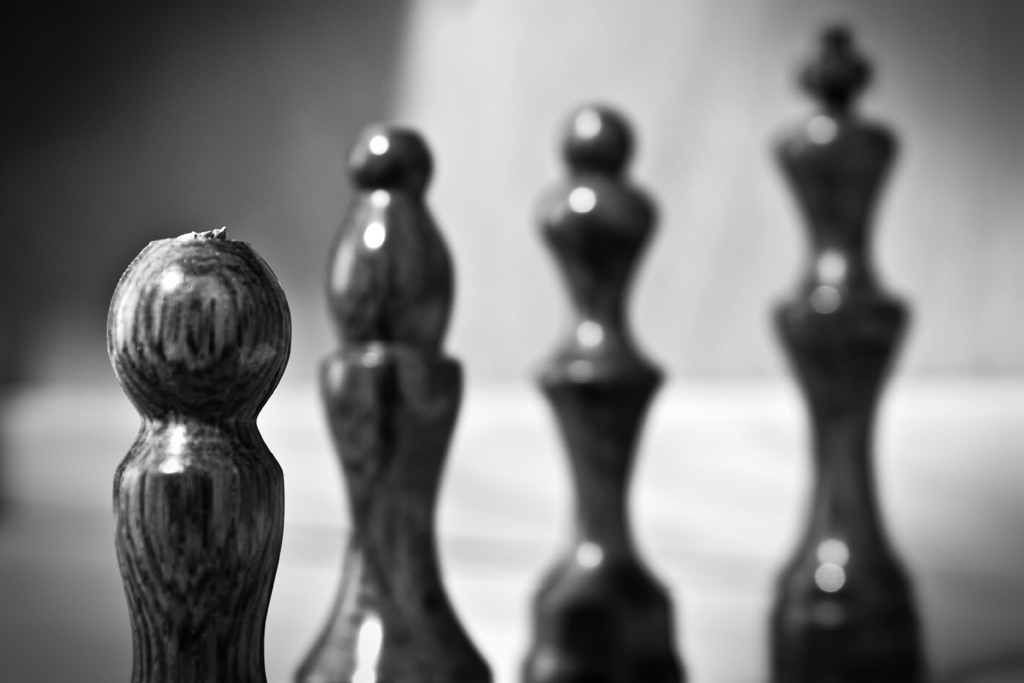
A couple of days ago, I shot this still-life of some chess pieces I made over a year ago. While composing it, I thought it might look good in monochrome, so I went ahead and shot in RAW+JPEG mode. That way, I figured, I could try playing with the RAW file in Lightroom, and if I didn't like it I could always default to converting to monochrome from the JPEG in Photoshop.
Turns out I was right. It does look good in monochrome.

click to enlarge, or see it on Flickr
Aperture: f/6.3
Shutter Speed: 6 seconds
ISO: 100
Focal Length: 36 mm
Tripod
The Lightroom tools for monochrome are extremely intuitive, even when working in RAW. In fact, had I not known, I wouldn't have been able to tell that I was working in RAW. When I was happy with my result, I exported to JPEG. Just for comparison purposes, I did my best work on the JPEG with Photoshop to see if I liked that result any better. It wasn't even close. RAW is champion when it comes to monochrome. I couldn't get close to the amount of contrast I wanted without severe posterization.
My last step was just to experiment with a vignette in Photoshop until I liked it. There are a few things I feel I could have done better, and a couple of things I thought I wouldn't like, but turned out really good. The pawn isn't in sharpest focus. It's pretty close, but I should have been paying more attention when I set the shot up. The aperture could have been stopped down just a little more, to achieve the really distinctive hierarchy of levels of focus I was going for. And I didn't think the unfinished tops of the pieces would look good, but I think they add some character to the shot.
I may try a redux of this shot sometime with a more carefully set-up environment, etc. But now I know: for monochrome photos, don't bother with anything but RAW anymore.
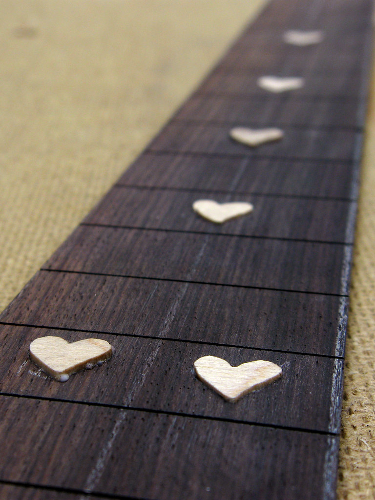
I rarely participate in these, because they're usually something kind of obscure that would be hard for my to photograph. But this one worked out perfectly. I remembered it while working on my guitar yesterday, and what do you know? The fretboard inlays I was working on were heart-shaped.

click to enlarge, or see it on Flickr
Aperture: f/3.2
Shutter Speed: 1/80
ISO: 80
Gorilla Pod
I felt it was appropriate not only because of the heart theme, but because of how much I love my guitar, even if it's not finished yet.
In other news, even though I couldn't get a photo of this, my parents are buying me an early graduation present: A Canon Digital Rebel XSi! I'm so pumped!
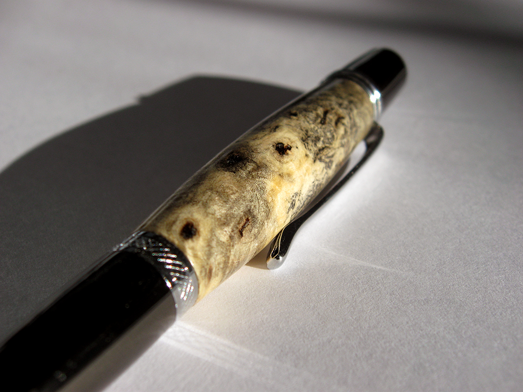
I tried again tonight, and got... closer. I'm still not there yet, although I think this time was due to being in a rush with post.

click to enlarge, or see it on Flickr
Aperture: f/2.6
Shutter Speed: 1/15
ISO: 80
Handheld
I shot against a white background, with less "yellow" lighting, and fewer warm-cast objects reflecting the warm light everywhere. This made a huge difference. I also used a Levels adjustment mask layer to set the white point as the paper. It made it too bright, but I sort of compensated with Brightness&Contrast. But then the pen looked too dark, so I did one of those careful white radial gradients in Overlay blending, with about 50% opacity. I think it was still a little too much. There are elements in the image I'm not totally satisfied with. But I'm on the right path.
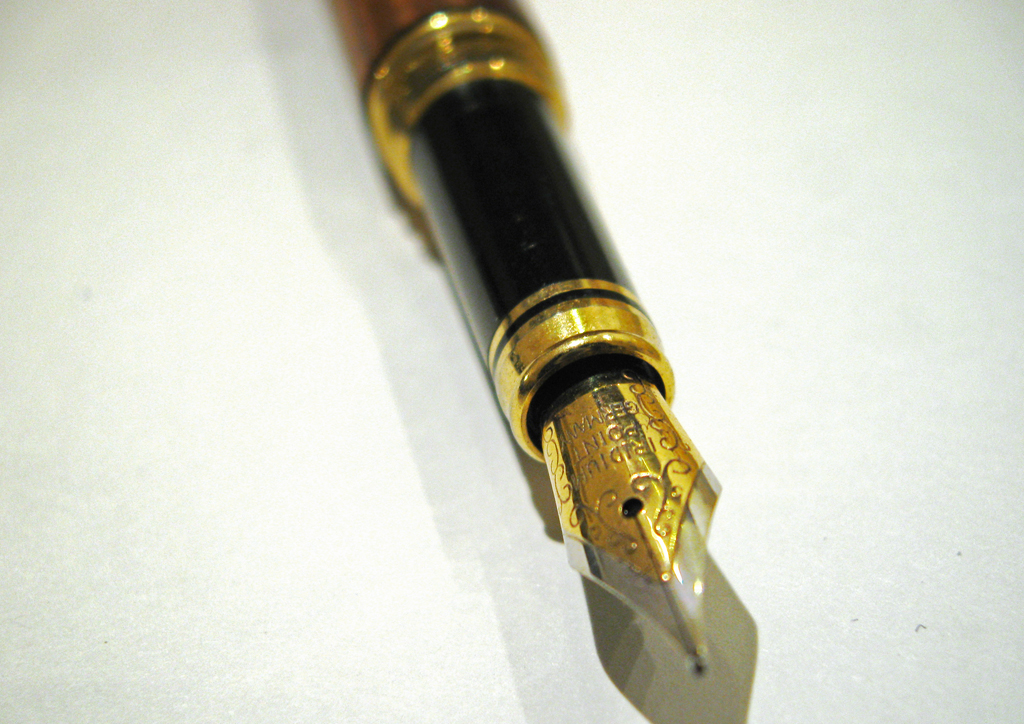
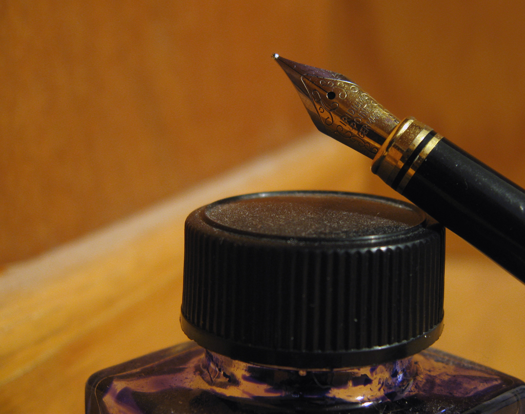
I wanted to take a picture of the fountain pen I made over last summer. I liked how it looked when "posed" with the ink bottle it uses, so I took them together. The resulting crop excluded any of the actual woodworking, but I got the tip of the pen, which I think is more interesting.
Unfortunately, I've learned that the "incandescent" setting on my camera is basically just insufficient. I have a hard time correcting for that kind of a WB slip-up in Photoshop (although I didn't try it in Lightroom, which I think might do a better job), so when I revisit this, and do another shoot of the fountain pen, I'll probably just shoot it with a more neutral light color.

click to enlarge, or see it on Flickr
Aperture: f/2.6
Shutter Speed: 1 second
ISO: 80
Gorilla Pod
Also, I'll probably clean the bottle (especially the dusty lid) and pen thoroughly first. I keep forgetting that macro shots expose details regardless of how unpleasant they are.
So a somewhat disappointing shot, but I'm armed to get it right next time.
I decided that if my red mosaic is going to be interesting, then I can't show you all every photo before I finish and upload the mosaic. So today's photo is a macro of a pen I turned yesterday. The pen kit type is called the Wall Street II, and the wood is Buckeye Burl.
I've had this piece of Buckeye Burl sitting around for about three years. When I first got it, I was still relatively new to woodturning. I thought it looked ugly, and it's extremely porous, so I doubted it would polish well. Today, I looked at it and figured that, since it was burl, it would look much better sanded and under polish. The turning was easy because it's a light punky wood. The sanding was easy because for some reason, it seemed eager to sand to a very smooth sheen. I sealed it using cyanoacrilate glue (superglue). I actually had to seal it twice to fill all the air inside the wood. Then I finished sanding, polished it, and voila:

click to enlarge, or see it on Flickr
Aperture: f/2.8
Shutter Speed: 1/1250
ISO: 80Gorilla Pod
Enough about the woodworking though. This is a photo blog. From a photographic standpoint, I didn't do much to this in post. I shot it in direct sunlight, on top of a piece of regular 8.5x11" printer paper in an attempt to reflect some of the light more evenly. I'm not sure if that worked, but the lighting seems fine. I really liked the shadow cast by the pen, so I kept it. I didn't crop or change the saturation. All I did was use the following trick to get the white-balance exactly right. By exactly right, I mean that the tones showing on the monitor (at least my monitor) match the tones that your eye would see if you were looking at the pen in real life. This is useful when you want your photography to convey precisely accurate representations of what an object looks like. To achieve lifelike white-balance, follow these steps:
1. Create a new transparent layer over your background. Call this layer "Difference."
2. Edit>Fill the "Difference" layer with 50% gray.
3. Change the blending mode of the "Difference" layer to "Difference."
4. Your picture should look like a funky negative. Don't worry. It goes away.
5. Zoom in as far as your computer will allow.
6. Hunt for black pixels. Not just really really dark pixels. You need one that registers a hex code of #000000. I use the eyedropper tool to sample pixels until I get a black one.
7. Mark the pixel using the Color Sampler tool. To get the Color Sampler tool, right click on the eyedropper tool in your toolbar. It should be directly under.
8. Now delete the "Difference" layer. You only needed it to locate a pixel that was exactly 50% gray in your photo.
9. Add a Levels Mask Layer. In the box that pops up, make sure you click on the little eyedropper icon that is between the other two.
10. Click on your marked pixel. Press "Okay."
11. Flatten your image. Your white-balance should be perfectly neutral.
Today's post was SUPPOSED to be the start of a few days worth of architecture shots taken of abandoned buildings. I had a shoot lined up yesterday, and... it started snowing. Not in the plan. Unfortunately, it seems to still be snowing today. So I might have to wait on the shoot until tomorrow, or even later this week.
Instead, I'll show you a couple of Christmas tree ornaments I turned on my lathe. Nothing too fancy; one is maple, and the other is walnut. But they were pretty fun photography subjects (once I finally got them to stop rolling off the counter).

click to enlarge, or see it on Flickr
Aperture: f/2.6
Shutter Speed: 1/13
ISO: 80
Handheld
Not as tack sharp as I would have liked. That goes with shooting handheld at 1/13th of a second. I don't care how braced against things you are, or how good your image stabilization is. At 1/13th, you'll get better results with a tripod. Unfortunately, when I shot this, I was in a hurry to get out the door.
On the bright side, I barely had to do any post-processing. The lighting was already pretty warm, but not overdone, the white balance was just right, and I didn't feel adding a lot of saturation or contrast would help this photo. I didn't even crop. This is very close to being right off the camera.
Out of curiosity, does anyone else out there woodwork or woodturn?
Short post today. I made another pen as a secret-Santa gift for a friend in the Chamber choir I'm in. This one is walnut.

click to enlarge, or see it on Flickr
As far as straight-up photographic value goes, I don't like this one as much. It's rather out of focus in what I consider to be an important area of the photo. But the lighting is nice, and an unsharp mask in Photoshop helped a little.
Apart from photography, one of my hobbies is woodworking, and particularly, woodturning. I have a nice setup with a mini-lathe in my garage, as well as some other shop tools. I have also amassed a pretty nice collection of pen-blank sized exotic woods over the past few years. As my friend's birthday was today, last night I turned a basic slimline pen out of Tasmanian Blackwood. Turns out (pun definitely intended) small woodworking projects make for some cool macro photography opportunities. It's nice that I can get twice the regular artistic value out of a single pen.

click to enlarge, or see it on Flickr
I do quite a bit of woodworking, though not so much during the winter months. So now that I know about this, I'll be photographing more of my work. Cool.