skip to main |
skip to sidebar
I've done a little bit of dabbling with food photography, but nothing too serious. It's quite a challenge apparently. Well, there's nothing I like more than tackling a photography challenge. Before I started, I noted that most professional food photos I've seen have:
-Shallow DoF
-Frame-filling subjects
-High-key, relatively uniform lighting
-Simple backgrounds
-Utensils
-Camera tilts for odd angles (something I'm not a huge fan of)
-Either spot-on lifelike white-balance, or a slightly cooler cast
The food I had on hand for this was muffins, which generally don't require much utensil usage. I guess in hindsight I could have used a knife, but oh, well. I used my kit lens, usually at around 35mm focal length I think, and at a wide variety of apertures as experimentation. The counter in my house is corian, so it reflects light from windows nicely, but it's also quite uniform. It gave me a ready-made professional looking background. I set up the muffins in various positions to emphasize texture, etc. and started shooting (foregoing the camera tilt... maybe I'll try it next time).

click to enlarge, or see it on Flickr
Aperture: f/8
Shutter Speed: 0.6 seconds
ISO: 100
Focal Length: 34mm
Tripod
The last thing I did after my regular contrast/sharpness/exposure adjustments in Lightroom was going through the steps from this post to get the white-balance exactly right. I tried it with a blue cast first, but it didn't look so good with brown muffins.
I think I could have gone a bit wider in the aperture, but otherwise I'm pretty satisfied with the shot. Sure, there are things to improve on, but considering I basically set a couple of muffins on the counter and shot a few photos, they turned out pretty good.
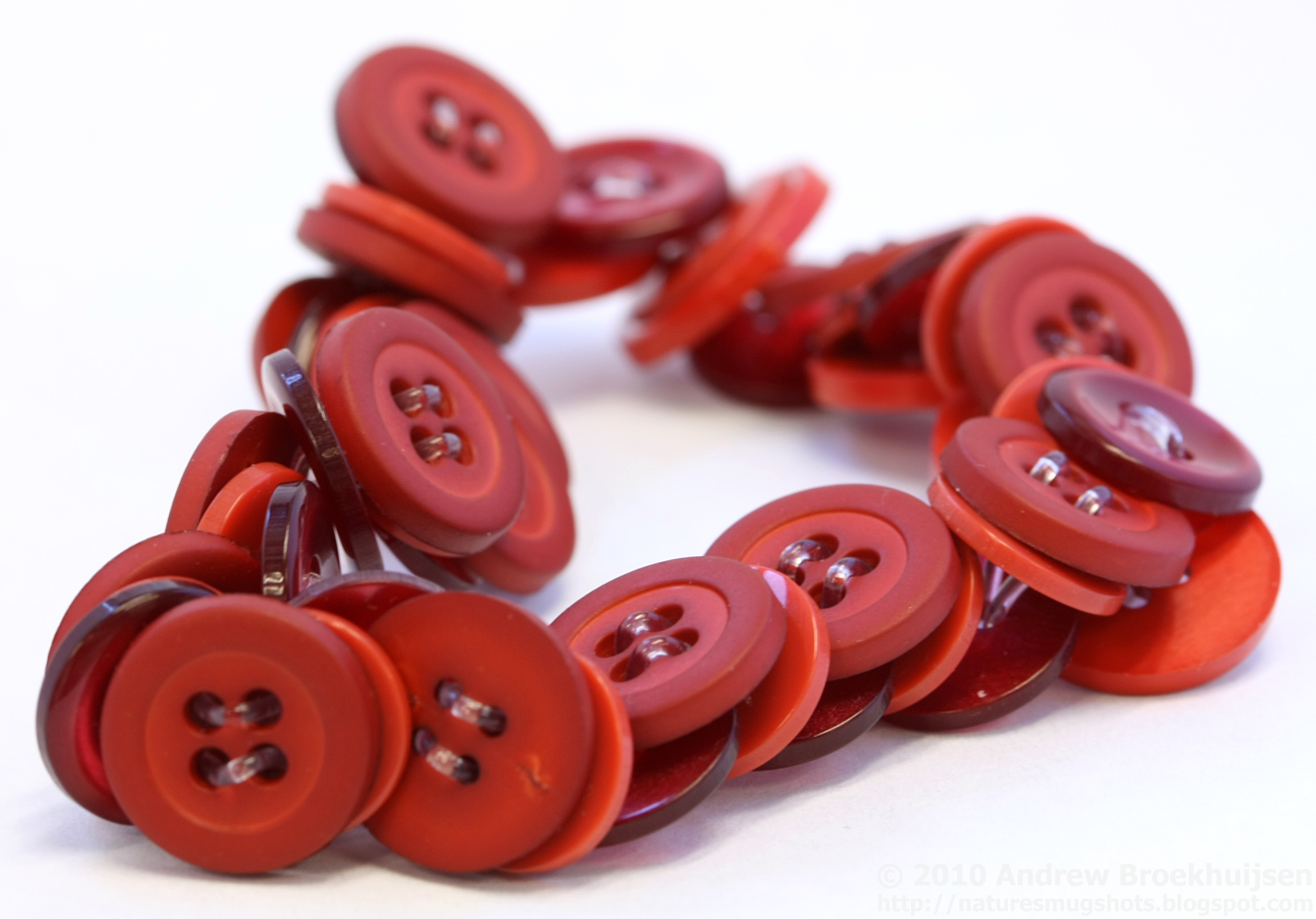
As I mentioned yesterday, I did do a number of product shots in a paper light box. I'm happy with how they turned out. Just as in this post, I'm continually impressed with the professional-looking results that you can achieve with 4 pieces of paper to diffuse the light.

click to enlarge, or see it on Flickr
Aperture: f/8
Shutter Speed: 0.8 seconds
ISO: 100
Focal Length: 100mm
Tripod
I used the 100mm f/2.8 macro lens and a tripod that belongs to the newspaper staff. It was interesting shooting these, because I knew they all had to turn out really well. I wasn't just shooting for myself, it was a semi-professional job. As I had an odd mix of cloudy window lighting and overhead fluorescent, I had to manually set the white balance. Not a big deal, but it turned out excellent—I wanted to be sure the colors displayed were accurate.
So if you like what you see, head on over and check out my friend's business: http://cuteasabuddon.blogspot.com. Hopefully soon you'll see some of my photos on there, when she has time to update the site!
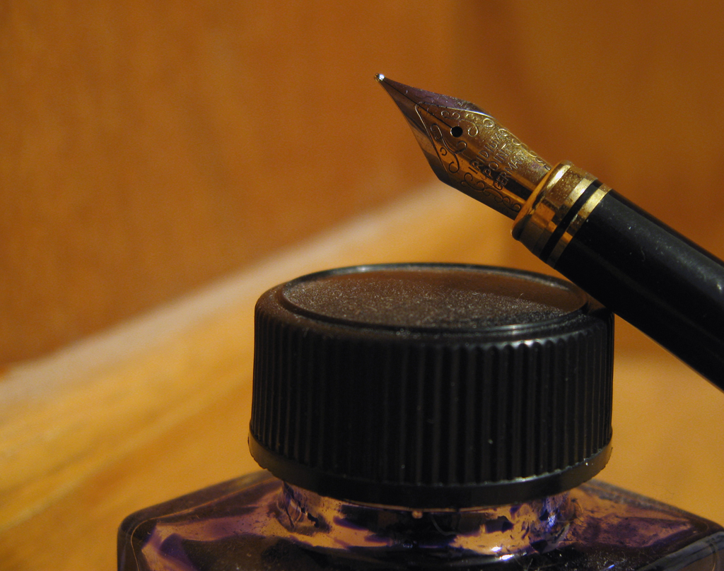
I tried again tonight, and got... closer. I'm still not there yet, although I think this time was due to being in a rush with post.

click to enlarge, or see it on Flickr
Aperture: f/2.6
Shutter Speed: 1/15
ISO: 80
Handheld
I shot against a white background, with less "yellow" lighting, and fewer warm-cast objects reflecting the warm light everywhere. This made a huge difference. I also used a Levels adjustment mask layer to set the white point as the paper. It made it too bright, but I sort of compensated with Brightness&Contrast. But then the pen looked too dark, so I did one of those careful white radial gradients in Overlay blending, with about 50% opacity. I think it was still a little too much. There are elements in the image I'm not totally satisfied with. But I'm on the right path.
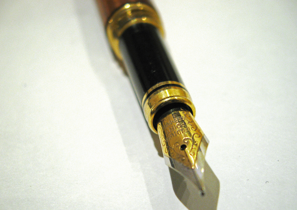
I wanted to take a picture of the fountain pen I made over last summer. I liked how it looked when "posed" with the ink bottle it uses, so I took them together. The resulting crop excluded any of the actual woodworking, but I got the tip of the pen, which I think is more interesting.
Unfortunately, I've learned that the "incandescent" setting on my camera is basically just insufficient. I have a hard time correcting for that kind of a WB slip-up in Photoshop (although I didn't try it in Lightroom, which I think might do a better job), so when I revisit this, and do another shoot of the fountain pen, I'll probably just shoot it with a more neutral light color.

click to enlarge, or see it on Flickr
Aperture: f/2.6
Shutter Speed: 1 second
ISO: 80
Gorilla Pod
Also, I'll probably clean the bottle (especially the dusty lid) and pen thoroughly first. I keep forgetting that macro shots expose details regardless of how unpleasant they are.
So a somewhat disappointing shot, but I'm armed to get it right next time.
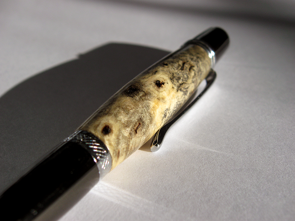
I decided that if my red mosaic is going to be interesting, then I can't show you all every photo before I finish and upload the mosaic. So today's photo is a macro of a pen I turned yesterday. The pen kit type is called the Wall Street II, and the wood is Buckeye Burl.
I've had this piece of Buckeye Burl sitting around for about three years. When I first got it, I was still relatively new to woodturning. I thought it looked ugly, and it's extremely porous, so I doubted it would polish well. Today, I looked at it and figured that, since it was burl, it would look much better sanded and under polish. The turning was easy because it's a light punky wood. The sanding was easy because for some reason, it seemed eager to sand to a very smooth sheen. I sealed it using cyanoacrilate glue (superglue). I actually had to seal it twice to fill all the air inside the wood. Then I finished sanding, polished it, and voila:

click to enlarge, or see it on Flickr
Aperture: f/2.8
Shutter Speed: 1/1250
ISO: 80Gorilla Pod
Enough about the woodworking though. This is a photo blog. From a photographic standpoint, I didn't do much to this in post. I shot it in direct sunlight, on top of a piece of regular 8.5x11" printer paper in an attempt to reflect some of the light more evenly. I'm not sure if that worked, but the lighting seems fine. I really liked the shadow cast by the pen, so I kept it. I didn't crop or change the saturation. All I did was use the following trick to get the white-balance exactly right. By exactly right, I mean that the tones showing on the monitor (at least my monitor) match the tones that your eye would see if you were looking at the pen in real life. This is useful when you want your photography to convey precisely accurate representations of what an object looks like. To achieve lifelike white-balance, follow these steps:
1. Create a new transparent layer over your background. Call this layer "Difference."
2. Edit>Fill the "Difference" layer with 50% gray.
3. Change the blending mode of the "Difference" layer to "Difference."
4. Your picture should look like a funky negative. Don't worry. It goes away.
5. Zoom in as far as your computer will allow.
6. Hunt for black pixels. Not just really really dark pixels. You need one that registers a hex code of #000000. I use the eyedropper tool to sample pixels until I get a black one.
7. Mark the pixel using the Color Sampler tool. To get the Color Sampler tool, right click on the eyedropper tool in your toolbar. It should be directly under.
8. Now delete the "Difference" layer. You only needed it to locate a pixel that was exactly 50% gray in your photo.
9. Add a Levels Mask Layer. In the box that pops up, make sure you click on the little eyedropper icon that is between the other two.
10. Click on your marked pixel. Press "Okay."
11. Flatten your image. Your white-balance should be perfectly neutral.
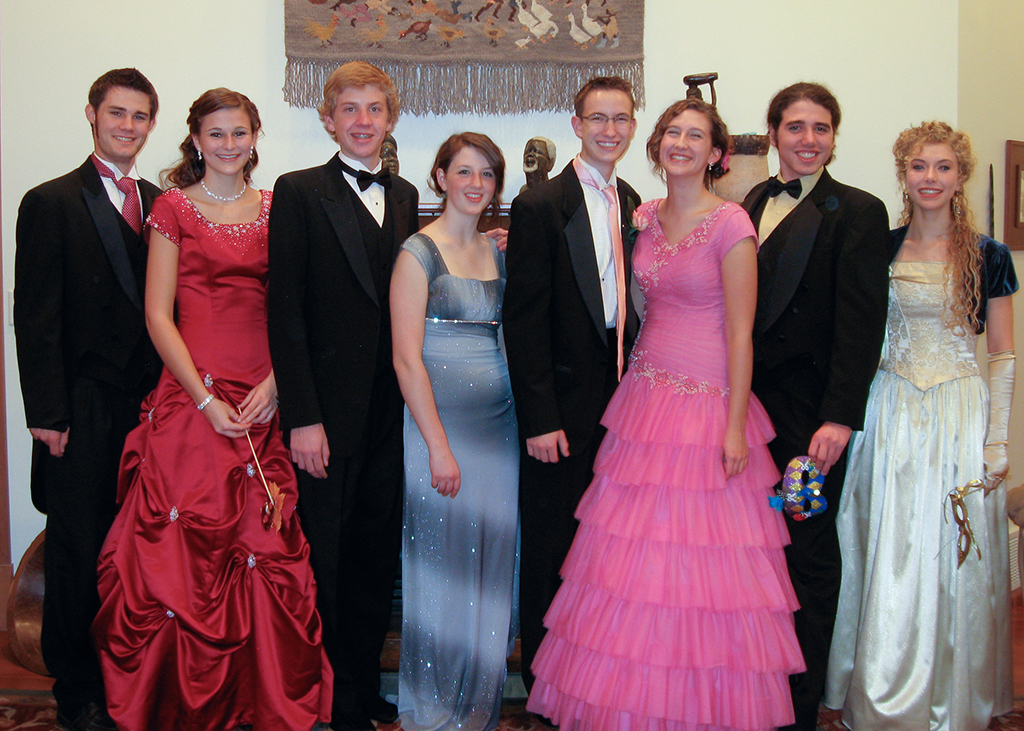
Once again, I volunteered to do the pictures for the group I was in for my school's Preference dance last night. And once again, the original plan to shoot outside was assassinated by too little light, and waiting too long before meeting up to do pictures. So I got to shoot inside.

click to enlarge, or see it on Flickr
Aperture: f/2.6
Shutter Speed: 1/6
ISO: 100
Tripod
The white balance in the house was a nightmare. Without a flash, I was using shutter speeds in excess of 1 second, which was not an option. With a flash, I could go to 1/6—still significantly shorter than I like to shoot any kind of moving subject in, but it was doable. Unfortunately, flash lighting and Incandescent bulbs are two very different flavors of light. So I basically gave up on getting the WB right in-camera, and fixed it in Lightroom afterwards. It turned out okay. I still would have rather shot these outside.
I had to bump my ISO up to get those extra fractions of a second for my shutter speed. Normally I try to shoot ANYTHING I'm considering printing in 80 ISO, but I had to compromise somehow. I used my flash on it's dimmest setting, mostly as a fill flash, because, it being an in-camera flash, anything over the dimmest setting gives you awful glares that make portraits look horrendous. Since I'm only printing these at 5x7, I felt okay with shooting at 100.
I'm reasonably happy with how they turned out, considering my difficult situation. They lack the really "professional" look you get when you shoot with a super wide aperture to blur the background, and the WB is merely acceptable, but I feel okay about it. At least it gave me some more portraiture experience. And if I take nothing away from my last two dance-photo attempts other than "SHOOT OUTSIDE WHILE THERE'S STILL LIGHT," then the effort hasn't been wasted.
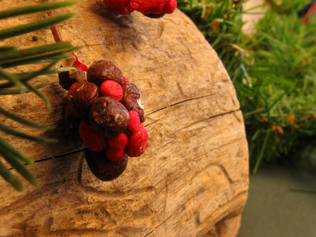
For most pictures, accurate color representation is what you're after. I usually just stick with my AWB (auto white-balance) setting; it does a good job. Other times, a preset is nice (indoor shooting w/o flash calls for the Incandescent Bulb setting). But for some photos, you can really change the feel of the photo by using what would technically be the "wrong" setting.
Here's an example of a shot I took indoors with no flash. It was during the set-up process of a Christmas dinner/play that my school does (which I take part in). Because we were still setting up, the windows weren't yet covered, which was letting in a lot of blue light from outside. I wanted this shot to be more cozy and feel like the holidays, however, so I used the "Cloudy" preset. This preset adds warmth to your colors, as cloudy light tends to be blue and cool.

click to enlarge, or see it on Flickr
I like how it turned out—warmer than the light in there really was, but it captured the feeling I was after.
Try fiddling around with your white balance from time to time. A lot of cameras these days have a manual setting (mine included) which can make for some very interesting colors if you "set" it with some other color besides white. Post links in the comments!
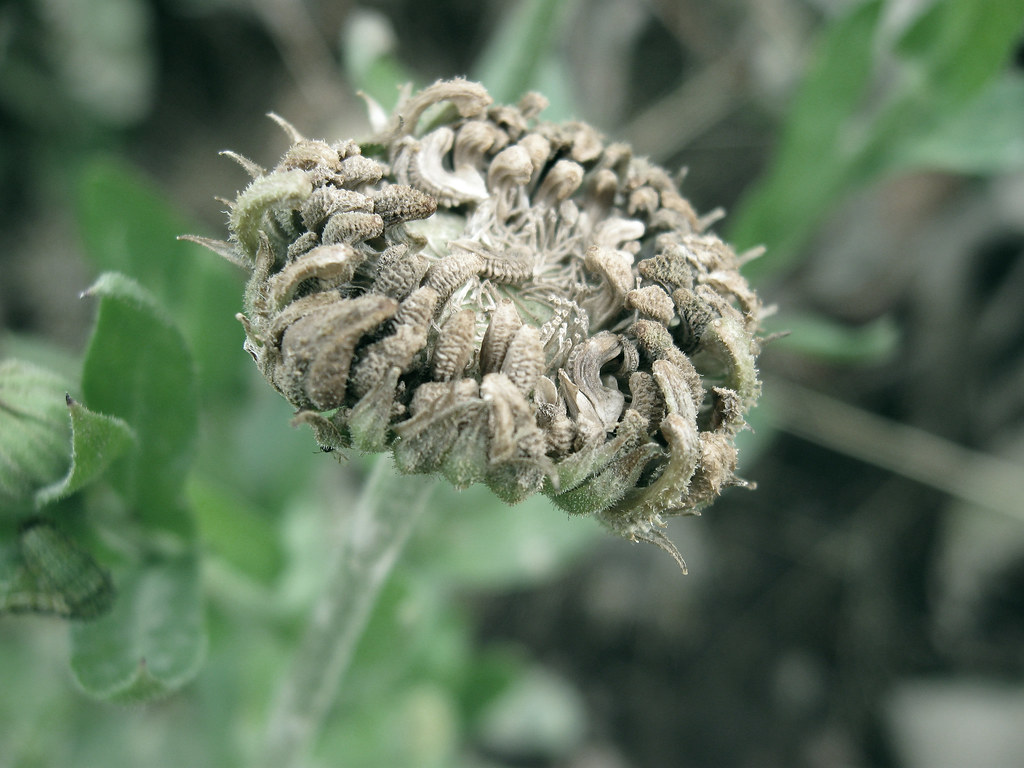
One of my favorite ways to give a picture more impact is to give it a definite mood. Most photos have a fairly obvious subject, which usually gives them a general "feeling." The trick is to take this feeling, and then enhance it by editing different properties of the photos.
For instance, if you have a picture of a dead flower, it will create a generally gloomy feeling. To really emphasize that mood, you could partially desaturate the image. Be careful though—if you completely desaturate the image, you get black & white, which doesn't necessarily make a picture seem more melancholy.

click to enlarge, or see it on Flickr
As you can see, the colors are still there (especially in the green leaves), just very muted.
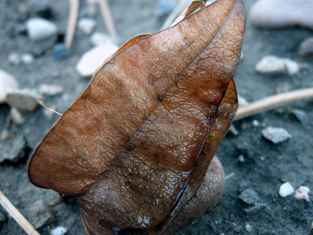
A slightly more advanced idea is to change the lighting. This is primarily done while composing the shot, but you still have at least a little influence over the lighting in Photoshop. For example, this picture of a leaf was taken on an overcast day.

click to enlarge, or see it on Flickr
While I was optimizing it on the computer, I noticed that the wet patch on the leaf, combined with the damp ground, made the leaf look like a survivor of a recent rainstorm. To accentuate this effect, I added quite a bit of blue tinge in the Levels adjustment, and voila—it looks like the photo was taken on a rainy day. Had I noticed this mood possibility while I was taking the photograph, I might have tried a white-balance adjustment to give me a more natural-looking blue cast.
Just as images can be partially desaturated to make them gloomier, saturation can be added to make them seem more vibrant and happy. Similarly, light and white-balance adjustments can cool down an image or warm it up. Don't go overboard though—the image should still appear pretty natural once editing is over, rather than looking like it just made a daring escape from the Piknik factory. I usually take one image with a correct white balance in case the artistic one doesn't turn out, and then several with various other white balances (flourescent, daylight, etc.).
Tinker around with your composition, white-balance, levels, lighting, saturation, curves, and contrast to help set the mood of your photos. As you get better, your photo quality will increase, and your images will start to be more eye-catching.