skip to main |
skip to sidebar
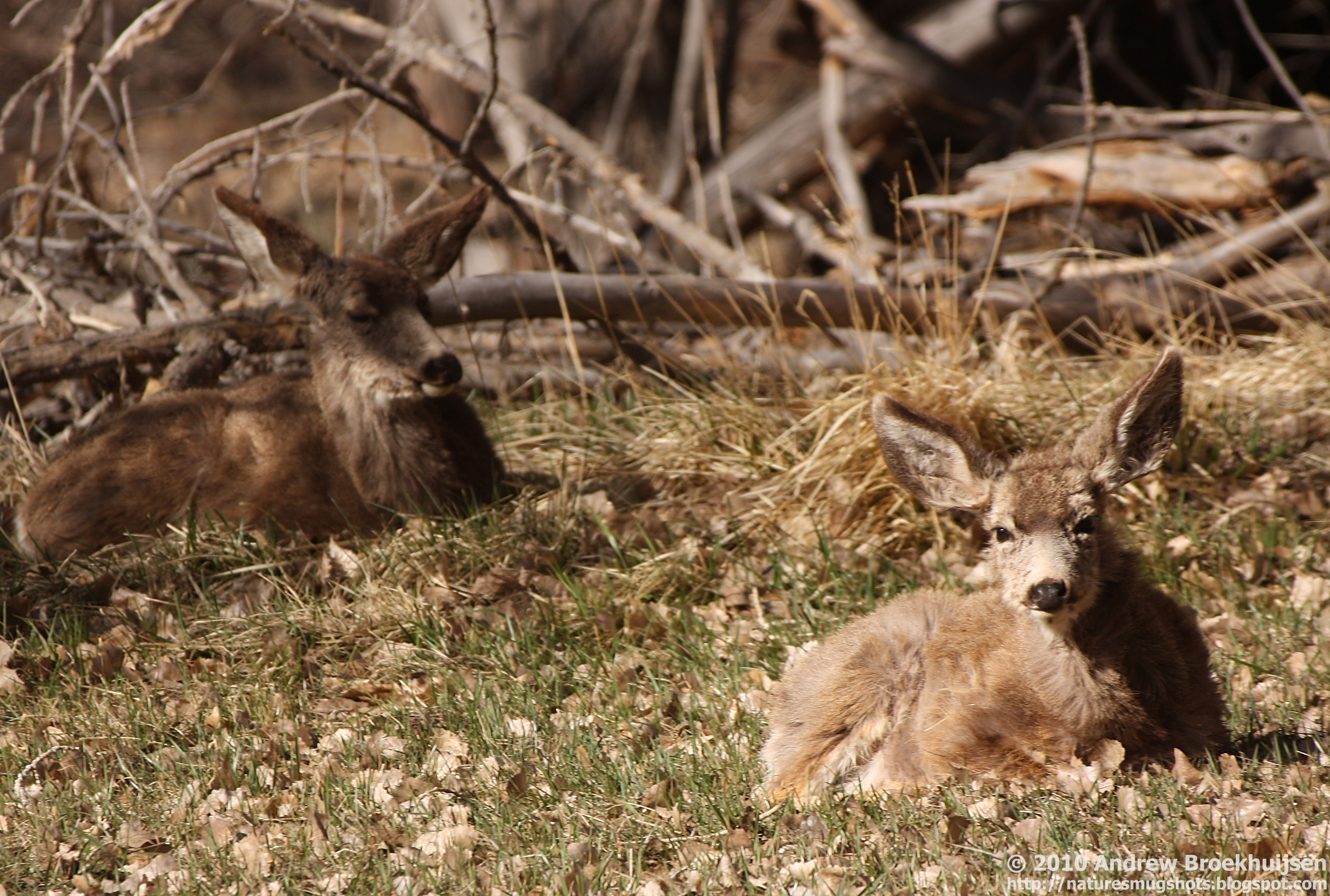
Watermarking
After reading a DPS post on automatically watermarking your images, I've decided to adopt a watermark. Now that I have full-res photos available on Flickr, it's probably a good step to protect them a little more. I will strive not to make my watermark distracting. Here's a sample. If there are any changes you would recommend, speak now or forever hold your peace.

click to enlarge, or see it on Flickr
Aperture: f/5.6
Shutter Speed: 1/400
ISO: 100
Focal Length: 300mm
Monopod
Should I just put the name? Just the site? Smaller text? What do you guys recommend?


Well, here's my two cents on watermarks. If it's small enough to not be distracting, then it's generally super easy to crop it out if somebody wanted to snatch it. Like this one, you could just shave a little off the bottom and be done with it. But then if it's large enough to actually deter image thieves, then it's distracting when you're viewing the image.
ReplyDeleteAs far as your actual watermark goes though, I think it would be better if it were just the name, and then you could get away with a little larger font. I'd like to be able to read it here on Blogger without having to click through to the larger version. Right now, I can't do that.
Usually I watermark in three places in the photo, then I lower the opacity to different levels on each one. Then I have a main one. Lately though I haven't been doing any watermarking. Just too lazy I suppose. I will have to read the DPS about the auto.
ReplyDeleteI agree with Amy about the font size, it is kind of hard to see.
I would go with just the name. Love the photo - are those mulies?
ReplyDelete