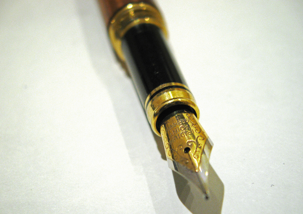
click to enlarge, or see it on Flickr
Aperture: f/2.6
Shutter Speed: 1/15
ISO: 80
Handheld
I shot against a white background, with less "yellow" lighting, and fewer warm-cast objects reflecting the warm light everywhere. This made a huge difference. I also used a Levels adjustment mask layer to set the white point as the paper. It made it too bright, but I sort of compensated with Brightness&Contrast. But then the pen looked too dark, so I did one of those careful white radial gradients in Overlay blending, with about 50% opacity. I think it was still a little too much. There are elements in the image I'm not totally satisfied with. But I'm on the right path.


Definitely on the right path. The focus looks really nice here.
ReplyDeleteI like it! Keep working and posting your attempts - I am learning right along with you!
ReplyDelete