skip to main |
skip to sidebar
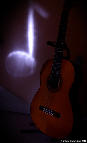
Today I was able to make use of all my new equipment, namely my new tripod head and my remote shutter release. I was trying a technique called a "light stencil." It's a form of light painting that involves the use of a stencil cut out of paper to shape the light. It seems quite simple but is in fact difficult to execute. It took me the better part of an hour and lots of experimentation to get this one, and it's not even that great.
When light painting, the aperture has less to do with the depth-of-field, and is really used only as a deciding factor for how bright your various light "paintbrushes" will look. Shutter speed can be as long as you need, and I use ISO primarily to balance out distance between me and a flash, if I use one.

click to enlarge, or see it on Flickr
Aperture: f/7.1
Shutter Speed: 26 seconds
ISO: 100
Focal Length: 18mm
Tripod
More to come as I improve on my methods here. I will say light painting is infinitely more fun when I don't need to worry about fitting everything in in 15 seconds.
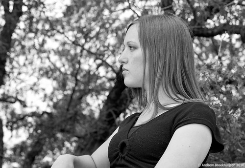
To finalize and round-off my portfolio before I print it, I've been going portrait crazy for the past week. I decided I had enough "standard" style portraits in there, so I went for a couple of different-ish ones.

click to enlarge, or see it on Flickr
Aperture: f/5
Shutter Speed: 1/200
ISO: 100
Focal Length: 50mm
Monopod

click to enlarge, or see it on Flickr
Aperture: f/4
Shutter Speed: 1/100
ISO: 100
Focal Length: 50mmHandheld
I mostly decided to go black & white because it makes the photo's tone a little more serious and reflective, which helps compensate for models that have a hard time not smiling. :)
Anyway, these are the last two portraits I'll show you for a while. Last night I did some fun light painting with a new remote shutter release I bought (infrared) at a sick discount from the camera store where I work. Makes things very fun. And in case you were interested, tomorrow I buy a joystick-style ball head for my tripod and monopod. Buying camera gear is the bomb.
In other news, today I began construction on my official website at http://www.andrewbphotography.com. There's a link on the side of this page if you don't feel like typing. It won't be done until sometime this week probably. I am also looking at a real domain name (andrewbphotography.com) and pricing for a host, etc. So this site might not be around for very long. We'll see. Hopefully this will help me get some paid portraiture work over the summer and kind of jump-start my semi-pro photography "career."
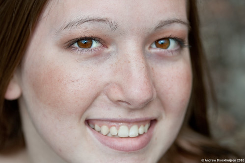
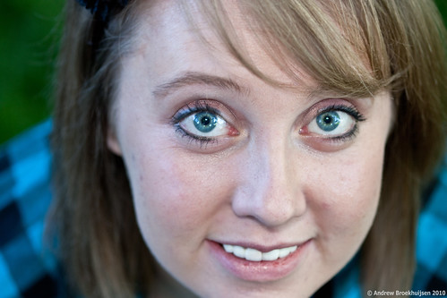
Another shoot today. This time, just one person. In a way it was kind of nice because I never had to worry about chopping off parts of one person's face or something. Basically it just changed the dynamic. I did have one photo that I am going to convert to black-and-white, but I haven't gotten around to it yet.

click to enlarge, or see it on Flickr
Aperture: f/3.2
Shutter Speed: 1/125
ISO: 100
Focal Length: 50mm
Monopod

click to enlarge, or see it on Flickr
Aperture: f/2.8
Shutter Speed: 1/200
ISO: 100
Focal Length: 100mm
Monopod
I must say, I've been very happy with most of the close-up headshots. Eyes are fun to work with in post-processing when they're big, have juicy catch lights, and are the main focus point of the image.
I also learned that before you take the photo, you should make sure that the model does not have any hairs on his/her face that would be distracting. Especially make sure that said hairs do not cross over the eye of the model. Otherwise you might spend 45 minutes in Photoshop, carefully cloning them out.
As I mentioned last post, I sort of took out an ad on Facebook in an attempt to pad out the "Portraits" section of my portfolio before I get it printed. The first resultant shoot of that ad was today. I must say, it went quite well. I had a number of good shots, got a lot of good experience working with models, various lenses for different types of shots, and other equipment. Great learning experience, great fun, and a few of my friends got some free portraits out of the deal. Here are my favorite two from the shoot, which will be going into the portfolio.

click to enlarge, or see it on Flickr
Aperture: f/2.8
Shutter Speed: 1/40
ISO: 100
Focal Length: 100mm
Monopod

click to enlarge, or see it on Flickr
Aperture: f/2.8
Shutter Speed: 1/40
ISO: 100
Focal Length: 50mm
Monopod
The top is among my favorite portraits I've ever shot. I made a really concerted effort to get the lighting, catchlight, depth-of-field, angle, composition, and focus just right, and I think I may actually have succeeded on all counts. Not to brag, or anything :)
The 2nd was my favorite from all the landscape-oriented portraits I took. Is that an oxymoron?
Ugh. I haven't ever been this bad about updating my blog. My apologies. I'll get better, I promise.
Anyway, here's the update: I've been reading a LOT about the Zone System and HDR lately, and been wanting to try both. I decided a scene where there were pretty deep shadows and a very bright sky would be a good candidate for HDR, so I gave it a shot (or 5 bracketed shots).

click to enlarge, or see it on Flickr
Aperture: f/11
Shutter Speed: (bracketed)
ISO: 100
Focal Length: 18mm
Tripod
The Good: HDR definitely brought the colors to life, though I think they're a bit over-saturated. This is predominantly because I still suck at tone-mapping. Everything seems to be exposed correctly. The left side was a single exposure, which I set to be somewhere in between correctly exposed for the sky and the rest.
The Bad: HDR made my mountains look fake, and really bad. I knew beforehand that it tends to kill detail in midtones, which is why most people who are good at HDR like to use exposure blending (which is essentially masking out various places of the HDR and substituting a real photo) as well in their HDR photos.
The Ugly: Despite the fact that I checked the "fix ghosting errors" box in Photomatix, the clouds look like an acid trip. I think the solution is to actually use my AEB setting in-camera rather than bracketing manually. That would allow me to get three frames bracketed 2 stops apart in less than a second, minimizing cloud drift, etc.
I'll continue to experiment with HDR. I feel like I totally understand the concept, I just need mucho practice at tone mapping.
As my place of work is starting to print and bind photobooks now, they have offered all the employees a free 20-page hardcover. Which is rad. I'll be using mine for a portfolio, so after roughing out what the design would be like, I concluded I needed more portraits to round it out. Approximately 38 seconds after offering to shoot free portraits on Facebook, I filled up the next two weeks with shoots. So expect a lot of portraits in the near future.
First, the good news. I spent a lot of time studying up on HDR today, and some on the Zone System as well. I'll definitely be delving into those more deeply, and soon. But for today, you get boring flowers. Not that the flowers are boring. Just the fact that I shot them exactly how I shoot any other flowers.

click to enlarge, or see it on Flickr
Aperture: f/5
Shutter Speed: 1/8
ISO: 100
Focal Length: 41mm
Tripod
Hopefully better stuff will be up soon.
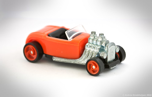
I haven't been feeling very inspired for the last few days. I know this happens to everyone, but it's a frustrating situation. Anyway, here's today's shot: a toy Rolls Royce in a DIY softbox. I was going to process it to go in the Motionless set, but it didn't seem to fit the theme very well.

click to enlarge, or see it on Flickr
Aperture: f/4
Shutter Speed: 0.3 seconds
ISO: 100
Focal Length: 100mm
Tripod
I kind of liked the color here, although it's not my first choice for a multi-million dollar car. Yeah. Hopefully something more interesting will enter my head soon.
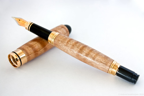
Now that we're FINALLY starting to get some nicer weather around here, we have kind of "re-opened" our wood shop. As it's nearing the end of the school year, I have begun to make pens for some of my teachers. One teacher in particular (who teaches the Newspaper class, as well as some English classes) really enjoys writing. As in, poetry. I figured she would probably appreciate a fountain pen. But I wanted one that would really fit her personality. She's unique, not not in a negative, weird way. She's just awesome. So is Fig-Asian Satinwood, as I discovered.

click to enlarge, or see it on Flickr
Aperture: f/7.1
Shutter Speed: 0.3 seconds
ISO: 100
Focal Length: 53mm
Tripod
Even though I was working with a light tent, I wanted some directional light to try and capture the "holographic" effect the flame in this wood gives, especially under polish. I don't think I did it justice, but facing the open side of the softbox into the light helped a little bit. It also gave me that rather obnoxious glare coming off the main barrel of the pen. I guess that's a fair trade off.
Also, because I haven't been very good with keeping up with this blog (or photography in general) the past few days, I have already noticed a really big oversight in the process of taking this photo. I got to the "pick the best photo to use" stage of post-processing and realized... I shot all of my exposures at f/7.1. I didn't vary the aperture once. f/7.1 happened to be a reasonably good aperture for the job though. If it hadn't, I would have gone back and shot again. I need to be doing photography, every day, otherwise I start slipping. It doesn't take long.
One final piece of news: I got hired at a camera store nearby! Dream job, here I come. I start work in... 2.5 hours. Woot!
Today was the final choir concert of the year at Timberline Middle School. I went there, I love singing, and the choir teacher there is the one who taught me how to sing, and how to love singing. So I make it a point to get to as many of their concerts as possible. I'm glad I went.
Also, while I did have an interview for a job at a camera store, I didn't actually get around to taking any good photos today. So I figured it would be a good time to draw on my mostly untapped roll from Hello Dolly at TMS.

click to enlarge, or see it on Flickr
Aperture: f/2.8
Shutter Speed: 1/250
ISO: 800
Focal Length: 135mm
Monopod
I do wish I had gone with a slightly faster shutter speed here, but I still think this turned out pretty well. The action was mostly frozen anyway.
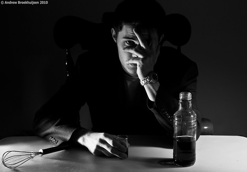
I was in a creative mood today, so I decided to try something interesting. Before I go any further with this post, I've realized that I need to explain what "Assassin" is, which will both help this photo make a lot more sense, and explain the title of the photo from this post.
Assassin is a game being played at my school by about 70 people right now. Essentially, we are given a "target" by the person running the show, and our job is to eliminate that target using a whisk. Then we report our kill, and receive a new target. We are also being constantly hunted by someone else, but we are not told who. I always need to be watching my back. Last man standing wins $50. It's a blast.
Anyway, I decided to take somewhat of a satirical picture showing what might happen to us all psychologically in the long run.

click to enlarge, or see it on Flickr
Aperture: f/5.6
Shutter Speed: 0.6 seconds
ISO: 100
Focal Length: 42mm
Tripod
The lighting and setup for this shot was ridiculously complicated. I used three separate desk lamps, each with a custom-shaped DIY snoot. One was about 10 feet to the left of the camera, about the height of my head, pointing at my face and the chair. That light provided the illumination on the right side of my face. There was another one just to the left of the camera, barely above the level of the table, and pointing slightly up. That one provided the illumination on my right hand and the wire whisk. The last light was on the right side of the camera, higher up, lighting the back-right corner of the table, which provided most of the ambient light as well. Other than those three directional desk lamps, the room was pitch black.
The "beverage" was actually just water with green food coloring. I chose green because there was no other green anywhere else in the shot, so I figured it would give me very independent control over the tone of the liquid. That idea worked out nicely.
I'm extremely pleased with the way the lights behaved. It took a lot of effort and experimentation. I had no assistant, which meant I was stuck with guessing at pre-focusing, setting the self-timer, hitting the shutter release, running to the chair and posing, then checking out the results. Then I would tweak the lighting slightly, rinse, and repeat. In the end though, it paid off. It's nice when plans come together perfectly, with the lighting, pre-planning of drink color, etc. for post processing, and everything else that went into the creation of this shot.
I try to use a tripod for macro shooting whenever possible, but sometimes I see an opportunity and I don't have mine handy. This is what happened today. There were a few problems with this; first of all I was using a 100mm macro lens, which is quite a long focal length to be shooting with handheld anyway, but especially for a close subject. Second, it was windy, and therefore the subject was moving. And third, various clutter around the subject was confusing my autofocus enough that I switched to manual—something I usually hate to do when I don't have a tripod.

click to enlarge, or see it on Flickr
Aperture: f/3.2
Shutter Speed: 1/125
ISO: 100
Focal Length: 100mm
Handheld
I shot anyway. Considering all the factors involved, I think I got a pretty good result for a 1/125 shutter speed, handheld, with manual focus. But the sharpness issues (caused both by motion blur and slight positioning adjustments after focusing) become quite apparent when you view the full-size image.
Either way, there will be a redux of this sometime when I have my tripod and a spray bottle handy to create water droplets.
Don't ask why the title of this photo is "Assassinate." It's a really long story. And not the kind that's funny, just the kind that makes you say "I wish I hadn't asked why the title of that photo is 'Assassinate.'"
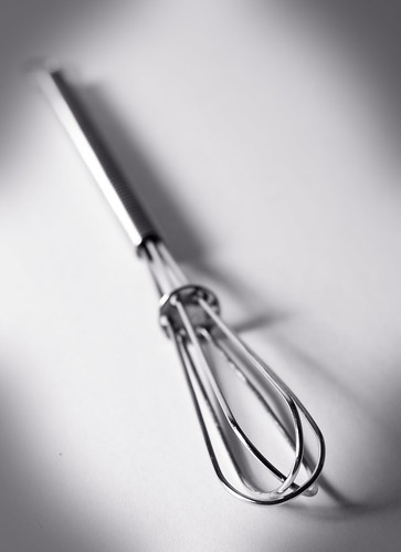
Anyway, I was playing around with different directions and distances of light. I found that when the light source is further away from the subject, the shadows are more defined. Not wanting too many harsh shadows that would make the photo too busy (and distract from the simplicity that is one of the features of the Motionless set), I opted for one of the shots that had the light source closer.

click to enlarge, or see it on Flickr
Aperture: f/8
Shutter Speed: 1/10
ISO: 100
Focal Length: 55mm
Tripod
I'm pretty happy with how this turned out. If I could change one thing, I would have made the light a little more directional from the side. The image could use slightly more contrast. And the DoF is a little shallower than I wanted, but that's not too distracting.
I've done a little bit of dabbling with food photography, but nothing too serious. It's quite a challenge apparently. Well, there's nothing I like more than tackling a photography challenge. Before I started, I noted that most professional food photos I've seen have:
-Shallow DoF
-Frame-filling subjects
-High-key, relatively uniform lighting
-Simple backgrounds
-Utensils
-Camera tilts for odd angles (something I'm not a huge fan of)
-Either spot-on lifelike white-balance, or a slightly cooler cast
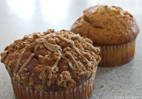
The food I had on hand for this was muffins, which generally don't require much utensil usage. I guess in hindsight I could have used a knife, but oh, well. I used my kit lens, usually at around 35mm focal length I think, and at a wide variety of apertures as experimentation. The counter in my house is corian, so it reflects light from windows nicely, but it's also quite uniform. It gave me a ready-made professional looking background. I set up the muffins in various positions to emphasize texture, etc. and started shooting (foregoing the camera tilt... maybe I'll try it next time).

click to enlarge, or see it on Flickr
Aperture: f/8
Shutter Speed: 0.6 seconds
ISO: 100
Focal Length: 34mm
Tripod
The last thing I did after my regular contrast/sharpness/exposure adjustments in Lightroom was going through the steps from this post to get the white-balance exactly right. I tried it with a blue cast first, but it didn't look so good with brown muffins.
I think I could have gone a bit wider in the aperture, but otherwise I'm pretty satisfied with the shot. Sure, there are things to improve on, but considering I basically set a couple of muffins on the counter and shot a few photos, they turned out pretty good.
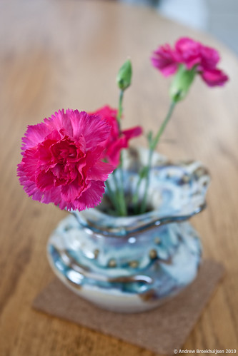
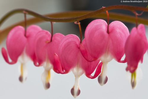
I know that title sounds ridiculously corny. But it's the name of the plant featured in this post, and I must say it's pretty accurate. Once again, I shot this indoors, so I didn't have to deal with wind. I love that.

click to enlarge, or see it on Flickr
Aperture: f/8
Shutter Speed: 1/2
ISO: 100
Focal Length: 100mm
Tripod
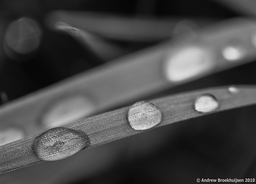
I liked the lines from this shot, although the angle wasn't super creative. That being said, my original idea of having the line start closer to the lens and go further away from it, and at a slight angle to create more depth, didn't work out. Even at f/32, I had too much blur.
To compensate a little for the boring angle, I added a tiny bit of Orton effect. I had to try a lot of adjustments and stuff before I was happy with it... too much Orton looks bad; I've found myself getting more and more subtle about it with each time I apply it.
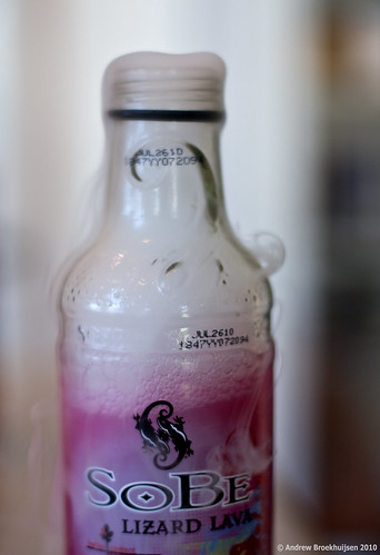
I bought some dry ice today in an attempt to take some photos for this contest. I had a few ideas in mind, but unfortunately none of them worked out this time. The problem was, I had a pound and a half of dry ice left. So I was drinking a SoBe and figured I could cool it down pretty quick with some of the leftover dry ice. It worked. It also looked pretty cool.

click to enlarge, or see it on Flickr
Aperture: f/1.8
Shutter Speed: 1/80
ISO: 100
Focal Length: 50mm
Tripod
Not a particularly great photo, but it was more for fun than anything. I really think this dry ice thing has some potential if I can figure out how to get the vapor to behave.
On another note, this bottle exploded shortly after this was taken. Turns out putting the lid on with dry ice inside will cause that. Good thing I foresaw that possibility and placed it outside. It was loud.
I didn't shoot anything particularly creative today. So I'm falling back on some more Hello Dolly pictures. Cheating, I know, especially when I'm up against things like this, but I'm tired. Today was my last AP test, so I should have more time and energy to devote to photography starting now.

click to enlarge, or see it on Flickr
Aperture: f/2
Shutter Speed: 1/250
ISO: 800
Focal Length: 135mm
Monopod
This guy and his partner were pretty impressive. He looks confident up there on that unicycle... a skill I don't have.
I saw this on my way home from working on my guitar today. I'm rather confused. There were tons of these signs everywhere. Either it was a very elaborate joke, or someone actually lost a kangaroo.

click to enlarge, or see it on Flickr
Aperture: f/5.6
Shutter Speed: 1/320
ISO: 100
Focal Length: 55mm
Handheld
So not much photographic value here, but I thought this was funny.
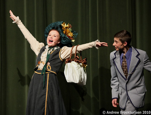
My little brother was in his school's production of Hello Dolly, and I went to see it yesterday. I have to say I was quite impressed. The singing in particular was top notch, especially for a Jr. High. Needless to say, I took pictures. 340 of them. I haven't looked through all of them yet, but there are bound to be some keepers.

click to enlarge, or see it on Flickr
Aperture: f/2.8
Shutter Speed: 1/250
ISO: 800
Focal Length: 135mm
Monopod
Her face is a bit too contrasty and washed-out here, but this stage was well-lit enough for me to go down to 800 ISO and still get pretty impressive shutter speeds, In fact, it looks like the lens wasn't even maxed out aperture-wise here. Good job, TMS techies.
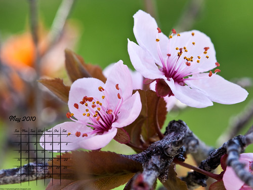
I was pretty happy with this photo, although maybe I should have switched the photos for April and May. At any rate, here's the calendar.

1600x1200
As always, feel free to share, etc.
Edit: I would also like to point out that I'm an idiot for including "April 31st."
Up front, I'll apologize for not getting posts out recently. I was gone on a hike all day Friday and Saturday. On the bright side, I got a few good photos on the way. Also, if the weather decides to cooperate instead of snowing again (yes, in MAY), I'll have a new calendar out tomorrow.
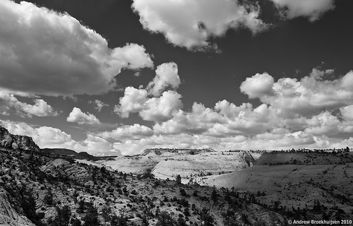
Anyway, here's my favorite photo from the trip.

click to enlarge, or see it on Flickr
Aperture: f/11
Shutter Speed: 1/250
ISO: 100
Focal Length: 18mm
Handheld
I love the way the clouds look when you shoot at a wide angle. One of the first lenses I will buy is a really, really wide one for shooting breathtaking landscapes.
This was taken about 2/3s of the way through the 18-mile hike. It was grueling, and it really put things in perspective for me when I could be standing on top of the most recent hill, take a photo like this, and then realize that about an hour or so previous, we were beyond the farthest mountain visible in the shot. I'm glad I did it though, it was a cool experience.
